Become a MacRumors Supporter for $50/year with no ads, ability to filter front page stories, and private forums.

jpfisher

macrumors regular
Original poster
Dec 5, 2006
149
0
New Jersey
Rules:

1. You may only submit one photo per contest.

2. The contest runs for exactly one week, from the first time stamp of the first post in the thread (this will be made by the winner of the previous week's contest).

3. Please refrain from commenting on the photos submitted in the contest. A good photograph is one that can appeal to someone who may not know much about the technical aspects of photography, so it would be best if the judge isn't swayed by someone else's opinion of the photograph.

4. The judge will choose his/her favorite at the end of the week, place a post listing it, and include a short synopsis of why he/she chose that photo. The winner is then responsible for choosing a new topic and starting a new contest thread, which will again run for exactly one week.

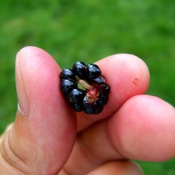
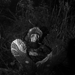
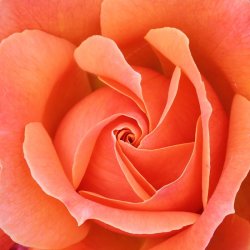
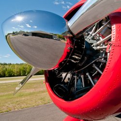
This week's theme: It's Hip to Be Square
I was once told that "Everyone should shoot with a 6x6cm camera at some point in their life." I'm not going to require that you break out a medium format film body, but show off your skills with a square composition -- all shots should be in a 1:1 aspect ratio. Best of luck!
 
Rose
 

Attachments

  • rose.jpg
    rose.jpg
    143.5 KB · Views: 219
This has been a tricky one since all my pictures from my Film Hasselblad are square so I didn't really know what to pick!

 
emorydunn: I like the use of selective focus in this shot -- the real subject is the logo on the pot -- it's an interesting study of an object, but I find myself wondering what this would have looked like in color.

flutegirl822: A nice departure from the typical flower shot. I like the framing a lot.

raxafarian: It's nice to see a shot like this that doesn't prominently feature a reflection of the photographer -- great up close look of the airplane's prop.

deep diver: What am I looking at here? It's almost Warholdesque, but the ambiguity takes away from the pop art characteristics.

VirtualRain: I hope you don't take offense if I say 'This look slike it oculd be an album cover." Great location, I really like the light panel in the ground.

01jamcon: This shot just doesn't work for me. Too much fingers and not enough berry and bug.

MattSepeta: Looks like a fun night, but the shot is too jumbled for me. I keep being drawn to the fire on the right. You've got too much of the house and not enough of the interesting subjects in this.

redkud300: I think I would have gone for more or less depth of field with this photo. I know it's hard to get closer to birds, but I think this would work better if we were closer to the gosling, or if his friends were also in focus.

Xander562: I really love this photo. The symmetry, the subject matter. Looks great.

dobes36: Now this is original. There's a lot going on here, the bottom of the sneaker, the hair, the gas mask, the camo, the backdrop. It's a photo that just screams "look closer."

The Mad Kiwi: I really, really love this photo. Fantastic use of negative space and selective lighting. Wish I had taken it.

JDDavis: Certainly a unique perspective. Love the shallow depth of field -- great job "finding" this perspective for a photo of your little girl. Might have cropped it a bit tighter, there's a lot of space on the bottom.

acearchie: Little bit of a light leak there, but I don't think it detracts from the photo. Not sure what your model is doing here with her hands -- but it looks like a good time was had by all.

kreuzberg: I like the vanishing point framing you have on here with the land disappearing into the water and the trees all leading your eye to the distant figure.

runlsd: Nostalgia, eh? With an autofocus lens? :) Maybe Nikon could use this in their marketing materials…


It's a tough call for me, but I'm going to give the win to Xander562.
 
Good choice for the winner... Xander562, nice photo and congrats!

As for mine, that's exactly what I thought when I was cropping it... It could be an album cover... if only the guys in the photo were in a band and not my friends and work colleagues! :D

Looking forward to a new topic. :)
 
emorydunn: I like the use of selective focus in this shot -- the real subject is the logo on the pot -- it's an interesting study of an object, but I find myself wondering what this would have looked like in color.

flutegirl822: A nice departure from the typical flower shot. I like the framing a lot.

raxafarian: It's nice to see a shot like this that doesn't prominently feature a reflection of the photographer -- great up close look of the airplane's prop.

deep diver: What am I looking at here? It's almost Warholdesque, but the ambiguity takes away from the pop art characteristics.

VirtualRain: I hope you don't take offense if I say 'This look slike it oculd be an album cover." Great location, I really like the light panel in the ground.

01jamcon: This shot just doesn't work for me. Too much fingers and not enough berry and bug.

MattSepeta: Looks like a fun night, but the shot is too jumbled for me. I keep being drawn to the fire on the right. You've got too much of the house and not enough of the interesting subjects in this.

redkud300: I think I would have gone for more or less depth of field with this photo. I know it's hard to get closer to birds, but I think this would work better if we were closer to the gosling, or if his friends were also in focus.

Xander562: I really love this photo. The symmetry, the subject matter. Looks great.

dobes36: Now this is original. There's a lot going on here, the bottom of the sneaker, the hair, the gas mask, the camo, the backdrop. It's a photo that just screams "look closer."

The Mad Kiwi: I really, really love this photo. Fantastic use of negative space and selective lighting. Wish I had taken it.

JDDavis: Certainly a unique perspective. Love the shallow depth of field -- great job "finding" this perspective for a photo of your little girl. Might have cropped it a bit tighter, there's a lot of space on the bottom.

acearchie: Little bit of a light leak there, but I don't think it detracts from the photo. Not sure what your model is doing here with her hands -- but it looks like a good time was had by all.

kreuzberg: I like the vanishing point framing you have on here with the land disappearing into the water and the trees all leading your eye to the distant figure.

runlsd: Nostalgia, eh? With an autofocus lens? :) Maybe Nikon could use this in their marketing materials…


It's a tough call for me, but I'm going to give the win to Xander562.

You misspelled my username.
Thanks for the feedback.
 
runlsd: Nostalgia, eh? With an autofocus lens? :) Maybe Nikon could use this in their marketing materials…
That's true.

But I thought about it for a whole second and named it nostalgia because I don't own the set anymore for an unfortunate reason. It's okay though. May be a c&c on the photo itself next time. :)

It's a good topic! I especially liked acearchie & kreuzberg's shots especially.

Congrats, Xander562!
 
jpfisher - You should probably pick a runner up in case we don't here from Xander562. Has anyone PM'd him? By tomorrow we should pass the baton to the runner up to start the new contest.
 
jpfisher - You should probably pick a runner up in case we don't here from Xander562. Has anyone PM'd him? By tomorrow we should pass the baton to the runner up to start the new contest.

Despite my inability to spell his username correctly, I'd give the runner-up nod to djones36.
 
*bows* I'm glad that you all liked it. Thank you.

(I would have posted earlier, but the forums seemed to break down yesterday when people's iphones started arriving.)
 
Not sure what's happened with Xander562:confused:

djones36 you should probably go ahead and start a new contest. You're profile wouldn't let me send you a message so hopefully one of you will see this.
 
Register on MacRumors! This sidebar will go away, and you'll see fewer ads.