Got a tip for us?
Let us know
Become a MacRumors Supporter for $50/year with no ads, ability to filter front page stories, and private forums.
a new mock-up
- Thread starter timmillwood
- Start date
- Sort by reaction score
You are using an out of date browser. It may not display this or other websites correctly.
You should upgrade or use an alternative browser.
You should upgrade or use an alternative browser.
that post-it is random.
you went with "spun designs"? you need some logo work. The design font is so overused it's tacky. and the lines behind it look weird. what's it supposed to be/represent? reminds me of a chalkboard.
it's a start, but like others recommended to you: you shouldn't rush into this. you run the risk of setting an immediate not-so-positive impression.
that post-it is random.
you went with "spun designs"? you need some logo work. The design font is so overused it's tacky. and the lines behind it look weird. what's it supposed to be/represent? reminds me of a chalkboard.
it's a start, but like others recommended to you: you shouldn't rush into this. you run the risk of setting an immediate not-so-positive impression.
What design font?
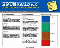
top bit represents a designer's desktop, with 'To Do' post it, and lines to layout text
Why do i need a logo? if a do have a logo no one will know what it means because it is just a small company, I think it would be better just to a have a name in a font a the logo so everyone knows what it is.
I really like the design of this site, so just hope to get some suggestions or ideas i might of missed
He is referencing the type/font used for the word "design" in your masthead.What design font?
My desktop only looks like that when no one is going to see it, I wouldn't advertise yourself in such a way that it makes you look archaic, messy, cluttered, or anything other than professional.top bit represents a designer's desktop, with 'To Do' post it, and lines to layout text
It is like the outfit you are wearing - it show a style of work, quality, as well as ads professionalism in the eye of the consumer.Why do i need a logo? if a do have a logo no one will know what it means because it is just a small company, I think it would be better just to a have a name in a font a the logo so everyone knows what it is.
With a site like this you need to design for usability while maintaining a clear concept.I really like the design of this site, so just hope to get some suggestions or ideas i might of missed
Why do i need a logo? if a do have a logo no one will know what it means because it is just a small company, I think it would be better just to a have a name in a font a the logo so everyone knows what it is.
I think that's what he was talking about. Your logo, whether it is an image or just text in a certain style, represents you as a company and needs to be the best it can be - especially if you are a design company and most especially if you do logo design. Pick something distinctive and stylish, something that will make people think of your company whenever they see it. If you use a font that is popular and overused then your brand recognition becomes diluted. Just some ideas. If you are happy with your site as is then go with it.
For your future mock ups you should also get some better standard placeholder text.
Here is a fun generator.
Here is a fun generator.
I was looking for a designy font, and i like itHe is referencing the type/font used for the word "design" in your masthead.
My desktop only looks like that when no one is going to see it, I wouldn't advertise yourself in such a way that it makes you look archaic, messy, cluttered, or anything other than professional.
I disagree, i think it doesn't look messy, it looks organised, using post-its and planning text placement is being organised, and i think it looks good
ok, if you think i need a logo, the name will be the logo in those fonts, like Stampyhead saidIt is like the outfit you are wearing - it show a style of work, quality, as well as ads professionalism in the eye of the consumer.
With a site like this you need to design for usability while maintaining a clear concept.
I hope to follow Zeldman's book on designing with web standards, as well as Neilsen's ideas of usability
I was looking for a designy font, and i like it
I disagree, i think it doesn't look messy, it looks organised, using post-its and planning text placement is being organised, and i think it looks good
ok, if you think i need a logo, the name will be the logo in those fonts, like Stampyhead said
I hope to follow Zeldman's book on designing with web standards, as well as Neilsen's ideas of usability
If you like that is all that matters but remember you are not the client your customers are.
P.S. as far as a logo is concerned you are correct many companies go with only a set type for their identity - FedEx is a fine example but it is fluid and designed, not just a sting of characters - while Target's identity is just a string of characters that are supported by a bug.
I was looking for a designy font, and i like it
The fact that this typeface screams designy to you, makes me cringe")
That being said, we all start somewhere and Zeldman and others are good people to listen to. More importantly I would suggest getting a few books with solid design principles which will lend you much more knowledge on this area you're interested in.
I think most people who have responded are accurate, and you can't put yourself out there without being open to all forms of critiques. Good or bad. I'd say push this design further because it looks like you're holding back to represent yourself as a company bigger than yourself. Is it ironic that the reason why people freelance is to stay away from the corporate atmospheres yet this design reminds me of a cubicle? Just remember, personality and branding sell.
The fact that this typeface screams designy to you, makes me cringe
When i say designy i don't mean cool, flash, artsy i mean sketchy, hand drawn rough design.
Therefore the name (logo) is SPUN in a codey font and Design in a sketchy/designy font.
Yeh, design is the hardest bit for me I am a lot better at code, but i really enjoy it, and I look forward to doing it alone, one day I want my company to be a big corporate company, and i want to convey that corporate professional image.
There is relevance to the style of types needed, but why not find a less-common type face or scan in your handwriting.
In it's current rendition it looks as if you just picked a system font that happened to be on your computer.
try something thats actually hand written
Example using redstar.ttf

How do you find a good font?
The font i chose was Bradley Hand, can't remember if i had it or downloaded it, but it had good height for the lines.
Although the more i look at the lines the more i dont like them, i have been trying it out in different sizes and am unsure about them.
EDIT: tried redstar and it looks both too Disney and too messy. Currently looking into other hand-written fonts
How do you find a good font?
The font i chose was Bradley Hand, can't remember if i had it or downloaded it, but it had good height for the lines.
Google "type foundry" or checkout linotype.com or veer.com if you are wanting a nicely designed full typeface. You can always search "free mac fonts" but they are usually low quality, incomplete, limiting, or just plain cheesy.
Although the more i look at the lines the more i dont like them, i have been trying it out in different sizes and am unsure about them.
I personally don't think the lines are helping at all, I keep seeing the large ruled paper used when teaching the alphabet in elementary schools.
Yeh, design is the hardest bit for me I am a lot better at code, but i really enjoy it, and I look forward to doing it alone, one day I want my company to be a big corporate company, and i want to convey that corporate professional image.
Yes, design is the hardest part. Zeldman will show you how to write code well but not really good web design.
Check out sites like oswd.org, csszengarden, and I'm sure there's a list somewhere on this forum. It'll help give you a better idea what's good design and what's not. Generally some people have an eye for it and some don't. And it's not something you'll find out right away.
Your design is a good start. But it's a start. You can't rush it and just throw it up online. Check out htttp://www.webdesignfromscratch.com The author is really good at explaining design.
Also another suggestion I didn't mention before. Get of those 3 grey lines. Subtlety is chic now a days and if you have content, the layout subdivisions should be self evident. The other thing you could do is have 3 equal columsn with a solid rectangular very light grey background if you want to have distinctions on the page.
Re: logo+design, that's what I meant. Thanks everyone for clarifying.

Quite a nice one
No doubt i will be back with more design problems, let me know if u have any PHP or SQL problems!
Quite a nice one
No doubt i will be back with more design problems, let me know if u have any PHP or SQL problems!
I would question that sample because it may cause legibility problems as well is it looks a little dated and pirate-ish
I would question that sample because it may cause legibility problems as well is it looks a little dated and pirate-ish
Doesnt look as good in context, i'm sorry but i cant find one that looks as good (in shape and size) as Bradley hand.
I also want it to have an a and not an a like people write
I would question that sample because it may cause legibility problems as well is it looks a little dated and pirate-ish
Yarr! It also looks kind of clumsy when the letters don't quite meet correctly.
That being said, I don't like the logo either, but I think the bigger problem is that, overall, the page has no focus. There's a bunch of random stuff put up. It might represent the clutter of a real desk. I dunno. But the three column layout has far too little pull to me. I'm not sure where I'm supposed to be looking.
Doesnt look as good in context, i'm sorry but i cant find one that looks as good (in shape and size) as Bradley hand.
I also want it to have an a and not an a like people write
The only problem with "Bradley" is that is reminiscent of Comic Sans, Brush Script, etc. - if you are wanting something with a distinct look you should try writing out "design" in sharpie on plain white paper over and over again until you get the look you want than scan it in and trace it. It wouldn't hurt to have friends and family write it out as well.
haha,
That's the funniest design related response I've heard in a while. Turn that around for a second on yourself, if your client came to you said "we'd like our website to look designy" what would you say?
Dude, I honestly believe that your trying your damnedest, and we all had to start somewhere. But please, when asking for feedback take the chip off your shoulder
I'm sure you'd love to post a layout and have everyone go "wow, that's amazing! great work!" but people aren't going to lie to you just to make you feel warm and fuzzy inside.
So if your going to continue posting designs here (which history suggest you will) please lose the attitude and take people's advice to heart. Their trying to help you, not upset you.
I was looking for a designy font, and i like it
That's the funniest design related response I've heard in a while. Turn that around for a second on yourself, if your client came to you said "we'd like our website to look designy" what would you say?
Dude, I honestly believe that your trying your damnedest, and we all had to start somewhere. But please, when asking for feedback take the chip off your shoulder
I'm sure you'd love to post a layout and have everyone go "wow, that's amazing! great work!" but people aren't going to lie to you just to make you feel warm and fuzzy inside.
So if your going to continue posting designs here (which history suggest you will) please lose the attitude and take people's advice to heart. Their trying to help you, not upset you.
I have been reading a few blogs...
...and i am going for plain and simple.
I am a uni graduate
I design for normal everyday people
I am a normal everyday person
Why have a flashy web site?
I have to rethink and look at the market
I think i just need a plain logo (text name) with a plain site saying who I am, what I do and what I offer.
I can then work up from there.
If you are a massive company (eg Wal-mart) you don't get a guy like me to do your website. If you are a small local band, local music shop etc you look at cheap, small, local companies to do your website.
So this is where I am gonna go.
Links
http://www.fortymedia.com/
http://www.modernlifeisrubbish.co.uk/
This is not too terribly bad, although it is a bit trendy -- Web 2.0 to be specific in terms of trend. But it has a basic, simple, well-executed layout. It communicates information clearly. There's a difference between simplicity in the sense of minimalism and simplicity in the sense of laziness... if you're going to do simple, you can pick either, but ... well. Well.
Register on MacRumors! This sidebar will go away, and you'll see fewer ads.