hey guys, I think it's better to make the dock area transparent, at least as transparent as folder.
Speaking critical of IOS7 is strongly discouraged in the IOS7 forum.
That's not necessarily the problem. It's that this forum is not the place to make design suggestions. Those should be sent to Apple.
Although I agree that design suggestions should be sent to Apple, there's no reason they can't also be discussed here. This is an iOS 7 discussion forum after all.
Sure they can. But reading the original post makes it sounds like this is intended for Apple not for discussion.
hey guys, I think it's better to make the dock area transparent, at least as transparent as folder.
I didn't perceive it that way, especially since it was prefaced with "hey guys." Sounded to me like it was aimed at us.
To each his own but the wording of the post sounded to me like it was meant for Apple.
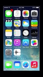
Like this?
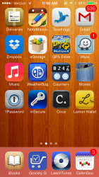
Right after beta 1 was released to developers, some noticed that the iOS 7 version Apple was using in their WWDC sessions was different. The screenshot below comes from one of those official videos and clearly shows a dock that's more transparent. I kinda like it better that way. Still holding out hope that they will change it to that.
...and clearly shows a dock that's more transparent.
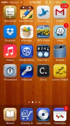
True, with the blur it would definitely look better.It's missing the blur. The transparency looks similar to how it always has been in iOS7 betas.
It's missing the blur. The transparency looks similar to how it always has been in iOS7 betas.
True, with the blur it would definitely look better.
I don't think I've seen anything in iOS 7 that looks like the dock in that picture. And the lack of blur = more transparent so the wallpaper is clearer behind it.
, i started this thread to just want to discuss it as a common issue or bug or something else alike rather than to send it to apple.Right after beta 1 was released to developers, some noticed that the iOS 7 version Apple was using in their WWDC sessions was different. The screenshot below comes from one of those official videos and clearly shows a dock that's more transparent. I kinda like it better that way. Still holding out hope that they will change it to that.
Like this?