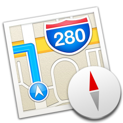
just wanted to share icons that pertain to the original intention but slightly altered. some are based on apple's style before it's recent 'flat' trend as seen in the new icons in iOS 7, also influencing some new icons in Mavericks such as the maps icon, looking flatter.
some match the iOS 6/7 icon colours..
some are to find consistency, such as the app store/ibooks icon not matching the new iTunes 11 icon.
here you go, i don't take credit for all of this, some, especially the Messages icon, is from other places, some i reworked worked myself.
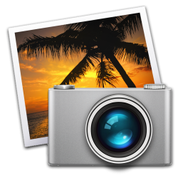
the iPhoto is a 'concept' i'm going to try and create properly in the future.
some match the iOS 6/7 icon colours..
some are to find consistency, such as the app store/ibooks icon not matching the new iTunes 11 icon.
here you go, i don't take credit for all of this, some, especially the Messages icon, is from other places, some i reworked worked myself.
the iPhoto is a 'concept' i'm going to try and create properly in the future.
Attachments


Last edited: