I thought I was imagining things. The 16e appeared to be easier to read than my 15 pro. Today I double checked and measured the actual icons and the 16e icons are actually a little bit bigger than the 15 pro. Side by side you can actually notice this and there’s less space on the sides. I double checked the settings for the display to be zoomed on both, the icons are set to large in the home screen settings, text size set to same and bold turned on. Anybody else noticed this? Am I missing a setting?
Got a tip for us?
Let us know
Become a MacRumors Supporter for $50/year with no ads, ability to filter front page stories, and private forums.
iPhone 16e app icons bigger on 16e than 15pro
- Thread starter shamus99
- Start date
- Sort by reaction score
You are using an out of date browser. It may not display this or other websites correctly.
You should upgrade or use an alternative browser.
You should upgrade or use an alternative browser.
Maybe due to the different screen resolution? It’s a small difference so if you’re seeing a small difference that might be it.

good question unfortunately I just packed up the 15 pro to send back to Apple as a trade-in.
I did test that on the 16e and it’s a combination of both the display zoom setting AND the icon size setting in the home screen, edit, customize icon setting.
I did test that on the 16e and it’s a combination of both the display zoom setting AND the icon size setting in the home screen, edit, customize icon setting.
good question unfortunately I just packed up the 15 pro to send back to Apple as a trade-in.
I did test that on the 16e and it’s a combination of both the display zoom setting AND the icon size setting in the home screen, edit, customize icon setting.
My wife has a 15, I might check hers later and see what it looks like.
I did the same trade-in, as crazy as some might think it is (15 Pro I traded in was pretty used)...
great let us know if you get a chance
the settings ive found are:
settings, display and brightness, display zoom
home screen, edit, customize
it might not seem like a lot, but for a guy like me that needs his glasses sometimes to use the phone it really helps.
the settings ive found are:
settings, display and brightness, display zoom
home screen, edit, customize
it might not seem like a lot, but for a guy like me that needs his glasses sometimes to use the phone it really helps.
I remember this issue between my iPhone SE and the min. for some reason the SE was a little bigger despite having a smaller screen
The aspect ratio on the Mini squeezed the text a bit more than the SE, and honestly I could read off the SE better than the Mini because of it. I'd be willing to bet it's something similar here with the slightly different resolution.

I have a 13 mini, my gf has a 16, and I'll be getting a 16e soon. If I remember, I'll review it and comprare the 3 screens/resolution and share my impressions.I addressed that in the first post. yes they are both set to large.
In addition I just checked my wife’s 16 and the 16e is bigger.
thanksI have a 13 mini, my gf has a 16, and I'll be getting a 16e soon. If I remember, I'll review it and comprare the 3 screens/resolution and share my impressions.
Hello, today I have received my 16e.thanks
My gf is not at home right now, but I share two screenshots, one from my 13m and another from my 16e.
13 mini
16e
In my opinion, both looks very similar, with enough space around the edges of the “dock”.
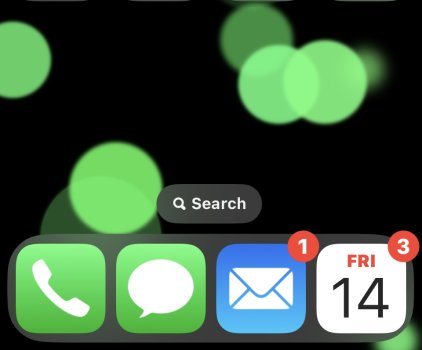
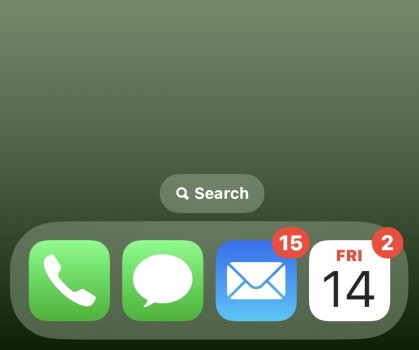
Yep, I agree with this. I can reproduce the same thing on my iPhone 13 and iPhone 16, which have the same screen specs as the 16e and 15 Pro, respectively. For whatever reason, Apple has decided to have things scaled differently on these two screen sizes/resolutions. (Both screenshots below are using 'Larger Text' display zoom and 'Large' icons.)Maybe due to the different screen resolution? It’s a small difference so if you’re seeing a small difference that might be it.
View attachment 2492108
iPhone 13 (and 16e) | iPhone 16 (and 15 Pro) |
|---|---|
| Screen Size: 6.06" Resolution: 2532 x 1170 | Screen Size: 6.12" Resolution: 2556 x 1179 |
 |  |
Register on MacRumors! This sidebar will go away, and you'll see fewer ads.