Become a MacRumors Supporter for $50/year with no ads, ability to filter front page stories, and private forums.

chris1111

macrumors 6502
Original poster
Jul 8, 2015
433
1,041
Montréal Canada
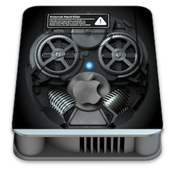
On Monterey 12 Apple wanted to continue with mechanical disk icons like this o_O
Internal.png

So I wonder why they didn't modernize them a bit to make them prettier and more attractive like this one for example ?😎

Apple.png Windows.pngAppleRecv.png
 
Good question really.. I have not thought about opening up the icon internal hard disk drive. I already have it re-made, as good as I can, in Sketch. The idea isn't bad.
 
  • Like
Reactions: chris1111
Because Apple's is a representation of real hardware and your's isn't.

it is not a question of real material or not
you are completely off the track
it is a question of design and evolution of icon!
Apple introduces an HD which was used almost 10 years ago in Mac's, HDs are no longer used in modern computers because it had SSDs and now NVMEs the question is to understand why there is no such thing. modernization on Icons
 
Last edited:
The same can be said for calling the main HD “Macintosh HD”. This is purely vestigial for a couple of reasons:

1) Apple doesn’t use hard drives (HD) anymore.
2) Apple doesn’t use the “Macintosh” name anymore in its marketing, and haven’t done so since around Mac OS 9 was first released.

The default drive icon and naming are both anarchisms from the past.

With that said, it’s a nice touch and “throwback” to the old days.
 
  • Like
Reactions: NC12 and chris1111
it is not a question of real material or not
you are completely off the track
it is a question of design and evolution of icon!
Apple introduces an HD which was used almost 10 years ago in Mac's, HDs are no longer used in modern computers because it had SSDs and now NVMEs the question is to understand why there is no such thing. modernization on Icons

For most people outside the "tech nerdy world", the place were they keep files is commonly called a hard drive. Most people isn't aware of the difference between an hard drive and a SSD, because in comparaison the SSD tech is pretty recent. Most people still relies on "old" knowledge.
So it's not completely idiot to keep that representation to allow users to feel comfortable.
Do you really think this is what Apple thinks?
I think that Apple is sloppy in the design aspect of its Images and Icons because looking in several apps it is always the same images that come back, I know that Big Sur has had some IOS style changes and improvements in this dimension but I have the impression that it does not dare . And when they often dare, it is the users who are not happy :)
We are talking about one of the few companies in the world that takes care of their brand and design meticulously. The company that makes rain drops hit the top of the weather sections in the app, the company that puts his postal address in the envelope of the Mail icon, the company that uses BSOD for Windows machines representation, but suuuuuure, they are sloppy with the hard drive icons. Think whatever you want.
 
  • Like
Reactions: NC12
I think it’s worth keeping the hard disk icon. Many programs still use a floppy disk icon for saving files; it’s familiar and consistent, even though many young people don’t know what a floppy disk is.

Windows 11 is getting a lot of flak over omitting written selections of “Copy”, “Paste”, and “Rename” in their right-click menus. The function of the “rename” icon in particular is not apparent at all.
 
Register on MacRumors! This sidebar will go away, and you'll see fewer ads.