Become a MacRumors Supporter for $50/year with no ads, ability to filter front page stories, and private forums.

MacRumors

macrumors bot
Original poster
Apr 12, 2001
68,236
39,038


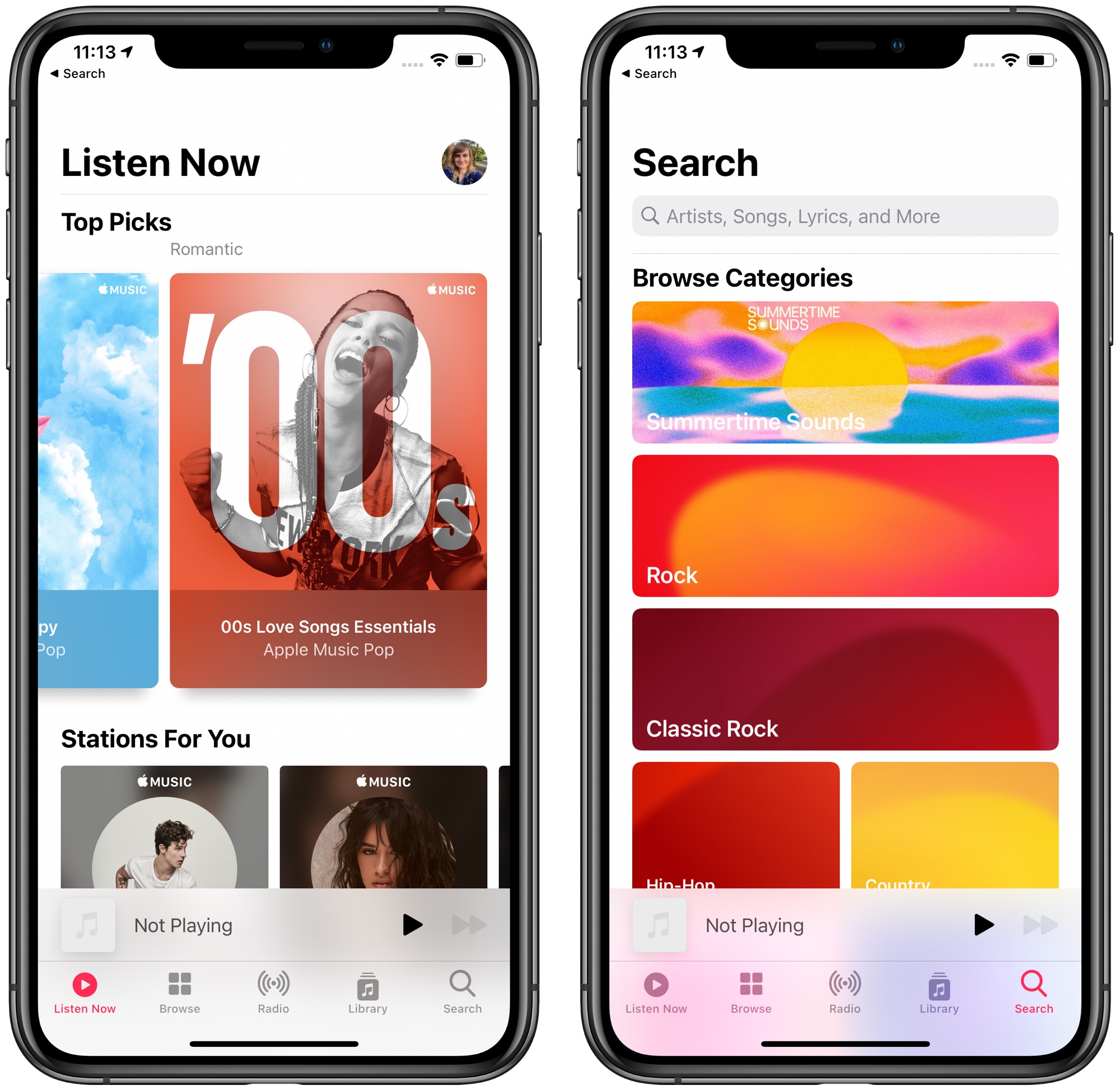
Apple Music will receive a number of design changes in iOS 14, including a new "Listen Now" tab, improved search, and Autoplay. Another small design update is larger playlist artwork, and today Benjamin Mayo with 9to5Mac shared how some of these designs now include animated art.
musicappios14.jpg

On the new Listen Now tab, a "Top Picks" section includes oversized icons for playlists, radio stations, albums, and more, all of which Apple Music thinks you'll like. This week on the iOS 14 developer beta, some of these playlists have now received animated artwork, which you can see in the video below.


This appears to mainly be focused on Apple's own curated playlists, like "Party Starters," as well as your personally curated Mixes. The animations are short and appear similar to live wallpapers on iOS, showcasing brief and colorful sequences that apparently loop infinitely.

Besides Apple Music, there will be numerous changes in iOS 14. You can read up on all of the updates that have been announced and discovered in our full iOS 14 roundup.

Article Link: Apple Music Introduces Animated Playlist Artwork in iOS 14 Beta
 
As long as it doesn't keep looping in the background running down the battery. I disable all animation and effects in iOS.
 
  • Like
Reactions: NMBob and Huck
Oversized icons for playlists = can only see one icon at a time. This is less user friendly.

I would love for their to be at least one tab in Music that is customizable.
What would be really nice is if Apple allowed me to see more than three tiles of music selection. I don't need animations, I don't need lyrics, so disappointed with Music. I want to see music choices!
I wholeheartedly agree; it seems with each new release of iOS, Apple Music eats up more space in the already crammed music player.

If you just want to play your own music, you now have two tabs at the bottom and an extra three you'll only ever use if you mistakenly tap on.

Older is not always better, but damn do I miss when there were independent tabs for Songs, Playlists, Artists, Albums, and you could rearrange them:

ios 5 vs 14 music.png
 
Last edited:
If they haven't fixed the ridiculous idea that you have to give it access to your local library, it's still not worth paying for. The only reason I am a subscriber is that Verizon continues to give away the subscription.
 
All I want is better sound resolution. Please Apple give us 16 / 44.1 ALAC with a choice to use it or stay with 256 kbps AAC for those that don’t care.

Fancy graphics don’t do it for me. CD quality resolution and decent album artwork is all I need.
 
I mean it looks nice, but I wouldn't want a whole page of the animating at the same time, that would be pretty jarring.

BTW - Does Apple Music have handoff yet? I'd rather the team focussed on that first!
 
No, no, no. For those of us with large music libraries (in my case 90 gig) these design ideas are ridiculous. In the current version, the same picture shows up for many playlists when that picture isn’t even valid. Is there some app that will accept all the genres changes & ratings added to iTunes? I want out of this design bloat which may be great for Apple Music listeners but totally sucks for the rest of us.
 
  • Like
Reactions: urnotl33t
Ok Apple you had this really good application called iTunes. You know one thing it iTunes has going for it? That as far as I know, no other music service has? SMART PLAYLISTS!!!! Bring this feature to the Apple music app in iOs/iPadOs for people that like to make there own list based on what's in their library using a combination of artist, genre, date added, star rating, loved, date song was released, BPM etc. It's really sad that you need to own a mac to be able to create a smart playlist. :(
 
All I want is the ability to cross fade music. You can keep the animated artwork 😒
 
I’m wondering if this new design was made to accommodate this new feature. Only one animation ever plays, for power efficiency, so Apple forces only one image to show up at a time, so it doesn’t look odd that only one is playing. Function follows form
 
I wholeheartedly agree; it seems with each new release of iOS, Apple Music eats up more space in the already crammed music player.

If you just want to play your own music, you now have two tabs at the bottom and an extra three you'll only ever use if you mistakenly tap on.

Older is not always better, but damn do I miss when there were independent tabs for Songs, Playlists, Artists, Albums, and you could rearrange them:

View attachment 931461

You can still accomplish that if you disable Apple Music, and only use "iTunes" though, right? I deleted the app from my phone as soon as I could, so apologies if that's no longer the case.
 
  • Like
Reactions: CrazySuzyn
Fancy graphics don’t do it for me. CD quality resolution and decent album artwork is all I need.
Totally not saying your wrong, I have no idea, but ARE you saying that iTunes/Music can't play a CD-audio sampling rate encode?
[automerge]1594235652[/automerge]
Do we know roughly when the Beta for iOS 14 will be released for testing?
Why do we care?
 
Register on MacRumors! This sidebar will go away, and you'll see fewer ads.