Become a MacRumors Supporter for $50/year with no ads, ability to filter front page stories, and private forums.

MacRumors

macrumors bot
Original poster
Apr 12, 2001
70,415
42,063


Apple is rolling out a new look to their App Store individual app pages tonight which brings it in line with the rest of the iTunes 9 design that was revealed a few months ago. The changes will be of primary interest to App Store developers who rely on the App Store pages to drive sales.


205713-doodle_500.jpg


Changes that may impact developers include:

- Much larger icon is shown
- Multiple screenshots are more obvious to viewer
- App description is truncated to the first 2 lines by default. While users can expand to see the rest of the description, many will likely not. This places much more importance on the first two lines of the App's description
- More apps by the same developer are listed automatically

In general, there seems to be a bigger focus on the icon/screenshots on first glance of the page. The changes seem to be propagating to the App Store tonight so not all pages have been affected.

Article Link: Apple Rolls Out New App Store Look

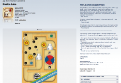
Old look attached below:
 

Attachments

  • Screen shot 2009-12-11 at 9.02.52 PM.png
    Screen shot 2009-12-11 at 9.02.52 PM.png
    448 KB · Views: 1,935
Didn't they just come out with one?

I actually kinda liked it, but whatever, this could be good. :p

I would need to see it in the store though
 
Are the pictures multitouch? Seems like they should be. Tablet friendly. Are we getting to the stage where you can use iTunes, Apple.com without any need for a mouse? (Just maybe an onscreen or physical keyboard?)
 
Are the pictures multitouch? Seems like they should be. Tablet friendly. Are we getting to the stage where you can use iTunes, Apple.com without any need for a mouse? (Just maybe an onscreen or physical keyboard?)

wishful thinking much?

lol, were all doing that ;)
 
The description being truncated is a good thing - reduces all those developers putting

********************************
NEW GAME AVAILABLE! BUY XXX PRO!
********************************

on top of their pages.
 
wishful thinking much?

lol, were all doing that ;)

Well - yes, but also - If you look at how they've started spacing things out on the Apple.com site, making pictures either multitouch rows, or coverflow etc - it is friendlier to a multitouch trackpad at the very least.

Put another way, wouldn't Apple want to make their line of products more accessible to using a tablet? If they were thinking of having a tablet, you'd likely see changes to get ready for one. Maybe there are better examples :)

MBP is fine for me, but i'm just thinking. Heck, we have no idea what OS 4 for iPhone looks like, let alone Tablet.
 
Haha, I just browsed the app store. Lol @ the huge pixelated icons.

Apple could have at least sent out a memo to developers letting them know that they should upload hi-res icons and redo their pages. Some pages have hi-res icons, like Discovery and Shazam. Others don't, like Labyrinth 2 and Bejeweled 2.

For instance, what about the devs that have custom page artwork? I looked up Super Monkey Ball, The Sims 3, and Yelp, and they're still the old style with custom artwork that is still in place. Has anyone found a newly formatted page that has custom background artwork??
 
gimmmmmmmeeeeeeeeeeeeee!!!(){
// beer
}

So if I'm reading your code right, you want comments about beer? Sorry, this is an Apple only site. Unless you go to the Community Discussion section of the forum.

Otherwise, I think you want this:

while (stomach < full){
beer++;
}

Of course I didn't declare the stomach and full variables...I'll leave those up to personal preference.
 
They should just straight up copy amazon.com. People who bought this also bought, etc. The store is still a mess, though. Kinda slow.
 
Apple could have at least sent out a memo to developers letting them know that they should upload hi-res icons and redo their pages.

Developers have had to upload 512x512 icons since the App Store began. This is nothing new. If some devs stretched low-res icons up to full-size, well, they were told not to do that. And now we see why.

My icon (click for full size):
RealMazeiPhoneIcon.png
, and here it is on the App Store.

--Eric
 
Cool, but still, ..........I would rather they focus on fixing the ugly white background in iTunes . Used to be cool, now its ugly. But ....this is good too, ......I guess.. screw:apple:

You can change it to black yourself in the preferences. That's what I did.
 
For instance, what about the devs that have custom page artwork? I looked up Super Monkey Ball, The Sims 3, and Yelp, and they're still the old style with custom artwork that is still in place. Has anyone found a newly formatted page that has custom background artwork??

The original x-plane app had custom page artwork. That page has gone to the new style and the custom background artwork has disappeared. Just the normal white background now.

with the new layout you can now add apps to your wish list. about time!

Wow, thanks for posting that. I wouldn't have noticed. I have always used the wish list / shopping cart, and have long wanted it to work with apps. Though I've gotten quite accustomed to using Appshopper's wish list...
 
Nice to see the app store change.

Developers have had to upload 512x512 icons since the App Store began. This is nothing new. If some devs stretched low-res icons up to full-size, well, they were told not to do that. And now we see why.
Looks nice. Decided to give it a try. :)
 
It looks nice. Now if they could only fix the problem that it still shows I have an app update even after I've already updated the app.

Superflous, but annoying as all get out.
 
"A picture is worth a thousand words."

Apple is taking advantage of that by emphasizing the images, and expanding on it by reducing the number of words.
 
Register on MacRumors! This sidebar will go away, and you'll see fewer ads.