Become a MacRumors Supporter for $50/year with no ads, ability to filter front page stories, and private forums.

MacRumors

macrumors bot
Original poster
Apr 12, 2001
70,077
41,597


Apple Watch owners have been voicing their frustration online over changes to the Workout app that Apple introduced in watchOS 26, with many finding the redesigned interface makes starting exercises difficult and exasperating.

watchos-26-workout-app.jpg

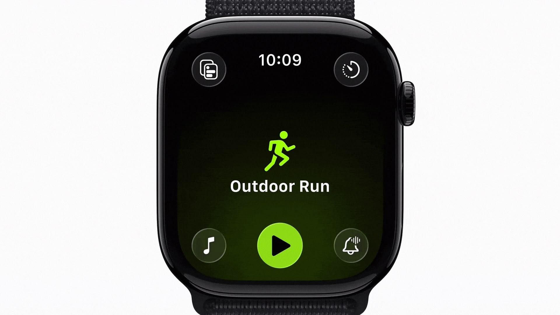
When Apple launched watchOS 26 in September, the Workout app went from large, easily tapped workout tiles to a scrolling, corner-button interface. Instead of tapping a workout once to begin, users now select the workout type, and then tap a smaller play button that appears after a brief animation. Apple has also integrated music and podcast setup directly into the Workout app itself, so users can configure audio to automatically begin playing when they start exercising.

However, many of the changes appear to have become a major source of frustration over the last couple of months, based on a Reddit thread on r/AppleWatch that's full of complaints. "Touch targets are way too small," one user wrote. "Often times I have to tap the play button several times to get the workout to start."

Another user said the update has been "absolutely horrible," adding that "activating a swimming workout has become impossible once in the pool." Several swimmers echoed this view. One notes that the latest design makes it "impossible to reliably start or switch workouts once you're wet or mid-lap."

The redesigned layout also moves common controls like goal settings, quick-start options, and frequently used workouts into different positions. Long-time users say this breaks years of muscle memory. "What I used to be able to do in my sleep without thinking now takes my full brain capacity and always annoys me just before my workout," one user noted.

Some users also report reliability issues, like tapping the start button and seeing the press animation without the workout actually starting, or walking workouts failing to register completely. Mis-starts are another recurring issue. "I've accidentally started the wrong workout so many times," one user wrote. "The play button loads late, so I think I'm scrolling, but I actually tap it the moment it appears." Another said they've watched the button animate when tapped, "and then found out later that it didn't actually register."

workouts-watchos-7.jpg
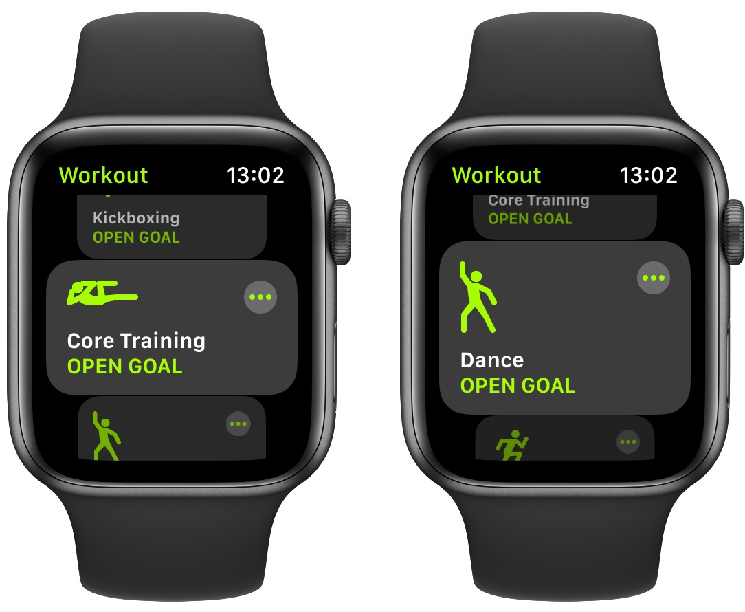
The old Workout interface in watchOS 11

"The scrolling is so bad now," wrote another user, while others said the interface simply feels laggy. One explained that "the delay between selecting and starting is so long that I constantly overshoot or open the wrong thing."

Some users have turned to Siri voice commands to bypass the new interface altogether, while others rely on the Action button on Apple Watch Ultra models to start workouts directly. A few say they've been letting auto-detection handle walking and cycling sessions simply because it's less tedious than navigating the UI.

What have your experiences been with the Workout app on Apple Watch since the watchOS 26 update? Do you get on with the redesigned interface, or is it a step backwards from watchOS 11? Let us know in the comments.

Article Link: Apple Watch Users Claim Workout App Is Now Worse in Every Way
 
Last edited:
I'm a triathlete. It is. And let me explain why. Do note, some of this stuff has been carried over for many years.

1. The interface is slow and clunky. When you are working out, the last thing you need is an unresponsive interface. It needs to be quick and actionable. The animations take forever. Reduce Motion helps this a bit, but all the movement is awful for precision tracking and utility.

2. The digital buttons are small. Why are they so small? Make them big so the touch surface for them is easier to hit.

3. Ending a workout and starting another immediately is glitchy and slow. Same applies for adding one to the previous one is as well. Sometimes it works immediately, sometimes it takes 10 seconds. This is important to me because I chug through runs, rides and swims back-to-back.

4. Workout metrics get covered whenever custom intervals start. This is terrible because I like to check my metrics as soon as intervals start to adjust as needed. The mitigation is to tap the screen to jump back to your custom views.

5. Default settings make little sense for the user experience. For example, Precision Start is off by default; Voice Feedback is on by default; Press to Pause is off by default. Should be inversed. Press to Pause takes over the screenshot functionality, I get it, but what's more important in a watch? Screenshots or pausing a workout?

6. When you go to Custom Workouts for a specific workout type, it "suggests" my Custom Workouts. **** off. I know what I'm doing, and it's not what I want to do most of the time. It also defaults to this view.

7. You cannot delete race routes. Why is the app setting these without an option to remove?

8. Autoplay Media shuffles a playlist in a specific order and it affixes that order. This is a bug and needs to be fixed.

There's probably more, which I will add to this list.

In general, it is clear that the Workout app is handled by a design and engineering team which have no idea or interest in what athletes need. It's disappointing. And third-party alternative apps are not much better. Every day I'm inching closer to getting a Garmin or Coros.
 
Last edited:
Runner here. Can confirm, the new workout app is terrible. On the Apple Watch Ultra, the process used to be: "click action button to launch workout" Scroll to "Outdoor Run" and tap anywhere on it - it begins acquiring signal while i finish prepping for the run. Tap the Action Button to start (i use the precision start feature). Now it's: "Click action button to launch workout app". Scroll to "Outdoor Run", "wait for a tiny Play button to appear" ... "can't tap anywhere on the screen, must land precisely on the tine play button"...which doesn't actually start the workout. Then tap action button to begin the workout.

Once running, scrolling between stat screens never works...you have to position the watch comically forward in front f your face before it will let you scroll between screens. And the new finger tap gesture certainly doesn't work for switching between stats because you have to be positioned just right to do it and when you're on mile 10 of a long run, I just want to see the stats i need, for the love of all that's holy. Why not use Siri?? Well, because Siri's dumb as all hell and can't read your current running stats even though they are RIGHT THERE ON THE SCREEN. And Workout Buddy only works when your phone is with you. I activated the 5G so i wouldn't have to run with my phone. Just makes me wonder if anyone at Apple has actually used the Apple Watch on a real run before.

Swim workouts are equally frustrating. Can't do anything on the screen when it's wet and it mis-calculates laps far more than it used to.

Apple, you can do better.
 
Last edited:
Siri no longer calls out my splits when I'm on a run.

Originally I thought it was my problem, and I visited and revisited settings numerous times.

I saw that other people were seeing the same issue (see posts on Apple discussion forums), so I kept raising defect reports.

I've moved from an iPhone Pro Max 14 to an iPhone Air. I run with an Apple Watch Ultra 1.

I don't run with my phone. (I accidentally went on a walk with my phone, and Siri (from my watch) called out my splits! If I don't bring my phone, Siri doesn't call out my splits.)

I guess this is another example of Apple releasing new product and reducing feature set?
 
  • Like
Reactions: Frosties
Totally agree on the article! Icons too small, everything takes longer and why on earth did we actually change an amazing UI ? What was the reason, might have missed this. Too add when I get the 1 mile announcement sometimes the volume of podcasts or music is changing.
 
The new update is terrible. The main menu is terrible during scrolling and causes you to accidentally start the wrong workout. While in a workout and starting a new workout a new menu has been added instead of just quick starting a new workout that also causes you to accidentally make the wrong selection. Notification Center also doesn't work and takes multiple swipes to interact with notifications while working out.
 
Haha, we're not THAT frustrated. Nobody's gonna sell us any Garmins until they can do contactless payments, stream our music, do phone calls, texts, email, alert emergency services and loved ones if we fall, and the list goes on.

Not everyone wants or needs all that cellular connectivity for their fitness watch.

Contactless payments work fine btw -- I do that all the time with my Garmin.

All that aside, the point about Apple UX and UI here remains.
Minimal buttons and only touchscreen driven UI is a real drawback for many types of usages.
 
Register on MacRumors! This sidebar will go away, and you'll see fewer ads.