Apple has had what feels like a decent time now to adapt to Swift on and to use Catalyst for macOS. From my own experiences it feels like there have been some good performance gains, but equally drawbacks too. The user interfaces are probably my biggest annoyance.


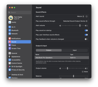
These are only select examples, but it is frustrating that Apple has gone for a 'one size fits all' approach for their devices now rather than actually optimising elements for the Mac as they have done in the past. Splash screens with tiny size 9 fonts bunched up in what is clearly an iOS/iPad template. Screens such as the Day view in photos that is now limited in width, despite having more than enough screen estate to fill the empty area. The new System Settings also has a lot of inconsistent and poorly designed UI elements compared to the predecessor.
I'd be very interested to hear your own thoughts and experiences, particularly coming from larger screens (i.e Studio Display).