Become a MacRumors Supporter for $50/year with no ads, ability to filter front page stories, and private forums.

Shaduu

macrumors 6502a
Original poster
Jan 31, 2007
750
0
Southsea
First off, I don't class myself as a graphic designer: I'm a photographer who messes around with design in Photoshop. Anyhoo, my friend asked me to produce an ad for his band's upcoming gig, why he asked me I have no idea.

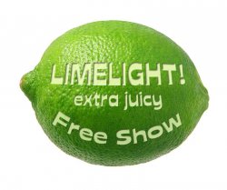
Although I know I'm no designer, I'd still like to make the most pro-looking ad I can manage, hence, I'm asking for crit on this first draft. Any suggestions will be taken on board. :)
 

Attachments

  • Limelight ad.jpg
    Limelight ad.jpg
    172.3 KB · Views: 203
From a content point of view.

The ad as presently worded, assumes that the audience knows who Limelight is, where the Red Room is, what the opening time is, and where to get tickets.

This is fine if both the band and the venue are local legends. But it won't draw in any new clientele. Part of the job of advertising is to tell the reader what they need to know. So, if Limelight is known for "Low down funky Klezmer dance music" then the ad should say so in a way that attracts the potential gig goer. Similarly the address of the club would help people get there if they've never been.

I get the lime theme, and its good as far as it goes. I am concerned about the triple hit to readability though, of a compressed oblique font, reversed type, and low contrast between the type and the background. Each of those alone reduces legibility, three together are risky.

The "Free" stands out -- partly because the colour is jarring against the green. You may be able to do more than the conventional medallion shape though. Do you have a photo of a lime? How about Photoshopping some words onto a lime instead?

Thanks a lot, I'll be trying to implement these into the next draft. I'm especially liking the lime idea, heh.
 
Here's a hack at it -- <disclaimer> IANAGD

Couple of things -- Limelight! suggests a hard shadow, like theatrical spotlights, which is reinforced by the 'ray' effect you have going. Try working with that.

Didn't have an exact match for the font, so re-do to suit. I am going more for content than layout, here.

(note - painting out a background where there is a gradient, angled lines, and a cross angle grid, is #^#@$ finicky. On your next draft, could you provide layered PNG or PSD files?)
 

Attachments

  • Limelight.jpg
    Limelight.jpg
    151.3 KB · Views: 140
  • lime.jpg
    lime.jpg
    110.9 KB · Views: 130
I think it needs some human interest on there. It's a nice simple design, but doesn't say what kind of night it is.

What exactly is it?
 
Register on MacRumors! This sidebar will go away, and you'll see fewer ads.