Become a MacRumors Supporter for $50/year with no ads, ability to filter front page stories, and private forums.

adamvk

macrumors 65816
Original poster
Oct 29, 2008
1,308
0
Phoenix, AZ
I just did a redesign of my site, I'm wondering how everyone likes the changes.

Before:

1ca93acd.png


After:

9e1f011e.png


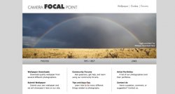
The site is www.camerafocalpoint.com, but there is not a ton there yet.
 
Not a knock against the old design, but the new layout is quite nice and looks very professional. Good work!

Thanks! The initial design was made in RapidWeaver, which I did not know very well at the time, so I basically just used a pre-made template and entered in my information.
 
Here are a few more pictures:

5936ff4d.png


4c5c088a.png


faa4af47.png


And this is a splash screen I will have just for a month or two after the new site is up:

1f10b8f2.png
 
Much better. Would try some more interesting typography myself, a more impressive image for the homepage too.
 
Avoid the splash screen. It will drive visitors away. It's an unnecessary click.

Don't be afraid to be bold with the launch of a redesign. You don't even really need to announce it. Just do it. :)

I really like your new site. My only suggestion is to remove the ".com" from the logo (in one of your screenshots).
 
Much better. Would try some more interesting typography myself, a more impressive image for the homepage too.

Do you have any fonts in mind? I would like to have a "modern" simple font, thats why I like the font I'm currently using, but if you have a suggestion, I'd be more than happy to hear it.

Avoid the splash screen. It will drive visitors away. It's an unnecessary click.

Don't be afraid to be bold with the launch of a redesign. You don't even really need to announce it. Just do it. :)

I really like your new site. My only suggestion is to remove the ".com" from the logo (in one of your screenshots).

I got rid of the splash screen. :) I guess they are annoying, I just forget that sometimes. I have the ".com" just on the forums because the forums are actually located at a different site. This way, if people find the forums before the site, hopefully they will enter the site url into their web browser. Eventually I might spend the money to get a forum integrated onto my actual site, but for now the free one at a different site works for me. :)

Unless you know of a free forum that can be put on my site...

Never use a hosted forum. Also try and host your own forums.

There are tons of open source forum scripts if you search the web (assuming you have a decent web host of course).
 
Never use a hosted forum. Also try and host your own forums.

There are tons of open source forum scripts if you search the web (assuming you have a decent web host of course).

What would I need from my web-host?

But anyways I have x10hosting, which I love. They have tons of features.
 
Many host will have Fantastico auto-installers for the popular forum software out there. Makes getting things set up a snap.
 
New design looks good. Better than the previous one.

I see that yet again your site is entering "a new web development phase". I said it before on a different thread that you started that you should worry less about the look of your website and instead focus on getting more content ready for it.

Content content content. I cannot stress it enough. Your site could be the most beautiful site in the world but if there is no content worth reading or looking at it will be unsuccessful.

Yes, I realize that this is where my problem is. One thing I am going to do it do a "tip of the week" or "tip of the day." I'm also going to contact photographers and see if they can submit wallpaper, tips, and guides.

And as far as the forum, my web host does support MySQL and PHP. Does someone have a link though that can point me in the right direction on how to set one up?

Thanks.
 
Your new site does look much better than the old one. Nice job.

Have you considered making the header smaller, negative space is great, but you also have can create a feeling of emptiness if it is used improperly. Also some top level navigation would also help, even if they're just simple hyper links.

For the logo, Future is a nice choice of font, well done. It's clean and modern and fits well with your site. However, I think it needs some additional contrast to really pop. Here I use a combination of type sizes and weights to achieve a strong but clean look for your logo.

How about something like this...
 

Attachments

  • camerafocalpoint.jpg
    camerafocalpoint.jpg
    73.1 KB · Views: 138
Your new site does look much better than the old one. Nice job.

Have you considered making the header smaller, negative space is great, but you also have can create a feeling of emptiness if it is used improperly. Also some top level navigation would also help, even if they're just simple hyper links.

For the logo, Future is a nice choice of font, well done. It's clean and modern and fits well with your site. However, I think it needs some additional contrast to really pop. Here I use a combination of type sizes and weights to achieve a strong but clean look for your logo.

How about something like this...

Oh, I really like that, thank you. Which font did you use for the "Focal" part?

Also by the way, I used Century Gothic, which is very close to Futura. :)
 
Reply/Question.

Hello. Amazing site. I think it's unbelievably clean, but I have a question.

Q: What is a good size in px for designing a website? I'm using Adobe Photoshop CS4.

Thanks in advance.
 
Oh, I really like that, thank you. Which font did you use for the "Focal" part?

Also by the way, I used Century Gothic, which is very close to Futura. :)

It's all different weights of Futura. If you have a graphics editor, I have it in PSD format, but could probably save the logo in some other format for you after later on and send it over.
 
It's all different weights of Futura. If you have a graphics editor, I have it in PSD format, but could probably save the logo in some other format for you after later on and send it over.

Ok, Sweet. If you could just leave it in .psd that would be great, I have CS4. I'll PM you my email address. Thanks again.
 
Ok, Sweet. If you could just leave it in .psd that would be great, I have CS4. I'll PM you my email address. Thanks again.

Oh, I missed this post about you having CS4. I could send over a PSD of the logo, as well. I went with jpg because i wasn't sure if you could open the file.
 
Oh, I missed this post about you having CS4. I could send over a PSD of the logo, as well. I went with jpg because i wasn't sure if you could open the file.

Thank you. :)

I tried to open it, and I can't edit it at all since I DON'T have the fonts. However, luckily for me it tells me what fonts are missing so I'll just download them.
 
Register on MacRumors! This sidebar will go away, and you'll see fewer ads.