Hello everyone,
I'm conducting a two week long Physics experiment next, and I'm writing up/logging results in iWork.
What would be the best themes to use in both applications? I want them to look nice together, since I'll be putting graphs from Numbers into Pages, and I'd like the font to be nice.
I know this a weird question, but please don't flame me.
Thanks
")
During your experiments, you take notes in a real (log)book. Real world logbooks can not be corrupted or be easily altered after the events. This can also be important later on if you need real proof that you did these experiments on or before a certain date.
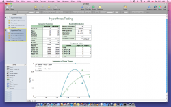
Excel and Numbers are nice for two things in a physics lab: 1) simple calculations and 2) quick and dirty, on the go graphs while running your experiments. It doesn't matter which themes you use, they still look bad. For decent looking graphs, you should use a professional software package like origin (via VMWare).
For small reports, word or pages would be fine I guess. LaTeX is recommend for larger reports, articles, thesis, etc. I know nobody who switched from latex to Word. I know plenty of people who switched from Word to LaTeX. Whichever you pick, you will still end up shooting at your computer. LaTeX produces a nicer looking document, though.
And yes, I work in a physics lab.
Edit: If you want to know how a decent graph looks like, then download a physics paper.
http://jap.aip.org/resource/1/japiau/v109/i1/p013911_s1?bypassSSO=1 (note, I am not affiliated with this paper)
Fig 1 is unfortunately not the best example (the ticks are pointing outwards), but the others are fine.
Don't put too many zeros in your axis values. That is why there are SI prefixes.
Don't use too small font sizes.
Play with symbols (round, square, triangle) and dashes (full, dash, dash-dot-dash). Make sure they still looks nice in black and white.
I might see the colors on screen but I am not going to waste color ink on your paper while printing.
Don't mix red and green. ~10% is colourblind
Don't use yellow in a presentation (projection screen).
The graphs and captions should tell the story. The text adds context to the report.
Not every report/paper is read by a native English speaker. So write clearly and objectively. Don't use fancy words or clever phrases.
It is about communicating your idea's, not showing of your mastery of the English language.
And the best looking graphs and fonts mean nothing if the content is crap or the experiments were badly conducted.