Become a MacRumors Supporter for $50/year with no ads, ability to filter front page stories, and private forums.

GC251114

macrumors 6502
Original poster
Jul 28, 2015
460
255
Ok atmittedly I haven’t seen it in the flesh , handled one , played with one etc , but am I really the only person who isn’t bothered at all about the black notch on the iPhone X ?

I’m not an Apple fanboy at all , the continued lag on my 6s Plus home screen icons on iOS 11 GM gets on my goat , but what I do appreciate is a UI & user experience that I consider far superior to other platforms.

Now I’m reading lots on here about how ugly & disastrous & ridiculous etc this black notch is at top of phone.

I just don’t see this at all. I still think the phone is a work of beauty. Now is this because I’m not a gamer , never have & never intend to play games on my phone ?

Yes it’s there on a full screen photo or video , but big deal.

Each to there own & I respect all views , but just curious to other people’s thoughts.

Cheers
 
I’m with you, I don’t really mind the notch at the top. I don’t really game or watch movies on my phone. Mainly social media and email for work if I’m out of the office. I think it’ll be alright. Now hopefully they ramp up production so we can get it before thanksgiving
 
I’m with you, I don’t really mind the notch at the top. I don’t really game or watch movies on my phone. Mainly social media and email for work if I’m out of the office. I think it’ll be alright. Now hopefully they ramp up production so we can get it before thanksgiving

Totally agree. Work & social emails , making calls , taking & viewing photos & occasional video. FB occasionally , accessing my diary & mostly all the stuff I’ve ever done on my iPhone since iPhone 3G.

So maybe it is a gaming thing.

Cheers
 
So you'd be ok if your TV had a notch in the middle of the picture at the top of the screen?

I don't care one way or another but what I see is bad design. It's distracting as implemented. It doesn't offer any added value. Use that screen area with a black background to display system info and it makes sense.

I respect your opinion , but as I said in my previous post , I only watch the videos I take on my phone , I don’t watch tv content from streaming sites etc. I have an iPad Pro , or MacBook Pro , or an actual 55” tv for that.

I’d be able to watch & Show the occasional iPhone video , without being worried about a black notch.

Cheers

It's not just videos, it's all content - including web and apps - where these ears are highlighted instead of subtly hidden. Sloppy.
 
It’s ugly. Watch, it’ll be gone in future iterations.

i think they'll keep this for the next 5-10 years, to make the iPhone recognizable, since all the phones will start to look the same with mostly screen left on the front..
 
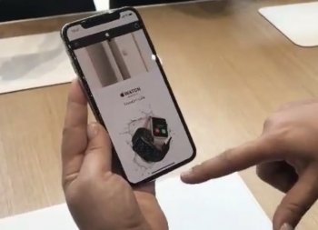
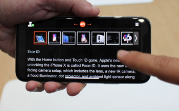
If you notice at the top your view is not obstructed on websites from this photo at the hands on portion of the event
 

Attachments

  • 5F7B8E69-8F5B-482C-BD1A-3A85EBBADFC6.jpeg
    5F7B8E69-8F5B-482C-BD1A-3A85EBBADFC6.jpeg
    87.1 KB · Views: 213
Very distracting when watching videos. The compromise of having a thick border on a near edge to edge display is not a good one.
 
  • Like
Reactions: michial
It's not just videos, it's all content - including web and apps - where these ears are highlighted instead of subtly hidden. Sloppy.

For Apple , yes maybe sloppy , but really such a big deal ? Surely there’s enough screen for you to read a web page or interact with an app.

As I type this on my 6s Plus , I’m looking at the top of my screen. It’s not going to make any difference at all. All it would be in way of is the time & website name , but this will then be positioned elsewhere. Sorry , but unless you play shooting , racing or flight simulation game , I just can’t see the problem.

Cheers
[doublepost=1505308279][/doublepost]
If you notice at the top your view is not obstructed on websites from this photo at the hands on portion of the event

Thank you , I point I just made in my additional post.

Cheers
 
It will be interesting to see if the 2018 iphone will have those ears.

Any early betters? :D
 
If you notice at the top your view is not obstructed on websites from this photo at the hands on portion of the event

It's not that it obstructs view of the content, it's that it's unnecessary to have that area colored at all. In this video here you can see that it does not obstruct during video playback.

If you look at the other parts of the video see how much more natural it looks when on the home screen where the top is a black background showing only the system info? What's the point not doing that all the time?
 
I like the black notch so much , I’ve just drawn in a black bar at the top of my iPad , MacBook & Watch with a permenant marker.

Damn you Apple & your inconsistencies !

I will not be beaten.

Cheers
 
  • Like
Reactions: illitrate23
Very distracting when watching videos. The compromise of having a thick border on a near edge to edge display is not a good one.
Agree. Samsung pulled off the true bezel less design much better. This has bezels all around and a funky cut out up top. Steve would’ve freaked.
 
Agree. Samsung pulled off the true bezel less design much better. This has bezels all around and a funky cut out up top. Steve would’ve freaked.

I think Steve would’ve thought ,

“ Will you please please stop bringing my name into every single thing that gets designed/released “

Cheers
 
It sounds good wh
It will be interesting to see if the 2018 iphone will have those ears.

Any early betters? :D
Judging by Apples history, this design is here to stay for a few years at least. As it should, there is nothing wrong with it. I can imagine it being annoying with photos and videos as was shown, but that’s something Apple can edit in software if there’s enough backlash.
 
I don’t think it’s really about what Apple could do in regards to bezels, but rather what they felt was right. I’m pretty sure if Samsung can “pull off” less bezel, most manufacturers can.

I won’t really know for certain until I’ve got it in hand, but I don’t see what everyone is on about. The ears look like they hide when they’d be the most intrusive.

People don’t seem to be complaining that they get in the way, rather that they “stick out.”
 
This seems like a silly thing to have a problem with....

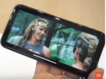
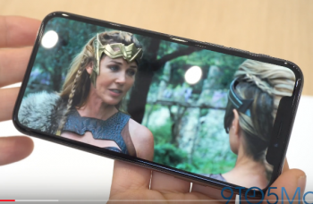
First thing and by far the most obvious, the screen is wider than 16:9. So the majority of your video content won't reach both sides when played normally. If you are the type that hates black bars and zooms into a video you'll be losing content on the top and bottom anyway.

Second, even wider screen films will still just fit. If you zoom in again you'll see the notch but you'll be losing content on either side, notice the actress on the right shoulder.

Screen Shot 2017-09-13 at 9.29.03 AM.png
Screen Shot 2017-09-13 at 9.29.21 AM.png

Point is, don't zoom into a video and if you do don't surprised if people don't care about your opinion on the notch for this reason. If that is distracting to you imagine how distracting it is for us to have large amounts of the video lost on all the edges.

Then there is the elephant in the room no one is complaining about yet (already regretting pointing it out), the screen has rounded edges. Internet and video content doesn't.

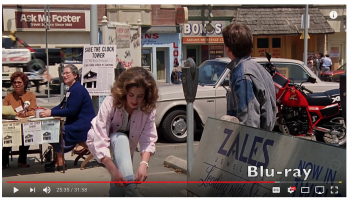
Ever watch an older movie on TV/BD? Ever notice how much information is cropped out? Back to the Future VHD vs BD, look at the top of the VHD where it says "Cupids" and the bottom near her foot, then look at the BD.

Screen Shot 2017-09-13 at 9.34.58 AM.png
Screen Shot 2017-09-13 at 9.35.14 AM.png

With a HDR and a color space specifically for digital movies (P3) the iPhone X should be a good device for watching movies (for a phone anyway).

For reading things like webpages in portrait you get more height for more content on the screen. Just think of the area beside the notch a place to tuck the status information into.

And in landscape you are back to wider than 16:9 so the notch won't effect anything.

Screen Shot 2017-09-13 at 10.34.25 AM.png
 
This seems like a silly thing to have a problem with....

View attachment 717371
View attachment 717372

I wouldn't say people are silly.

Of the two possibilities, the first is my preference. Having black bars is fine, never bothered me in the slightest ...having part of the picture chopped out (small as it may be) is a greater evil.

If you haven't realized, watching movies on the iPad...you always had to deal w/the bars.
 
Last edited:
  • Like
Reactions: illitrate23
I wouldn't say people are silly.

Of the two possibilities, the first is my preference. Having black bars is fine, never bothered me in the slightest ...having part of the picture chopped out (small as it may be) is a greater evil.

If you haven't realized, watching movies on the iPad...you always had to deal w/the bars.

The point I was making that if you are watching a video normally (black bars) you won't have the notch. Only if you zoom into the video will you see that because the iPhone X is wider than 16:9.

One of us is missing something.... lol
 
So you'd be ok if your TV had a notch in the middle of the picture at the top of the screen?

I don't care one way or another but what I see is bad design. It's distracting as implemented. It doesn't offer any added value. Use that screen area with a black background to display system info and it makes sense.

agreed
 
So you'd be ok if your TV had a notch in the middle of the picture at the top of the screen?

I don't care one way or another but what I see is bad design. It's distracting as implemented. It doesn't offer any added value. Use that screen area with a black background to display system info and it makes sense.

I would've totally agreed with you at first and I am still somewhat (keyword there) bothered by it but to be honest after seeing the Essential phone I'm less bothered by it but who knows seeing it in my hand it might annoy me....
 
Register on MacRumors! This sidebar will go away, and you'll see fewer ads.