I notice that the screen on my macbook air is not as sharp as my 4 yr old sony vaio s460. Is this the nature of the screen? I read chinese and there is a huge difference in sharpness with my vaio for small fonts compared to the air
Got a tip for us?
Let us know
Become a MacRumors Supporter for $50/year with no ads, ability to filter front page stories, and private forums.
Blurry Screen
- Thread starter whatjones911
- Start date
- Sort by reaction score
You are using an out of date browser. It may not display this or other websites correctly.
You should upgrade or use an alternative browser.
You should upgrade or use an alternative browser.
Blurry screen
I experience the same, particularly regarding text. Movies and photos seem to be ok, but the fonts are blurry. All sizes by the way.
I thought it might relate to a font setting I dont know of (I'm new to Mac).
Any help / thought much appreciated.
I experience the same, particularly regarding text. Movies and photos seem to be ok, but the fonts are blurry. All sizes by the way.
I thought it might relate to a font setting I dont know of (I'm new to Mac).
Any help / thought much appreciated.
I experience the same, particularly regarding text. Movies and photos seem to be ok, but the fonts are blurry. All sizes by the way.
I thought it might relate to a font setting I dont know of (I'm new to Mac).
Any help / thought much appreciated.
If it's only text, check in System Preferences -> Appearance and then the Font Smoothing options.
Apsterling, thanks for the suggestion. I tried it but it doesnt solve the problem.
It looks like it has something to do with the resolution of the screen. When I decrease resolution from 1280x800 to 1024x640 I see the effect worsening.
Also, pdf-files show the same effect. Maybe even photos.
I'm starting to doubt whether my eyes could be the problem. However, it should be in combination with a 13,3 screen then, since I do not encounter these problems on my 3-year old 15,4 inch Acer.
How can that be?
I notice this with all mac screens not just my mba. I guess it is just that way it is. Kinda disappointed that is not as sharp as my vaio.
If you are talking about text being blurry, as in Chinese, that is just the way it is. On the mac, they anti-alias even japanese, korean, and chinese while windows does not usually.
I use a Japanese computer, and it is the same. Korean is the same as well. They are all sort of blured in order to look more like print text. If I look at my windows pc, it is like night and day. However, if you continue to use it, it sort of grows on you. I have asked some Japanese friends to look at it, and they said it looks even better.
I actually prefer fonts in Windows XP, but this is something that I just put up with. You will get used to it eventually. Even if you use a program to turn off anti-aliasing, the fonts will actually look worse beause they were designed to be used with anti-aliasing on.
Hope this helps.
I looked at a friends MBP and indeed it has the same blurry text. Strange for a company which is famous for it's user centered design.. to have such bad text reading characteristics.
Mroseneo, thanks for the 'explanation'. I agree that the fonts in XP are much better. However, I can't believe this to be a matter of taste/preference.
I installed Internet Explorer for Mac on my Air, but that didn't help; it's determined somewhere in the OS obviously.
I am going to my reseller for an explanation and if indeed it can't be helped I will have to make up my mind..
"it sort of grows on you".
Taking a cold shower every day does too, it isnt very comfortable though!
It's how fonts are rendered in OS X. Windows forces the characters into a grid which OS X anti-aliases the fonts to make them more accurate. They are not "blurry". There's nothing you can do about it.
Although I've used Windows for 10+, since I got my Mac I now hate the default Windows rendering. I can't understand how I was able to tolerate it for so long. I "got used" to it in that I now much prefer OS X. And the first thing I do now with a new Windows install is turn on ClearType.
You may take this wrong, but since sitting at a computer involves reading text, you'll have to go back to Windows if you can't get used to it. Apple isn't going to change this behaviour. The vast majority of Mac users prefer it.
Windows has much better text anti-aliasing than OS X does; I think Windows uses subpixels or something (so the outlines are composed of non-grayscale colors), whereas OS X does it all in grayscale.
http://en.wikipedia.org/wiki/ClearType
There's not much you can do about it, unfortunately.
http://en.wikipedia.org/wiki/ClearType
There's not much you can do about it, unfortunately.
It's not a fault of the screen but a line that has been drawn in the sand. There are two camps in digital typography.
The Apple camp believes that antialiased fonts AT ALL COSTS is the way to go and hence Apple computers, and even Safari/Quicktunes on Windows renders all fonts regardless of how small with an antialiasing algorithm.
The Windows camp believes that the pixel grid should be respected AT ALL COSTS and therefore fonts on Windows machines are rendered using much more complicated algorithms (notice I did not say better, just more complicated) that involve taking into account font hintings and subpixel tricks. For example ClearType is a technology that turns individual red, blue, and green subpixels on and off to give more defined edges while fooling the eye into thinking it's still black.
If you're used to the Windows font rendering you'll think Apple fonts look blurry in comparison at small font sizes. If you're used to Apple font rendering you'll think Windows fonts look too sharp and that the kerning and spacing between characters is off since letters get snapped to the pixel grid.
Which is better is a matter of taste. The top typographers in the world constantly fight over this. There is no clear "best" way to render fonts.
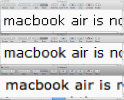
I thought some screenshots might make things easier to visualize. The first set of images is; top, XP with default rendering (what you would see on your 4 yr old Sony), middle XP with ClearType (also the default in Vista), bottom OS X.
I've zoomed in on the next set of images to show the anti-aliasing, or lack of it, and shows what tubbymac is talking about.
I guess ClearType vs OS X is a matter of opinion, but XP's default is hideous.
I've zoomed in on the next set of images to show the anti-aliasing, or lack of it, and shows what tubbymac is talking about.
I guess ClearType vs OS X is a matter of opinion, but XP's default is hideous.
Attachments
I thought some screenshots might make things easier to visualize.
Great shots! A picture is worth a thousand words. Just a reminder that people click on the magnifying glass or whatever in your browser of choice when you look at the pictures because by default they will probably be scaled smaller and everything will look hideous until at the original size.
Also the ClearType pictures are DEVICE DEPENDENT meaning it will look different depending on what type of monitor you have. It will look wrong on a CRT monitor since CRT monitors don't have subpixels. It will also look badly color fringed on certain LCD monitors with a different subpixel order. I'm assuming these were taken on a monitor with an RGB subpixel ordering but there exist many RBG and BGR and all the various permutations of subpixel orders too.
Windows has much better text anti-aliasing than OS X does; I think Windows uses subpixels or something (so the outlines are composed of non-grayscale colors), whereas OS X does it all in grayscale.
http://en.wikipedia.org/wiki/ClearType
There's not much you can do about it, unfortunately.
No, Mac OS X does not do it all in grayscale. Use a screen magnifier, such as ctrl-two finger drag on a default-settings modern mac laptop. You can see the coloured anti-aliasing. It is a different implementation, whose merits I won't repeat as others are doing it. I personally prefer the Apple font rendering over Windows' cleartype (but then I don't read chinese), but it seems perfectly legitimate to prefer it the other way round! I actually *personally* find freetype under ubuntu superior to either, but I just love OS X so much!
Great shots! A picture is worth a thousand words. Just a reminder that people click on the magnifying glass or whatever in your browser of choice when you look at the pictures because by default they will probably be scaled smaller and everything will look hideous until at the original size.
Also the ClearType pictures are DEVICE DEPENDENT meaning it will look different depending on what type of monitor you have. It will look wrong on a CRT monitor since CRT monitors don't have subpixels. It will also look badly color fringed on certain LCD monitors with a different subpixel order. I'm assuming these were taken on a monitor with an RGB subpixel ordering but there exist many RBG and BGR and all the various permutations of subpixel orders too.
Nothing one can do about the CRT with cleartype, but in fairness to MS it can cope with different ordering - there's a ClearType tuner IIRC. To be honest I haven't looked in a long time so apologies if I'm wrong about its capabilities, but I'm *fairly* sure that was one of the options, similar to the font tuning on Gnome these days
Also the ClearType pictures are DEVICE DEPENDENT meaning it will look different depending on what type of monitor you have.
Yes - the ClearType in the screenshot was optimized for the monitor I had at home. Here at work, I see color fringes around the text, although I have to look closely to see them.
Go here in IE: http://www.microsoft.com/typography/cleartype/tuner/step1.aspxhodgeheg said:Nothing one can do about the CRT with cleartype, but in fairness to MS it can cope with different ordering - there's a ClearType tuner IIRC. To be honest I haven't looked in a long time so apologies if I'm wrong about its capabilities, but I'm *fairly* sure that was one of the options, similar to the font tuning on Gnome these days
I thought some screenshots might make things easier to visualize. The first set of images is; top, XP with default rendering (what you would see on your 4 yr old Sony), middle XP with ClearType (also the default in Vista), bottom OS X.
I've zoomed in on the next set of images to show the anti-aliasing, or lack of it, and shows what tubbymac is talking about.
I guess ClearType vs OS X is a matter of opinion, but XP's default is hideous.
Great post. Might have to post this for every "is OSX blurry" thread. =p
https://forums.macrumors.com/posts/7038395/
No, Mac OS X does not do it all in grayscale. Use a screen magnifier, such as ctrl-two finger drag on a default-settings modern mac laptop. You can see the coloured anti-aliasing. It is a different implementation, whose merits I won't repeat as others are doing it. I personally prefer the Apple font rendering over Windows' cleartype (but then I don't read chinese), but it seems perfectly legitimate to prefer it the other way round! I actually *personally* find freetype under ubuntu superior to either, but I just love OS X so much!
I don't really know much about this; I'm not about to switch operating systems over it or anything so I don't care that much. But looking at the above image, OSX does appear to use all grayscale, while XP/Vista take into account the position of subpixels on LCD monitors with cleartype.
I don't really know much about this; I'm not about to switch operating systems over it or anything so I don't care that much. But looking at the above image, OSX does appear to use all grayscale, while XP/Vista take into account the position of subpixels on LCD monitors with cleartype.
No, both use color, but OS X is more subtle about it. The anti-aliasing appears greyscale at the size the images appear in the post, but if you look at them at full magnification, you can see the faint colors.
I thought some screenshots might make things easier to visualize. The first set of images is; top, XP with default rendering (what you would see on your 4 yr old Sony), middle XP with ClearType (also the default in Vista), bottom OS X.
I've zoomed in on the next set of images to show the anti-aliasing, or lack of it, and shows what tubbymac is talking about.
I guess ClearType vs OS X is a matter of opinion, but XP's default is hideous.
They all look the same just less thick/darker... maybe they all look great because I'm viewing this on my 24" LED ACD.

I've zoomed in on the next set of images to show the anti-aliasing, or lack of it, and shows what tubbymac is talking about.
Wow I never realized the difference was that big. I definitely like ClearType much better than OS X, but at least OS X is better than the default XP rendering.
If I had to pick one I personally prefer none of the above. I actually like the updated ClearType technology in Windows 7 the best. The previous version of ClearType only accounted for horizontal subpixel aliasing. If you look at the zooms you can clearly see it doesn't try to do anything in the vertical direction - it's only concerned about smoothing out things horizontally. The new version applies the subpixel tricks in the vertical direction as well making for some absolutely stunning curve rendering.
Microsoft has it patented up the wazoo though so it'll be a fat chance in hell we'd ever see it on an Apple platform or any other platform for that matter. OSX rendering is still too fuzzy looking for my tastes at small font sizes. At large font sizes or high DPI (printers) everything looks good so it doesn't matter what algorithm is used in that case.
The default XP is indeed ugly as sin but you have to understand the context. When XP came out there were still a lot of corporations that were running 640 x 480 VGA screens and the first thing they did was turn off the XP look and slap on the classic Windows 2000 theme. Looks or aesthetics didn't matter to them. They just wanted the least clutter and the most readable fonts on a tiny display. The XP one fulfills this requirement the best although with complete lack of taste
Register on MacRumors! This sidebar will go away, and you'll see fewer ads.