Become a MacRumors Supporter for $50/year with no ads, ability to filter front page stories, and private forums.

beerseagulls

macrumors 6502a
Original poster
Aug 18, 2021
863
681
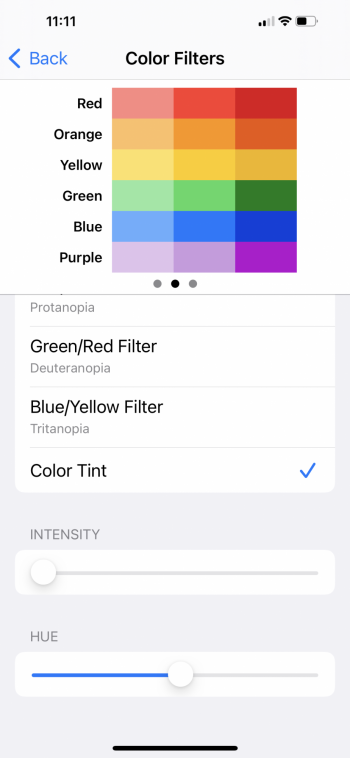
can I cause any permanent damage to iPhone 13(Pro & Mini) screen by using Color Filter in Accessibility to adjust the color to make colors "pop" more? not by much, just a tad, but noticeable enough... the blue is deeper and the red is a little more red.

back when I had a Samsung Galaxy Note 20 Ultra, it had a color profile setting(with 3 styles) to let the user chose whichever color profile was more pleasing... IIRC, I always changed it to the one that made colors more vibrant and pop.... obviously iPhones don't have a setting like that..
 
I used the tritanopia filter for a long time because I like how it makes the blues look but I realized it was making blue text a lot harder to read, especially when the phone is in dark mode.
 
I used the tritanopia filter for a long time because I like how it makes the blues look but I realized it was making blue text a lot harder to read, especially when the phone is in dark mode.
You’re doing it wrong. Joking. ..
See attached with nightshift on looks awesome for me. Try it.
 

Attachments

  • BDF6318D-0D59-4AA2-A4F0-062B0A6F16CD.png
    BDF6318D-0D59-4AA2-A4F0-062B0A6F16CD.png
    779.2 KB · Views: 355
Just use the phone in grayscale for a while: black and white. Then switch back to color and behold the obscenity of it all. iPhone OLED colors are way too saturated as it is. It looks like eye candy made of crack cocaine.
Everything (by default) looks like it’s been through the photoshop saturation setting cranked up to 15.
The older iPhones weren’t like this (iPhone 6 Plus) their color looked more natural. The OLED iPhone color display is way off - too saturated.

Sooo.
If your iPhone 13 display just doesn’t seem to pop anymore. just switch to grayscale for a while then switch back - and behold the charnel house of over saturated color it actually is.

Color perception can be like eating sugar or salt. The more you eat, the more you need to get the same satisfaction

Thanks!

I'm actually seeing the opposite on the iPhone 13 Mini(mine) and iPhone 13 Pro(family member's). The colors are dull and flat, with little or no pop. (compared to iPhone 12 and Xs Max, as well as my previous Note 20 Ultra)

I guess I'll play around with the settings here and there, until the desired colors are reached.... :)
 
Register on MacRumors! This sidebar will go away, and you'll see fewer ads.