Got a tip for us?
Let us know
Become a MacRumors Supporter for $50/year with no ads, ability to filter front page stories, and private forums.
Can someone post iOS 7 with iOS 5 and iOS 6's default wallpaper?
- Thread starter ImperialX
- Start date
- Sort by reaction score
You are using an out of date browser. It may not display this or other websites correctly.
You should upgrade or use an alternative browser.
You should upgrade or use an alternative browser.
It looks really good with that wallpaper. I think the wallpapers they used to show the new is make it look a little more "girly" than it actually is.
You mean like this?
Thank you, I was just curious as to whether it was the wallpaper that made the icons seem really cartoony, or the icons themselves were naturally like that.
I actually think the icons are fine now that I've looked at them a bit more.
You mean like this?
I think this looks great. You can really see how the apps colors were meant to work together. This is going to be something we all look back on and say "Really? People were that upset over icons?"


Bring Forstalls Linens Back To iOS 7 With These 8 Wallpapers
These are good. http://www.cultofmac.com/232758/bring-forstalls-linens-back-to-ios-7-with-these-8-wallpapers/
These are good. http://www.cultofmac.com/232758/bring-forstalls-linens-back-to-ios-7-with-these-8-wallpapers/
And yet so refined, and premium/professional-like. Just because something is old--in the sense that it's been around for some time--doesn't really make it bad. Lots of people wanted something new for the sake of just having something new, not because of what they had was actually bad.Man, iOS 6 looks so............ old.
Man, iOS 6 looks so............ old.
I'm with you, it's been 10 days and there's no way I could go back to iOS 6, the more I use and see iOS 7, the more and more I like it, yeah, some icons could be better, but overall they did a pretty good job and I'm only talking about the icons, everything else just looks beautiful (App Store, Photos, Calendar, Clock, Settings) and really looking forward to see how my favorite apps will manage to get the iOS 7 feeling.
And yet so refined, and premium/professional-like. Just because something is old--in the sense that it's been around for some time--doesn't really make it bad. Lots of people wanted something new for the sake of just having something new, not because of what they had was actually bad.
If it were really refined all the icons would have the glare.
Thank you, I was just curious as to whether it was the wallpaper that made the icons seem really cartoony, or the icons themselves were naturally like that.
I actually think the icons are fine now that I've looked at them a bit more.
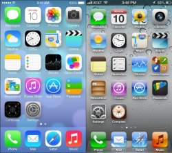
Here you go..
1. iOS 7 Dynamic 1
2. iOS 7 Dynamic 2
3. iOS 7
4. iOS 6
5. iOS 5
EDIT: I was charging my iPhone that's why the battery is green, otherwise is in white.
Attachments

Last edited:
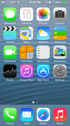
iOS7 looks amazing running the 'galaxy' wallpaper included in the OS.
i agree

iOS7 looks amazing running the 'galaxy' wallpaper included in the OS.
Which one is the "galaxy" wallpaper?

Looks good, but my personal favorite overall is Dynamic 2
Attachments
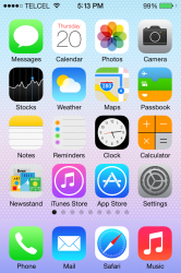
Here you go..
1. iOS 7 Dynamic 1
2. iOS 7 Dynamic 2
3. iOS 7
4. iOS 6
5. iOS 5
EDIT: I was charging my iPhone that's why the battery is green, otherwise is in white.
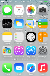
Ew, Telcel.
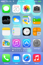
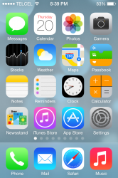
Here you go..
1. iOS 7 Dynamic 1
2. iOS 7 Dynamic 2
3. iOS 7
4. iOS 6
5. iOS 5
EDIT: I was charging my iPhone that's why the battery is green, otherwise is in white.
So, do you think that will Apple advertise the wallpaper that you listed as "default"? My guess is that the "default" one will be Dynamic 1.
That right there is a lot of pages of apps.Here you go..
1. iOS 7 Dynamic 1
2. iOS 7 Dynamic 2
3. iOS 7
4. iOS 6
5. iOS 5
EDIT: I was charging my iPhone that's why the battery is green, otherwise is in white.
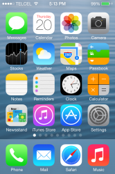
Thanks for posting all the screen shots.
Register on MacRumors! This sidebar will go away, and you'll see fewer ads.