Become a MacRumors Supporter for $50/year with no ads, ability to filter front page stories, and private forums.

Blue Velvet

Moderator emeritus
Original poster
Jul 4, 2004
21,929
265
I have to supplement a palette of 5 colours that are already chosen by someone else, with another range of 5 from the selection below which I've narrowed down already... but would love to have your opinion to help get it down to the last 5.

I have my favourites already, but I don't want to influence your choice.

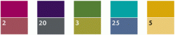
I realise that colours are going to look different on everyone's monitors but that's not important right now. The top row of colours are the ones that are the main colours, choose 5 to go with them and post their numbers.

Thanks!

BV :)


Colours.jpg
 
Colours for what? It would help me make my decision. Do random "what's your favorite color" really work in design?


I can't tell you, but it's not random as there's a selection there already. Choose 5 that you think look nice with the top five... :)

There's no right or wrong; it's more like a market survey.
 
Sorry, but my taste in colour with regards to wall and floor colours will be much different than my choice of colour in clothes, cars, flowers, furniture, etc. I think having some idea of what we're dealing with makes it easier. :confused:

Otherwise, I'll play it safe and say that all 5 colours go with #20, and 4 colours go with #5, with the exception being the yellow.

So in summary:

Pink: #20, #5
Purple: #20, #5
Green: #20, #5
Turquoise: #20, #5
Yellow: #20

There are other combinations that work, but I'll have to find another time (when I HAVE more time) to match all 5 colours up with the numbers I think they'd look good with.
 
I think having some idea of what we're dealing with makes it easier.


A range of all sorts of things from stationery to Tshirts to pens, to desk-toys... all sorts of stuff. I don't even know the full answer to that yet so I can't be too specific.
 
Here's mine - Buuut.... I'm not happy with 8 or 21 - I want 21 to have a bit more green in it, and 8 to be less blue and much dustier.

7 and 16 wwere both compromises because my original picks for those two were too close to each other, and my imagined brief was that the chosen colours each had to be related to one original colour, while at the same time easily distiguishably from each other.
 

Attachments

  • BVcolorchip.jpg
    BVcolorchip.jpg
    12.7 KB · Views: 73
...Buuut.... I'm not happy...

Yeah, neither am I with the whole thing so that's why I've thrown it out there. ;)

Thanks for all suggestions so far. This whole thing has a few days to run so I'm not sure when the final choice will be made.

:)
 
4, 8, 15, 16, 23 ... no wait....these are the 'Lost' numbers.

Oops :eek:


In terms of a secondary palette it is always best to have a lighter shade in the same colour family as the primary palette, which is a little difficult from your selection (especially for the 4 and 5 primary palette colours which are litter anyway)

However, here is what I think -- but I am not sure my IBM T43 laptop screen is doing the selection justice - am posting at work, will check again from my Mac at home.

In the order to match the 5 primary palette colours - 7 (or 1), 25 (or 16), 8 (or 9), 12, 5

Edit: because I spell like a 2 year old
 
My initial instinct was just to go with a slightly muted version of each colour:

View attachment 73119

But then I changed the middle three as they were a bit too close to the original, so I tried this:

View attachment 73120

Still not happy with it though, think I prefer the first set I chose.

Dammit, I wish I had an eye for this stuff! :eek:
 
Dammit, I wish I had an eye for this stuff! :eek:


Thanks though. :)

There's no correct answer; just trying to get some wider general feedback on something that's got my hands tied.

Imagine they were shoe colours instead. :D
 
10,19,8,12,5 with 3 & 9 as my lucky stars...

...right that's my Euro Millions numbers picked for Friday's £18m jackpot.

*looks forward to getting lucky on Friday*
 
i dont really like all the choices, but here you go...
i hope this helps

That's exactly the one I've come up with. :eek: *those shifty eyes things here*

To be honest Blue, I think that the general lack of contrast between the primary and supplementary colours means that you're going to have to do something really f'in stupid to f**k it up. ;)

You should take it down to the sunday chumps in a B&Q. They have a machine that can scientifically work out this type of stuff for you you know. You'd swear it's magic. ;)
 
To be honest Blue, I think that the general lack of contrast between the primary and supplementary colours means that you're going to have to do something really f'in stupid to f**k it up. ;)


I know... :(

Can't do much about what I've been given. Your choices have been added to the little poll I'm keeping here. :D

This is more helpful in weeding out the non-starters while I'm getting on with other things, so for that reason, I'm very grateful to all who have given their opinion. :)
 
Register on MacRumors! This sidebar will go away, and you'll see fewer ads.