Become a MacRumors Supporter for $50/year with no ads, ability to filter front page stories, and private forums.

ulfertg

macrumors member
Original poster
Jan 18, 2016
30
19
Some of you may think I'm fastidious on this, but since color grading and matching is part of my job (and a neutral, uniform environment makes it easier for me) this is important to me.
The body of my space gray 15" MBP is reddish while the touchpad is bluish.
On my 2013 rMBP both are neutral to each other.

Is this normal or is my device an exception?
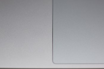
color mismatch mbptb.jpg
 
Same here. Saw this on a friend’s space gray mbp. That’s mostly why I ordered a silver one.
 
Last edited:
I hadn't noticed this on my Space Gray, but when I looked at it in daylight by a window just now I can see a slight difference.
 
I'm having a hard time believing this difference is intended.
It's not about differences in luminosity due to different refractive indexes when viewed from an angle, like in post #3.
It's the color tint wich is slightly different, not enough to qualify as intentional imo.
The body of my MBP looks like it came a little bit too close to the rose-gold anodizing plant ;)
Btw: the tint of my space gray iPad is exactly between the body and the touchpad of my MBP.

Well, matching neutral grays is one of the toughest challenges in color matching.

Regardless of what I wrote a second ago: as this seems to be state of the art with Apples space gray I'll try convince myself it's intended to look like this.
Should make it easier for me to learn to like it ;)
 
  • Like
Reactions: tomviolence
I'm having a hard time believing this difference is intended.
It's not about differences in luminosity due to different refractive indexes when viewed from an angle, like in post #3.
It's the color tint wich is slightly different, not enough to qualify as intentional imo.
The body of my MBP looks like it came a little bit too close to the rose-gold anodizing plant ;)
Btw: the tint of my space gray iPad is exactly between the body and the touchpad of my MBP.

Well, matching neutral grays is one of the toughest challenges in color matching.

Regardless of what I wrote a second ago: as this seems to be state of the art with Apples space gray I'll try convince myself it's intended to look like this.
Should make it easier for me to learn to like it ;)
They're all like that. Even mine.
 
Register on MacRumors! This sidebar will go away, and you'll see fewer ads.