Become a MacRumors Supporter for $50/year with no ads, ability to filter front page stories, and private forums.

mnkeybsness

macrumors 68030
Original poster
Jun 25, 2001
2,511
0
Moneyapolis, Minnesota
Alright, so I've got my site completely redesigned. Of note is that a couple pages are still missing and there is a small overlap flaw in Internet Explorer Windows (if you have some ambition, I would appreciate a fix :) ). The whole site has just been redone, so everything is fresh in my head and I'm willing to make changes all over the place.

paularms.com

I welcome every type of comment, because even negative thoughts can be constructive.
 
Looks good, Paul. Nothing negative to report, but that could be because I spent all day writing a paper for school. ;)

PS. Line 42, column 33: required attribute "type" not specified (explain...).
<script language="JavaScript"> :p
 
Rower_CPU said:
PS. Line 42, column 33: required attribute "type" not specified (explain...).
<script language="JavaScript"> :p

aw crap I thought that I got all of those... I've been working for almost 12 hours on this thing today, so I'm wearing a bit thin...

I fixed that on all the pages... thanks for the heads-up.
 
mnkeybsness said:
aw crap I thought that I got all of those... I've been working for almost 12 hours on this thing today, so I'm wearing a bit thin...

I fixed that on all the pages... thanks for the heads-up.

Yeah, I've been there. It takes a fresh pair of eyes sometimes...
 
looks nice. clean and simple layout, and i like the black and gray theme of the page holding the colorful images. that separation allows the visitor to completely focus on the real content, and there is no 'confusion' between what is for viewing and what is for navigating.

you might want to look at http://www.paularms.com/about/tutorials/photoshopnight.html. no images and "simple" is misspelled. also, the layout on both tutorial pages is a bit amateurish compared to the rest of this site. if the whole site was like those two pages, i wouldn't say anything. but after comparing those pages to the rest of the site, it is obvious you can do better than that! :) i also can't get the 'information' and 'comments' links below the pictures to work. i'm using safari 1.2 (v125)
 
Thom_Edwards said:
you might want to look at http://www.paularms.com/about/tutorials/photoshopnight.html. no images and "simple" is misspelled. also, the layout on both tutorial pages is a bit amateurish compared to the rest of this site. if the whole site was like those two pages, i wouldn't say anything. but after comparing those pages to the rest of the site, it is obvious you can do better than that! :) i also can't get the 'information' and 'comments' links below the pictures to work. i'm using safari 1.2 (v125)

I haven't had time to upgrade the tutorials to the redesign and probably won't for a few days. Hopefully I will get them done before spring break next weekend.

As for the Comments and Information, I'm using fugeelama's show/hide javascript that he uses on his page[/i]. I don't understand why his works with one click and it won't work unless I use two clicks.
 
Looks great man!

I don't know how it displays in safari, but on IE 6 Windows it is anchored to the right, leaving alot of blank/empty space on the left.

(lol its funny because thats the same thing my site does under safari lol)
 
Josh said:
I don't know how it displays in safari, but on IE 6 Windows it is anchored to the right, leaving alot of blank/empty space on the left.

I just checked on my room mate's computer IE6 Windows and the only difference is that the menu on the left is shifted about 2 pixels further right than it should be. I'm still trying to fix that problem. Other than that, it should all be about 175 pixels from the left of the browser window. Perhaps you have a very low resolution on your monitor?

The dead links are being worked on, as I've said. I moved the tutorials to be in a different folder to get the breadcrumb script to work better--and since all of my refs are absolute, the images aren't showing up.

Thanks for the replies everyone. I will get as much fixed today as I can... after class and all that studying that I was supposed to do this weekend.
 
Yeah Yeah...I use a PC at work.

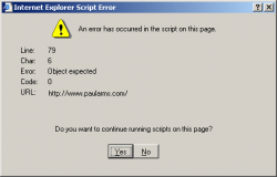
Still gots some JS errors.
 

Attachments

  • error.png
    error.png
    5.6 KB · Views: 141
mnkeybsness said:
I just checked on my room mate's computer IE6 Windows and the only difference is that the menu on the left is shifted about 2 pixels further right than it should be. I'm still trying to fix that problem. Other than that, it should all be about 175 pixels from the left of the browser window. Perhaps you have a very low resolution on your monitor?

Yes - I am at work right now running 800x600 :(

That makes sense - I guess I should've mentioned that. oops.

I upped the resolution to 1024x768 (very tiny text on this monitor) but it looks perfect now.
 
It looks odd in my browser window to have a big 175px gap on the left side. I'd just center the content. That should look better across many more browser window sizes and screen resolutions.
 
reh said:
It looks odd in my browser window to have a big 175px gap on the left side. I'd just center the content. That should look better across many more browser window sizes and screen resolutions.

I tried centering it, but that had major problems with Internet Explorer. It worked great in Safari/Mozilla browsers... IE just won't relatively position the menu and other things correctly when I center the content.
 
Register on MacRumors! This sidebar will go away, and you'll see fewer ads.