Become a MacRumors Supporter for $50/year with no ads, ability to filter front page stories, and private forums.

superninjagoat

macrumors 6502
Original poster
Apr 23, 2004
325
0
Apex, N.C
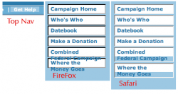
I'm working on a redesign for the United Way of Beaufort County's Web site in my spare time. I'm a mac fanatic without access to a mac (this hurts me), and I can't test the design out in Mac-based browsers.

Any feedback I can on how the pages perform in Mac browsers, particularly Safari, would be very helpful.

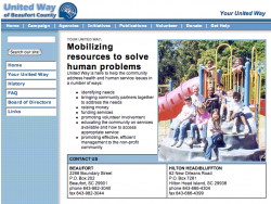
Be warned, the site's still in development: United Way Web site

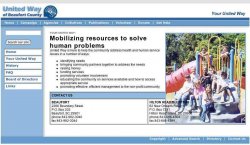
For a laugh, check out the current site: Current site :eek:
 
Your design is definitely a big improvement over the original.

Here are my initial impressions:

1) Validate your HTML and CSS - In order to give your site the best chance possible at cross-platform compatibility you need to use valid code. Start by adding a doctype declaration to before your opening HTML tag (I'd recommend HTML 4.01 transitional for someone just getting to know web standards).

2) The rollovers on the horizontal list of links at the top of the page aren't quite even. I'm not sure if that's intentional or not, but here's how it looks on Safari and FireFox. (see attached image)

3) The left-hand navigation is uneven as well. (see attached image)

4) You've got an odd browser sniffer at the bottom of your pages that looks like it's supposed to insert space after the table if the browser is Netscape. I'm pretty sure that's superfluous.
 

Attachments

  • unitedway.png
    unitedway.png
    6.1 KB · Views: 107
Thank you ...

... but I didn't get the attached screenshots. Could you resend (with a sidenav rollover active).

The browser sniffer at the bottom fixes a problem in Netscape on Windows (don't know 'bout Mac) that causes the window to scroll even when all content fits within one screen. I found that the space fixed it, but then caused a similar problem in IE. So, the script is my temporary work-around. It's likely a problem with my nested tables.

As for the rollovers on the side, I think I know what you're talking about b/c I had a similar problem in NS. I think I need to implement new sidenav rollover code and scrap what I have currently.

Thanks again for your help. :)
 
Something is screwy with your tables.

Are you using layers?
 

Attachments

  • Picture 2.jpg
    Picture 2.jpg
    53.8 KB · Views: 120
superninjagoat said:
I'm a mac fanatic without access to a mac (this hurts me), and I can't test the design out in Mac-based browsers.

Any feedback I can on how the pages perform in Mac browsers, particularly Safari, would be very helpful.

You may find this site useful, which creates a screenshot of what a site looks like in Safari:
http://www.danvine.com/icapture/
 
Same problem as above, but looks a bit different. None of that transparent stuff, but the picture is still covering up part of the table. Is there any way you could write this in XHTML? Using tables to align objects is not considered good practice. Safari 1.2.1.
 

Attachments

  • screenshot.png
    screenshot.png
    99.9 KB · Views: 110
And regarding your title, usually sites will render properly in most browsers if they validate. w3.org has a validator.
 
Redesign might be the way to go ...

After checking out some of the resources I've found through these forums -- especially MaxDesign -- I've decided on a rewrite of the site template using CSS positioning.

I've stuck to the "old" table positioning for far too long. And I have a feeling that if I do it right, it will make future redesigns a snap.

So ... my new question: Is there a "standard" way to do CSS layouts, because I may not always be doing the Beaufort United Way's Web site, and I want it to be as standards-friendly as possible so that, when their next (un?)lucky designer gets recruited to do a redesign/overhaul, it will be as easy as possible for that person.

Should this be a new thread?
 
As far as I've seen, there is no "one right way" to do a site layout with CSS positioning. Some people prefer absolute positioning, some prefer floats. Either way is fine. The trick is to find the best method that works for your site and your skill level.

A good idea for handing the site off to the next designer would be to put some comments in your HTML/CSS for them, just in case they're not very conversant with CSS.
 
Still very rough, but check it out

Here's what I've done between doing my real job and PhotoShopping Steve Jobs.

United Way test site 2

It's XHTML with CSS positioning and styling. I still have to add the Banner and real navigation links, but the basic structure's there.

So far, I haven't used a single table, and I want to keep it that way. But I can't figure out how to get the horizontal shadows under the top and bottom navigations (check here for example).

How would I go about doing that? Background images for the nav DIVs? Or do I simply have to shove a table in there? Or could it be accomplished just by putting another DIV in the document flow between the top_nav and body (sidenav and content) elements?

Thanks, everyone. I appreciate your help, and so do the folks at United Way of Beaufort. :)
 
Register on MacRumors! This sidebar will go away, and you'll see fewer ads.