Got a tip for us?
Let us know
Become a MacRumors Supporter for $50/year with no ads, ability to filter front page stories, and private forums.
CSS Template From Scratch
- Thread starter JackT06
- Start date
- Sort by reaction score
You are using an out of date browser. It may not display this or other websites correctly.
You should upgrade or use an alternative browser.
You should upgrade or use an alternative browser.
Can you be more specific on what aspect of the design you need advice on?
Sorry for not included enough information;
Mainly the outline, of how to get the layout, i know how to add the images to it all etc, its just making the ouline; because i have never made a CSS template from scratch..
This page has some decent and fairly simple to work through examples of some layouts. It gives both the HTML and CSS used to accomplish them, plus they're free to make use of. It should give you a pretty good place to start. If there's anything about the examples you don't understand or unsure how to tweak some piece to fit your needs feel free to ask here.
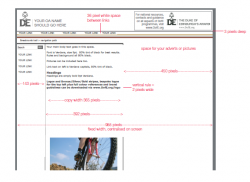
Text out of position...
How do i move the text inlign with the border lines....
How do i move the text inlign with the border lines....
Code:
#container
{
width: 98%;
margin: 10px auto;
background-color: #FFF;
color: #333;
border: 1px solid gray;
line-height: 130%;

}

#top
{
padding: .5em;
background-color: #ddd;
border-bottom: 1px solid gray;
}

#top h1
{
padding: 0;
margin: 0;
}

#leftnav
{
float: left;
width: 143px;
margin: 0;
padding: 1em;
}

#rightnav
{
float: right;
width: 450px;
margin: 0;
padding: 1em;
}

#content
{
margin-left: 143px;
border-left: 1px solid gray;
margin-right: 450px;
border-right: 1px solid gray;
padding: 1em;
}

#footer
{
clear: both;
margin: 0;
padding: .5em;
color: #333;
background-color: #ddd;
border-top: 1px solid gray;
}
#leftnav p, #rightnav p { margin: 0 0 1em 0; }
#content h2 { margin: 0 0 .5em 0; }
Attachments
How do i move the text inlign with the border lines....
Change the width's
Sorry, which ones..?
It's hard to say without an actual webpage where I can see the code, but I'm guessing the #leftnav element
It's hard to say without an actual webpage where I can see the code, but I'm guessing the #leftnav element
Does this help...?
Last edited:
Does this help...?
Post an updated screenshot of the issue since you changed the code.
Post an updated screenshot of the issue since you changed the code.
Here are the most up to date versions of all.
CSS
Code:
#container
{
width: 98%;
margin: 10px auto;
background-color: #FFF;
color: #333;
border: 1px solid gray;
line-height: 130%;
font-family: verdana;
font-size: 14px;
font-color: #001323;

}

#head
{
padding: 0.5em;
background-color: #FFF;
background-opacity: 0.5em;
border-bottom: 3px solid #3D4242;
img-rotate; 1em;
}

#head h1
{
color: #FF0000;
}

#navbar
{
padding: 0.5em;
padding-left: 1em;
background-color: #DDD;
border-bottom: 3px solid #782F21;
word-spacing: 3em;
}

#navbar p
{
padding:0;
margin: 0;
}

#leftnav
{
float: left;
width: 143px;
margin: 0;
padding: 1em;
}

#rightnav
{
float: right;
width: 450px;
margin: 0;
padding: 1em;
}

#rightnav h1
{
text-transform: uppercase;
color: #84A40B;
font: Serif Semi Bold;
}

#content
{
margin-left: 143px;
border-left: 1px solid gray;
margin-right: 450px;
border-right: 1px solid gray;
padding: 1em;
}

#content h1
{
text-transform: uppercase;
color: #4D2177;
}

#footer
{
clear: both;
margin: 0;
padding: .5em;
color: #333;
background-color: #ddd;
border-top: 1px solid gray;
text-align: right;
}
#leftnav p, #rightnav p { margin: 0 0 1em 0; }
#content h2 { margin: 0 0 .5em 0; }


ul#navigation
{
list-style-type: none;
margin: 0;
padding: .5em 0;
border-top: 1px solid #76B900;
}

ul#navigation li a
{
display: block;
width: 5em;
color: #FFF;
background-color: #76B900;
padding: .2em 0;
text-align: center;
text-decoration: none;
}

ul#navigation li a:hover
{
color: #FFF;
background-color: #69C;
}

ul#navigation .left { float: left; }
ul#navigation .right { float: right; }
HTML
Code:
<head>
<link href="style.css" rel="stylesheet" type="text/css" media="screen" />

</head>
<div id="container">
<div id="head">
<img src="Scoutlogo_3purple.jpg" width="250px"><img src="A4marque_CobrandingPartnership.jpg" width="250px" align="right">
<br>
<h1>Hampshire Peer to Peer Education</h1>
</div>
<div id="navbar">
<p>Home Test Blog Gallery</p>
<img src="BSG Stripe.jpg" width="100%">
</div>
<div id="leftnav">
<p>kjwehrt wejrhwkjerb wjehrkjwer wefwej werw et rt sfdg fsd gwer tw dfs gf wetr wsf sdf swret dsf </p>
</div>
<div id="rightnav">
<h1>Quick Links</h1>
</div>
<div id="content">
</ul>
<h1>Welcome</h1>
<p>
kjweklrjwerwe wekjrwkejr werkjwkler vwklejrwkejr wkejtrwekrj wkejrkwenr kwejrkwjer kjwerkjwer regthksdlfg skejwkejrwljlfkn kwejrklwejr wekjrwlejr wkejrkwejr kwjerkwjer.
</p>
<p>
Ut wisi enim ad minim veniam, quis nostrud exerci tation ullamcorper suscipit lobortis nisl ut aliquip ex ea commodo consequat. Duis autem vel eum iriure dolor in hendrerit in vulputate velit esse molestie consequat, vel illum dolore eu feugiat nulla facilisis at vero eros et accumsan et iusto odio dignissim qui blandit praesent luptatum zzril delenit augue duis dolore te feugait nulla facilisi. Lorem ipsum dolor sit amet, consectetuer adipiscing elit, sed diam nonummy nibh euismod tincidunt ut laoreet dolore magna aliquam erat volutpat.
</p>
<ul id="navigation">
<li class="left"><a href="#">Previous</a></li>
<li class="right"><a href="#">Next</a></li>
<br>
</div>
<div id="footer">
© 2011 Hampshire DofE Youth Forum
</div>
</div>
Thanks in advance!

Attachments

I think the source of your issues is that you need to understand the box model. The total width that an element will take up is it's property width + padding (left/right) + its margin (left/right) + and its border (left/right). For instance, the left column has a width that should fit its space, but you also have a 1em padding set to it, which makes it take up even more width on the page. Below are some readings for understanding the basics of the box model, which are vital to understanding CSS.
W3.org Box Model
W3Schools Box Model
On related note, if you're using Firefox, get Firebug. Its a great help with analyzing how CSS is being applied to your page in real time and lets you adjust the CSS actively. Safari has a Web Developer feature that has very similar features as well.
W3.org Box Model
W3Schools Box Model
On related note, if you're using Firefox, get Firebug. Its a great help with analyzing how CSS is being applied to your page in real time and lets you adjust the CSS actively. Safari has a Web Developer feature that has very similar features as well.
Increase the width of #leftnav to 200px and see if that helps. It's probably going to give more room than needed, but you can change the number around later is it works.
Register on MacRumors! This sidebar will go away, and you'll see fewer ads.