I'm currently working on a new business card design as part of rebranding my web development business. My new branding uses a brown/green/orange color scheme(you can see this on my website), so I have been considering printing the new business cards on kraft paper.
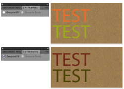
I've never designed for kraft paper before and have been wondering about specific design considerations, specifically what shades of green and orange can print well on it.
I'm looking at get them printed by greenerprinter.com
I've never designed for kraft paper before and have been wondering about specific design considerations, specifically what shades of green and orange can print well on it.
I'm looking at get them printed by greenerprinter.com