Become a MacRumors Supporter for $50/year with no ads, ability to filter front page stories, and private forums.

SW3029

macrumors 6502a
Original poster
Sep 22, 2019
517
2,642
Anyone else constantly checking for app updates in hopes the devs have updated their app icons for the new Big Sur look? 😁

Originally, I thought it was a stupid move for macOS apps to take on the rounded square iOS app icon shape, but now I love the look! Apps that still have an asymmetric shape now look out of place.
 
  • Like
Reactions: TheSkywalker77
I was wondering when Apple themselves would step up but they put out Logic and FCP the same day as Big Sur so we got our fancy new icons (and an update that went smooth as hell unlike Big Sur)..
 
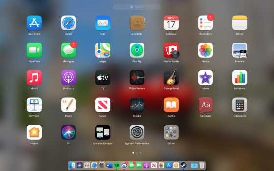
Screen Shot 2020-11-17 at 11.23.12 AM.png
Not to worry! Until that day comes, there's always the first page in Launchpad to enjoy.
 
  • Like
Reactions: SW3029
Unfortunately I have no graphic skill, but I am quite picky. If someone want to make a new Subler icon I would be glad to consider it.
 
I hate the fact my most used apps dont have any icon updates yet.
It's causing me to not have those apps in the dock, completely f**ks the aesthetic of the dock :(
 
And those of us who have zero use for Big Sur? I certainly won't be installing it before June next year, if at all.

Right now the only app I have installed that I have to look at is Chrome, with its tiny little icon-in-a-box, and it's annoying.
 
I feel like Dropbox are trolling its users. The main app itself has a nice updated icon, but for whatever reason they insist with the round icon for the Paper app.

Mind you, they could just 'Catalyse' the iOS app given how similar it is...
 
And those of us who have zero use for Big Sur? I certainly won't be installing it before June next year, if at all.

Right now the only app I have installed that I have to look at is Chrome, with its tiny little icon-in-a-box, and it's annoying.
Hahaha are you also running iOS6 and complaining the current flat design app icons look bad next to your 3d apple icons? 😂
 
Hahaha are you also running iOS6 and complaining the current flat design app icons look bad next to your 3d apple icons? 😂
No, but I wouldn't be running iOS 14 if it weren't for the new phone requiring it. I held my X on iOS 13 (and really wished I'd held it on iOS 12) until I traded it in.
 
No, but I wouldn't be running iOS 14 if it weren't for the new phone requiring it. I held my X on iOS 13 (and really wished I'd held it on iOS 12) until I traded it in.
So what you're saying is that one shouldn't fight it, just keep updating because you will be forced anyway? I agree xD
 
Well then there's really no point in participating in these threads is there?
I believe GP's complaint is that the icons that do look updated look weird on their non-Big-Sur Mac.

I'd encourage them to backup the old icns files before updating. Then you can use the trick with Get Info to restore the old versions.

Hahaha are you also running iOS6 and complaining the current flat design app icons look bad next to your 3d apple icons? 😂

...oh, and also, the process I described above is absolutely a thing I sometimes do on Mavericks. :p Ironically though, Big Sur icons look better on Mavericks than Yosemite/Catalina-era ones.
 
Register on MacRumors! This sidebar will go away, and you'll see fewer ads.