Become a MacRumors Supporter for $50/year with no ads, ability to filter front page stories, and private forums.

Do you like iOS 7?

  • Yes, I like it!

    Votes: 105 84.0%
  • No, I hate it!

    Votes: 20 16.0%

  • Total voters
    125

taptic

macrumors 65816
Original poster
Dec 5, 2012
1,341
437
California
Ok, so I don't know if there has already been a poll on this, so please mods, feel free to delete this if there has been.

Anyway, I have been seeing a ton of comments everywhere saying bad things about iOS 7. I personally love it and thought everyone generally felt the same, but maybe I was wrong. To find out, here's a poll!


(lol, just found another thread almost identical to this.... so yeah. Go ahead and delete this if you think it should be, mods....)
 
Last edited:
I'm not sure how I feel about it. Something about some of the icons to me looks half-assed. But they're just icons, after all.

My only experience with iOS 7 has been on my iPad Mini. It was a beta and understandably slow.

Perhaps my view of iOS 7 will change come release day when I can load it on my iPhone 5 and Mini again. Until then, I'm happy running a jailbroken version of iOS 6 with small tweaks that overall enhance the usefulness of iOS for me (such as adding time stamps to every text message, using f.lux, etc).

My 2 cents. I didn't vote because 1.) I don't particularly like what I've seen/experienced and 2.) I haven't played with the final version to judge that I 'hate' it.
 
I've been using iOS7 since the first beta and I wasn't really too thrilled with the new icons or color palette however it has grown on me. I wouldn't want to go back to iOS6 at this point because I am enjoying some of the newly added features and functionality to iOS7. The UI as a whole feels more cohesive through all of Apple's built-in apps now.
 
I thought I'd hate it, but I really like it. So much that I hate using anything that's still on iOS 6. That OS looks so old and tired at this point.
 
Yes I like it very much. Looking at iOS 6 now is like looking back in time, it looks old and dated.
I haven't see it in the flesh, but the more videos and screenshots I see of it the more I agree. My iOS 6 phone looks "old" by comparison. Who needs chunky shiny buttons in 2013?

The trend in apps has been towards flat, white minimal design (eg Impossible Road to name just one) and now the OS will match rather than looking like a dark and gloomy throwback.
 
Why are there only two options? I really like some parts of iOS 7 and dislike others. Why can I only love it or hate it?
 
I don't like the way it looks but I do like that it brings several needed features to iOS.
 
It's not enough to make me come back from Android, but I sure am happy that something is finally moving with iOS. Aesthetically speaking, it's quite stunning.
 
At this point, the only significant problem (for me) are the icons. I know they're just icons, but considering Apple is known for "the little things", I would have preferred if they had at least tried. This might be the first time I jailbreak.

Why is there only a love and hate option? Why not "eh…"?
 
I've been moving back and forth between iOS6 and iOS7 for the last few days, testing the latest version of our app. Both OS versions are running on iPhone 5 (32GB/Verizon), so the hardware is the same.

The more I use iOS7, the less I like iOS6 - and I'm talking everything including the aesthetics/design (including the icons :D), information presentment, UI "noise", features, etc.

I'm really looking forward to some of my commonly used apps picking up the same design as the stock apps.
 
image.jpg
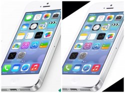
I don't know about anyone else. But I'm not really crazy about the brighter neon colours (ex. MESSAGES) This is my only problem with IOS 7. It seems juvenile and unprofessional in my opinion. I don't know if the screen on the right was just messed around in photoshop a little. But I really wish this is what it will look like for public release. Much more professional. Am I the only one??
 
View attachment 432285
I don't know about anyone else. But I'm not really crazy about the brighter neon colours (ex. MESSAGES) This is my only problem with IOS 7. It seems juvenile and unprofessional in my opinion. I don't know if the screen on the right was just messed around in photoshop a little. But I really wish this is what it will look like for public release. Much more professional. Am I the only one??

Neon green > puke green
 
Neon green > puke green

iOS 6 didn't use puke green. It just wasn't so bright it burned your eyes out. The neon green is not a great choice because it is low contrast with white glyphs and text. This is especially noticeable when you exit the phone app during a call. The double height status bar is so neon green that it is very difficult to read the white text on it. This is one of the many places where Apple's rigid adherence to its new design principles actually takes usability a step backward in iOS 7. Other examples include white road signs in the maps app (the map is predominantly light beige leading to low contrast), yellow-on-white in the notes app (don't even get me started), and text replacing buttons throughout iOS 7 (yes I know it's still a button but text only leaves a smaller target for your finger to hit). I like most of iOS 7 overall. But, Apple really went too far with this white flat, neon, and borderless thing in a few spots.
 
iOS 6 didn't use puke green. It just wasn't so bright it burned your eyes out. The neon green is not a great choice because it is low contrast with white glyphs and text. This is especially noticeable when you exit the phone app during a call. The double height status bar is so neon green that it is very difficult to read the white text on it. This is one of the many places where Apple's rigid adherence to its new design principles actually takes usability a step backward in iOS 7. Other examples include white road signs in the maps app (the map is predominantly light beige leading to low contrast), yellow-on-white in the notes app (don't even get me started), and text replacing buttons throughout iOS 7 (yes I know it's still a button but text only leaves a smaller target for your finger to hit). I like most of iOS 7 overall. But, Apple really went too far with this white flat, neon, and borderless thing in a few spots.

I was talking about his mockup, not iOS 6.
 
I'm not in love with it (I preferred some of the pre-reveal mockups of a "flat" iOS), but I certainly don't dislike it. iOS needed a design overhaul and I think version 7.5 or 8.0 will clean up the bits I don't care for.

Bring it on!
 
Register on MacRumors! This sidebar will go away, and you'll see fewer ads.