Got a tip for us?
Let us know
Become a MacRumors Supporter for $50/year with no ads, ability to filter front page stories, and private forums.
Do you like the new app store search result layout?
- Thread starter jomirrivera
- Start date
- Sort by reaction score
You are using an out of date browser. It may not display this or other websites correctly.
You should upgrade or use an alternative browser.
You should upgrade or use an alternative browser.
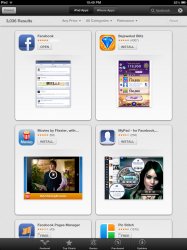

Looks fine on the iPad. It's REALLY bad on the iPhone:
Image
There's no way to easily scroll through a bunch of results. You can only see one at a time now. Terrible.
It makes the process of finding new apps painfully slow!
Strange, I'm getting this with new iPad and iPhone filters.
maybe its just of the apps you own? i honestly don't know but i kinda like the layout on both iPhone and iPad even though i know it narrows the view field in the iphone version. the solution to this proble i think would be to have the ability to rotate to portrait and boom cover flow with names below each icon and when you tap it it flips over for details
The current style was fine.. just let us filter through more details. But this is a pain, i can't believe the UI/UX lead who approved of this..
Strange, I'm getting this with new iPad and iPhone filters.
Same here on my 4s
it's alright, i rarely search for an App unless a friend tells me one specifically, so I assume the app i search will be the first one and it is a different UI.
One we're still in beta, and they are just running a trial of it.
However; Knowing Apple it will probably stick, they've already done all their usability studies internal already.
Whenever I have ever searched for an app, its always been the first 1-3 results, I cant think of a time when Ive scrolled and scrolled. Its a clean fresh layout, that wont be troublesome except in very rare circumstances.
My .02

It's a waste of space on the iPad screen, looks bad on iPhone...personally I prefer the old style better
Strange, I'm getting this with new iPad and iPhone filters.
Same for me! Does this mean they may let us start buying iPad apps, from the iPhone...
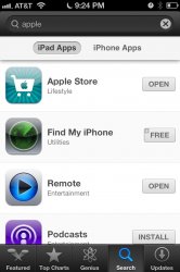
ALSO, not all of the Universal apps show the + sign. I did a test with Foursquare, it doesn't show it, and the Podcast and Remote app in your screenshot don't show the + Universal sign.
Odd!
edit: Neither does the Facebook app when I search 'facebook', but further down the list, Bejeweled Blitz shows the [+] universal mark.
It started showing me the new card layout today. I do like the screenshot idea but it's so inefficient.
People just dont like change. Dont worry you will get used to the new look.
But I kinda have to agree....that look on the iPhone is ugly
But I kinda have to agree....that look on the iPhone is ugly
It wouldn't be so bad if it worked properly.
When I swipe sideways, more often than not it gets 'stuck' at say 19 out of 200. I can't go back to anything < 19, and if I swipe enough times it starts showing negative numbers..
When I swipe sideways, more often than not it gets 'stuck' at say 19 out of 200. I can't go back to anything < 19, and if I swipe enough times it starts showing negative numbers..
Register on MacRumors! This sidebar will go away, and you'll see fewer ads.