Got a tip for us?
Let us know
Become a MacRumors Supporter for $50/year with no ads, ability to filter front page stories, and private forums.
Do you think this is a good combination of colors for a site?
- Thread starter celticpride678
- Start date
- Sort by reaction score
You are using an out of date browser. It may not display this or other websites correctly.
You should upgrade or use an alternative browser.
You should upgrade or use an alternative browser.
It's a bit on the cold side.
So - what do you think would be better?
So - what do you think would be better?
Well, opposite of cold is warm
") It just needs a little bit livelier colors in some spots to give it some life. Mac Rumors is a bit drab, but they give it s tad of gusto using some read and also using slightly off-gray-scale colors for a lot of the colors. Also, work your contrasts some to improve readability, namely in the header region.
It just needs a little bit livelier colors in some spots to give it some life. Mac Rumors is a bit drab, but they give it s tad of gusto using some read and also using slightly off-gray-scale colors for a lot of the colors. Also, work your contrasts some to improve readability, namely in the header region.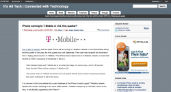
I like those colors better.
But - are they good or just better? Thanks for the help so far.
But - are they good or just better? Thanks for the help so far.
I don't like the header. It looks incomplete, try making the header more unified. Also, the "Apple has just released a new..." just below the Menu is kind of distracting.
I like the main body, but it doesn't fits with the dark colors of the webpage. In my opinion I would go for lighter colors (pastel/lighter tones).
Dark grey line.
Dark blue/grey (just slightly darker than the one in the main body background).
Dark grey line.
Slightly less darker blue/grey main body background.
Too much grey!
I hope it helps.
BTW, I do think it was an improvement from the first, but you can still make it much better.What do you think now? I had to remove the navigation bar for now...but it looks the same as before
Flip the main background color and the header color?
P.S. - I know the It's All Tech logo background is a different color - working on changing it.
Flip the main background color and the header color?
P.S. - I know the It's All Tech logo background is a different color - working on changing it.
Attachments

The color is definitely washed out, but wouldn't necessarily be a problem if your content was going to be rich in color (photos and the like) which it currently isn't. If your content is going to be primarily text, I would suggest adding a richer accent color.
Chose different shades of blue...how about now?
I like this one the best. But I would put the top nav bar on the left side..
(maybe it's just because i'm left handed...
)
Register on MacRumors! This sidebar will go away, and you'll see fewer ads.