Do you want a dark keyboard in iOS? There was one in iOS 7.1 beta 1 and then apple took it out. I liked it a lot and want apple to put it back. Do you want a dark keyboard?
Got a tip for us?
Let us know
Become a MacRumors Supporter for $50/year with no ads, ability to filter front page stories, and private forums.
Do you want a dark keyboard in iOS?
- Thread starter The Doctor11
- Start date
- Sort by reaction score
You are using an out of date browser. It may not display this or other websites correctly.
You should upgrade or use an alternative browser.
You should upgrade or use an alternative browser.
I feel like if they add a dark keyboard, there will be a huge push towards a dark theme. Maybe that's why they removed it. But I would really like the dark keyboard (and a dark theme to complement it ") ).
).
).Why can't they have both and simply swap them based on the ambient light sensor? The Dark one is only useful at night, otherwise the white one is closer to the original grey that still looks the best.
This man makes a lot of sense.
Why can't they have both and simply swap them based on the ambient light sensor? The Dark one is on'y useful at night, otherwise the white one is closer to the original grey that still looks the best.
I think it'd be better if it was dependent on colour of the device. Black phone, black keyboard.
I thought it made the system look horribly inconsistent, but I think it was a good idea to include.
Agree on the inconsistency -- it should be applied system wide as a dark theme option.
Hell, they have a white boot screen for the white phones...why not a black theme for black phones?
Make an option for auto (swap using ambient light sensor as mentioned above) and manual option for either the dark or white keyboard.
Why can't they have both and simply swap them based on the ambient light sensor? The Dark one is on'y useful at night, otherwise the white one is closer to the original grey that still looks the best.
Your a genius why aren't you working at apple headquarters?
----------
I think it'd be better if it was dependent on colour of the device. Black phone, black keyboard.
Um...NO
Agree on the inconsistency -- it should be applied system wide as a dark theme option.
Hell, they have a white boot screen for the white phones...why not a black theme for black phones?
Rather than black, a dark grey would look much nicer.


I think it's white is something that will be readable and black is not readable or gone forever I might not have apples exact words there but it's somewhere along those lines.
I think it's white is something that will be readable and black is not readable or gone forever I might not have apples exact words there but it's somewhere along those lines.
What I'm saying is Apple needs to pick one. I just took those screen shots yesterday.
I'm using it with the jailbreak and i like it, a darker theme would be nice.
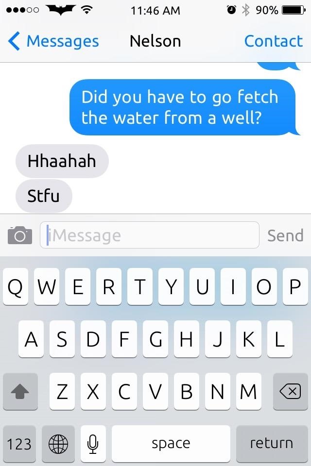
The dark keyboard doesn't fit well with every screen. For example when you bring it up in messages it doesn't look right.
What doesn't look right about it?The dark keyboard doesn't fit well with every screen. For example when you bring it up in messages it doesn't look right.
What doesn't look right about it?

I think the keyboard color should be dynamic depending on what screen you are looking at. You should'nt have a static keyboard for every screen you look at. This isnt 2003.
Don't get me wrong if the Messages app had a dark mode it would work just fine with it.
To me it doesn't seem that the effect is to the same degree if what increase contrast does. Sure, it creates some division in the app making the separation between the keyboard and the rest of the content more obvious, but then some would really like that actually.
By the way, the updated (default) keyboard in beta 3 is already slightly darker and/or less transparent/translucent.
To me it's really more about just subjective looks of it than a huge removal of a lot of obvious and really nice or useful transparency/translucency.
It all being an option that someone can select to use or not makes it less controversial too. And yes, an overall darker mode would be even better.
Last edited:
To me it doesn't seem that the effect is to the same degree if what increase contrast does. Sure, it creates some division in the app making the separation between the keyboard and the rest of the content more obvious, but then some would really like that actually.
To me it's really more about just subjective looks of it than a huge removal of a lot of obvious and really nice or useful transparency/translucency.
It all being an option that someone can select to use or not makes it less controversial too. And yes, an overall darker mode would be even better.
The less you allow a consmer to customize a product the stronger the brand recognition remains.
The iPhone's branding visuals are:
1. The apple logo on the back of every iPhone
2. The familiar square icons lined up in a grid
3. the familiar circle home button on the bottom.
I jailbreaked my iphone, put it in a case, used a Winterboard theme to change the way all the icons looked and you had to see the confusing looks I got from people when they looked at my phone.
"Is that an iPhone?".
You'd be surprised how these subtle changes confuse people.
If you notice the only UI customizations in iOS 7 relate to accessibility. Of course wallpaper being there from the start. I really don't see Apple allowing users to customize more and more aspects of the UI.
P.S. I'm still upset the new home button on the 5S doesnt have that rounded square undernear the button. it looks weird without it like the original broke and was replaced by some cheap aftermarket one.
Register on MacRumors! This sidebar will go away, and you'll see fewer ads.