Become a MacRumors Supporter for $50/year with no ads, ability to filter front page stories, and private forums.

TiberioG

macrumors member
Original poster
Dec 10, 2013
53
2
Hi mac fans!

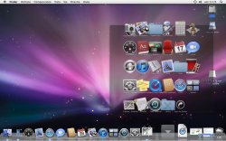
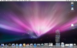
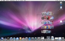
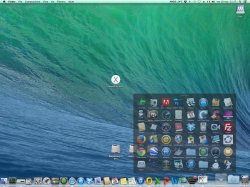
Here is a comparison between the effect of the opening of the Application folder on the dock in 10.9 and 10.5.

I pressed the shift key while cliking the folder in order to see the effect in slow motion.

I think that the effect on mac os X 10.5 is better!

What do you think?


Bye
 

Attachments

  • 1.jpeg
    1.jpeg
    143.6 KB · Views: 157
  • 2.jpeg
    2.jpeg
    165.2 KB · Views: 140
  • 3.jpeg
    3.jpeg
    190.5 KB · Views: 127
  • 1 copia.jpeg
    1 copia.jpeg
    463.1 KB · Views: 109
  • 2 copia.jpeg
    2 copia.jpeg
    467.1 KB · Views: 134
10.5 is really old, so a side-by-side comparison is not practical for most people, and your stills don't really get the point across. I think you're trying to show how 10.5 kept full-sized icons in a growing window. I think the overlapping icons looks messy. Mavericks does it better.
 
I never opened a folder with a shift click, so I'm not caring about it.

I'm happy with Mavericks, and thought Leopard was a bloated mess compared to Tiger
 
Register on MacRumors! This sidebar will go away, and you'll see fewer ads.