One of the biggest things I prefer about OS X over Windows is the font rendering. OS X looks so much better to me and that's important when you're staring at text all day.
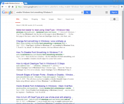
Lately I've been doing a lot of work in Windows 8.1 via VMWare. You can see the difference in font's between OS X and Windows Chrome in my attached screenshot. I only used chrome as a quick example because the issue is in other apps like Word too.
I've tried adjusting the clear type preferences, but that doesn't make much a difference to me. Is there anything I can do? To me, the Windows version look incredibly bad.
Thank you.


