Got a tip for us?
Let us know
Become a MacRumors Supporter for $50/year with no ads, ability to filter front page stories, and private forums.
Fake DVD Cover Almost Done - Comments Please!!!
- Thread starter John Doe 57
- Start date
- Sort by reaction score
You are using an out of date browser. It may not display this or other websites correctly.
You should upgrade or use an alternative browser.
You should upgrade or use an alternative browser.
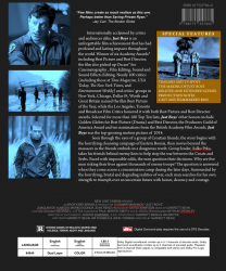
Overall it looks really good (Get rid of the red lines and it will look more convincing ") )
)
The only thing I would say is just teak the alignments of some of your objects.
A few I noticed after a Closer look
- I would line the bottom paragraph with the bottom of the third image
- The R rating and box and the box opposite seem off centre, I would move them a little to the left.
- The white text in the special features box, I would give the "-" a little more room maybe line the left edge of the text box to the left of the image above and the same with the right hand side.
Part from those little points I looks rather good, Have you done a front cover?
) The only thing I would say is just teak the alignments of some of your objects.
A few I noticed after a Closer look
- I would line the bottom paragraph with the bottom of the third image
- The R rating and box and the box opposite seem off centre, I would move them a little to the left.
- The white text in the special features box, I would give the "-" a little more room maybe line the left edge of the text box to the left of the image above and the same with the right hand side.
Part from those little points I looks rather good, Have you done a front cover?
Without looking in detail, I'd say it looks good, but probably get rid of half of the text. I haven't seen a DVD with that much writing on it before.
Saving Private Ryan
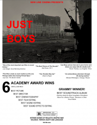
Forgive my cynicism, but what is the point of this?
Also, "Just Boys" sounds like a gay porno.
You can't judge a movie by it's name! Sexy Beast was a film that came out in 2000. It wasn't a porno at all. It starred BEN KINGSLEY. You ever heard of him? (Gandhi, Schindler's List) Sexy Beast was nominated for an Oscar!!!
Just Boys does sound gay-ish, I will agree. But you can't just read a title of a movie and go by that.
I think the point of that post was that people will judge a movie by its title whether they should or not. The Sexy Beast example makes the point even more likely due to the fact that very few have even heard of Sexy Beast.
With that said, I think your cover looks very proffesional although I agree that it is much too wordy. If I had been browsing Blockbuster and came across a cover with that much to read on the back, I wouldn't even read it.
P-Worm
As mentioned it does seem a little wordy. ALso the text in the special features box is too far left and the dashes are touching the bounding box. Otherwise I think it looks great. I recognize those pics from Behind Enemy Lines!
Sure, but google "Just Boys" and you'll find that it actually is the title of a gay video romp, so I wasn't wrong.Just Boys does sound gay-ish, I will agree. But you can't just read a title of a movie and go by that.
Anyway, you never answered my question about the point of all this.
P.S. Sexy Beast was highly overrated. After Kingsley's earlier achievements it actually made me feel glum. I've since cheered myself up. Thanks for reminding me and dredging up that 90 minutes of woe.
Sure, but google "Just Boys" and you'll find that it actually is the title of a gay video romp, so I wasn't wrong.
Anyway, you never answered my question about the point of all this.
P.S. Sexy Beast was highly overrated. After Kingsley's earlier achievements it actually made me feel glum. I've since cheered myself up. Thanks for reminding me and dredging up that 90 minutes of woe.
With that regard Courtaj, I think I will change the name. The name really does sound gay-ish. Oh well. I still think Sexy Beast was an excellent movie, we just have a different taste.
Thank you everyone for commenting!!
Here is the DEMO Front Cover and some more covers
Attachments
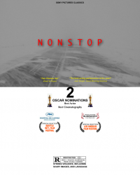
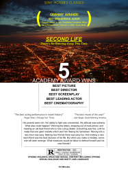
It looks good, but it looks like European (particularly German) DVD covers.
And I hate the look of them.
Unless you're IN europe and are modeling the general look of those DVD covers.
Just my .02
And I hate the look of them.
Unless you're IN europe and are modeling the general look of those DVD covers.
Just my .02
I agree that the pictures on the left side should be spaced down a bit on the back cover, along with moving the paragraph down a tad. The paragraph about the awards/top ten lists is way too long. Usually back jackets highlight one or two awards but don't give you an entire wrap sheet (e.g.- They usually don't mention sound editing if they won Best Picture and Best Director. They would just mention winning 3 others without naming them.)
Also, I like the euro-style format of the covers, but they look too generic. I think the thing that gets me the most is the font choice for the titles. I would suggest playing with some other fonts and at least dulling the shade of red you use, if not changing the color altogether.
Also, I like the euro-style format of the covers, but they look too generic. I think the thing that gets me the most is the font choice for the titles. I would suggest playing with some other fonts and at least dulling the shade of red you use, if not changing the color altogether.
Take a look at the Back Cover of the Saving Private Ryan DVD:
http://www.dvdexploder.com/Saving_Private_Ryan-front.jpg
I based it on that. The covers are just DEMOs. They are part of a project I put together a while ago.
http://www.dvdexploder.com/Saving_Private_Ryan-front.jpg
I based it on that. The covers are just DEMOs. They are part of a project I put together a while ago.
Register on MacRumors! This sidebar will go away, and you'll see fewer ads.