Become a MacRumors Supporter for $50/year with no ads, ability to filter front page stories, and private forums.

joes522

macrumors newbie
Original poster
Oct 2, 2008
16
0
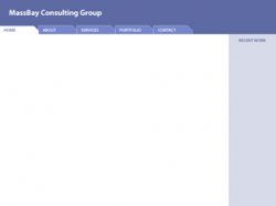
hey guys, Im new to macrumors and was just wondering if I could get some feedback on my site layout. I just put this together recently. Me and a buddy are trying to get a small, local technology consulting practice going (we already do it to some extent, but never had a web site)..(we're both seniors in college btw).

I was also wondering if anyone could help me out with the side nav bar...

Right now I have it as a fixed width div. The div is declared inside the container (large box with all the text) and offset negatively on the x axis by about 120px or so. I was wondering, would it be possible to somehow make the screen stop at a certain point, when a user tries to make their browser screen narrower (so that the nav bar and container will always show)?
Not sure if I made myself clear there, but any help or general feedback is appreciated. This is my first foray into web design.

http://www.joesut{{{cliffe.com/mbh{{{ome.htm

id rather not post the full link here, so just remove the brackets to get to my site.

thanks in advance.

PS Id also like to know what people think of the color scheme, particularly the main background (below the title bar and behind teh container). Does it go with the darker blue of the title bar? Or should I choose a new color? (Its technically a lighter opacity version of the title bar blue but Im not sure if i like it). If anyone has any suggestions for possible color changes please let me know. Hex code would be so helpful.
 
I won't comment on the code (which is quite bad with all that absolute positioning and inline CSS) since you asked about the layout, and this may just be a mock-up.

  1. The logo has a calm and professional feel to it.
  2. The placement of the sub-header ("Our knowledge is your business") is awkward.
  3. The silver bar at the top seems unnecessary.
  4. The top horizontal navigation lacks contrast with the words. The contrast when hovering an item is good though.
  5. The opposite is true of the bottom navigation. Good contrast to start, but hover state has bad contrast.
  6. Good contrast and text size of the main content.
  7. I would use uppercase words in your navigation menus. Adds to the professional look.
  8. The drop shadow on the top navigation is a little thick. I'd lighten it up.
  9. I'd lose the dashed border on the first header of the content. If you want the border go with solid and maybe lighten the blue so it's not too strong.
  10. I think the background of the container you ask about looks fine. The darker blue would have darkened the page too much in my opinion.
As far as the left navigation question, You'd be better off doing the CSS in a way that you don't need to do the offset. You can also look into the CSS property min-width, but know that it isn't supported in IE.
 
Joe, this is a good start as the page looks rather simple and clean.

However, there is a lot that could be done with the code to improve it. As angelwatt said, the inline styles (e.g. using style="..." in a <div>), and use of absolute positioning is problematic, particularly in avoiding the way that the navigation slides right out of view when you make the page smaller. One suggestion to help clean things up is to run your pages through html and css optimizers. This will help reduce unnecessary declarations, and will compact repetitous code.

With respect to the side bar, your page might better be structured like this:
Code:
<div id="container">
     <div id="sidebar">
          <!-- sidebar content -->
     </div>
     <div id="main">
          <!-- main content -->
     </div>
</div>

Then, your stylesheet should have something like:
Code:
#sidebar {
    float: left;
    width: 15em; //Use anything you like here
    // Other sidebar related styles
}

#main {
    margin-left: 15em; //Use same measurement as width of sidebar
    //Other main styles
}

What this will do is put the sidebar on the left and push the main content area to the right.

I'll also recommend that you check out A list apart and Sitepoint. I understand there is a lot of information in both places, but I've found the articles informative and easy to apply.

Good work so far. HTTH.
 
thanks so much for all the feedback guys.

With regards to my code, I definitely realize that the CSS is very poorly set up. I went into this with a completely different idea of what the site was to look like, and thus made a lot of changes. And ive learned a lot about CSS along the way. My goal is to eventually build a stylesheet and code everything properly. I just wanted some feedback with regards to the look and feel of the final product.

thanks very much for all the comments (and for the links memco).

Ill definitely look to optimize my code as time goes on. And I will try your suggestions angelwatt. I know the hover contrasts are problematic, still trying to work those out. Also, I had the all-caps links originally, I just wnated to experiment with all-lower. Ill probably put all-upper back though. Thanks also for the lighter blue border suggestion, sounds like a good idea.

Ill keep you guys updated if anyone is curious.

Thanks again
 
just to let you know, i changed a few things around..just add the number 4 to the url right before '.htm' in case you want to see it and give me some more feedback.
 
I don't consider myself expert enough to comment on coding etc but looking at the actual site itself it looks good. Clean and smooth.
 
I dislike the way the main navbar reacts to screen resizing; the links merge together at small browser widths, and they spread too far apart on large browser widths.
I think I would just dump the code you're currently using for the main navigation.
Keep it simple, or code for true RIA.

I very much like the tabs concept you're using on mbhome4.htm.
It works nicely and makes sense.
Why not do the entire site navigation this way?

The logo banner design is bit plain, yet simultaneously a bit too fussy/distracting.
I would simplify the overall design and implement the forementioned tabs at the left end of the banner.

Attached is a simplified comp for this site design.
 

Attachments

  • massBay.png
    massBay.png
    5.7 KB · Views: 300
thanks very much for that snickelfritz--the main nav was definitely my next task.

As far as tabbing the entire site like I did with the homepage:
I have been considering this. I am sort of steering against it a bit because Im not sure how I would handle the URL structure. Id like to be able to link to a specific page (e.g. the contact page) but with the tab setup, is it possible to do this? or will it always just show mbhome4.htm? Is there a way to make the URL in the browser window change on the click of a tab?

I will definitely consider the changes you suggest. Thanks for that.
 
The URL can change very easily using tabbed navigation. Here's one way to do the code. Do some research to see if this or another implementation is better. All in all, tabs are just an aesthetic, you could change it to something else very easily as long as you use CSS for styling.
 
thanks memco, I will look into trying something like that. Ive changed the color scheme and made a few minor changes to the layout. The new site can be viewed at mbhome5.htm

Please let me know what you think of the new color scheme. Thanks!
 
Some comments for the new design:

  1. I like some of the new colors on the page.
  2. The design is fluid and handles different size windows well.
  3. The navigation text I feel still lacks contrast. It's not hard to read, but not easy either. Though I'm not sure what color would look best. The new red you're using would definitely show up well, or even a dark blue or the gray you have in the header.
  4. The link color doesn't stand out except when you hover over it. You also took away the underline that most people use to locate links. I would recommend adding the underline back to links.
  5. The headings, like "who we are" I feel should have the first word capitalized given this is a professional site. It's hard to take a company serious who doesn't use proper grammar.
  6. You'll eventually want to work on some of the HTML. There shouldn't be anything after </html>, and you'll also want to move more of the style to the CSS and get rid of those nbsp.
  7. Good to see that the site degrades well when JavaScript is disabled.
Overall, you've done a great job incorporating the comments given from everyone and the site design looks much more professional from where you started. The first design wasn't bad, but the new design stands out as superior when you compare them next to each other.
 
thanks for the suggestions angelwatt. i currently have the navbar font color the same as the title bar grey. I cant decide if I like it better gray or maroon. I also added the link underline, and capitalized those headers as you suggested. thanks for that.
 
It's coming along nicely, it's interesting to see your progression.

My only critisism, although it looks like a nice image, I think the post-it looks out-of-place. It doesn't go with the feel of the design. In fact I think that entire right-hand nav could be removed. You've already got the top nav, the bottom nav and the tabs - more than enough to get you were you need to go.
 
I removed the post it. Now I feel like the site looks a bit bland. Any suggestions?

Edit: I added in a lighthouse logo on the banner. I applied a white color overlay and the white opacity is around 80%, so you can still see some of the features of the lighthouse. do you think this looks good? Or should I make the overlay completely white?

Or do you not like the lighthoue at all? Thanks!

The lighthouse is alright, but looks cramped in its spot. The text might be a little close to it as well. Hard to visualize how much space is good. The white overlay on it is OK, though I might suggest lessening the opacity to give a darker look, or perhaps increase contrast to bring out a few of those lighthouse details. Just some ideas. It's really personal judgment.

One thing I'm noticing on your navigation, there's less room above the text than below. You might want to tweak this to give it a more centered feel. It's just something my eyes keep noticing.
 
1. Do not put all your CSS styles in the index.html file!

2. Why does your site end with ".htm"?

3. Look into PHP includes if you plan on using multiple pages.

4. Use color contrast. Not 'Color 'Purple' :) .

5. See what happens when you drag the browser window to a smaller size... everything collides!

6. When all else fails, start over. It's a learning experience. We've all been through it. Take your time, don't rush. You'll be glad in the end.

7. Look at http://bestwebgallery.com/ for good designs and http://css-tricks.com for good tips on CSS :)

Sorry for being blunt, but you asked for advice, and trust us you got it :D

Mason
 
Sorry for being blunt, but you asked for advice, and trust us you got it :D

Mason

From your comments it doesn't sound like you're looking at his latest design. Be sure to read all posts so your own posts will have more relevance. Also realize this is a design page he's using so there's isn't much need to put CSS in a separate file, and using a htm extension is completely fine.
 
You should remove all the <br> tags in your index file. Use margin in CSS instead.
 
Hi Angelwatt:
Would you mind explaining exactly what you mean by this?

"on your navigation, there's less room above the text than below. You might want to tweak this to give it a more centered feel."

do you mean the button itself is not centered over that gray bar? Because in my browser it is, but if I lessen the font size in my browser, it moves upward.

Are you using normal-sized font in your browser? I have been trying to figure out how to center the button position in the bar, no matter what size fonts peoples' browsers default to.

e.g. ideally, Id like to have the (vertical) center of the button always align with the (vertical) center of the gray bar. Do you know if there's a way to do this?

thanks.
 
Hi Angelwatt:
Would you mind explaining exactly what you mean by this?

"on your navigation, there's less room above the text than below. You might want to tweak this to give it a more centered feel."

What I saw before isn't present now. What I saw before was a proper vertical centering, but sine it was all-caps the font height made it visually appear slightly off center. That doesn't seem to be the case anymore. Not sure if it was a change in the CSS or a temporary fluke with my browser, but it does look centered correctly now, so no worries.
 
Register on MacRumors! This sidebar will go away, and you'll see fewer ads.