Become a MacRumors Supporter for $50/year with no ads, ability to filter front page stories, and private forums.

Sdashiki

macrumors 68040
Original poster
Aug 11, 2005
3,529
11
Behind the lens
You may recall my last attempt at putting together a portfolio site. The one with the big blue flower...

Well, I tried way too hard to design that site, and I only cared about compatibility later. Much to the sites downfall.

So, I aborted that attempt, and started over. This time with 100% compatibility as well as being able to work within most, if not all, resolutions and window sizes.

My Site
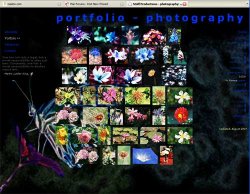
Untitled-1.jpg


Lots of things are missing, but the bulk of the design can be seen from the influences and portfolio sections; digital, painting, photography are the only completed pages.


Let me know if you have any problems with the site and any feedback on the site or my work is always appreciated it! :D


EDIT: under construction.
 
go safari FTW, anyone possibly offer any advice on what could be messed up.

I mean, IE6 works, and I thought that was my worst enemy!

methinks that its only on that page you pictured, perhaps its because the center content div is completely empty?
 
It functions in FF on Windows, but looks horrible, no offense.

Navigation on the left, then subnavigation on the right. Looks very bad on large monitors.

It just seems very cluttered and not very well thought out. You might want to consider starting with a base "sandbox" css template or something to help you get started with a decent layout and infrastructure.
 
it just seems very cluttered and not very well thought out. You might want to consider starting with a base "sandbox" css template or something to help you get started with a decent layout and infrastructure.

hmmm, i did that. used a template as my layout.

and as for cluttered, i dont see how, its left and right with centered content. being liquid it shouldnt break down with window sizing.

dont know why it falls apart in Safari, it seems to be basically ignoring the entire stylesheet as even the header is grey and not blue, other txt isnt white as it should be and some of my <ul> seem to be totally f-ed.

dont know wuts wrong with safari...

and for some reason Lightbox is totally gone, but the files are there. wtf?


EDIT: biggest problems seem to be a complete Safari meltdown, why is it ignoring basic CSS structure that even IE6 sees correctly? look at the image i posted and see how its "supposed" to look.

lightbox is no longer functioning once uploaded, but works fine locally. WTF is going on?
 
you have a big unordered mess of thumbnails in the middle which makes me instantly not want to have to navigate thru them. the blue color on the black background is impossible to read and its position is just tossed into the side of the page. the background image behind the thumbnails only makes it more cluttered and hard to understand.
 
the order of the thumbnails is that they belong to the "digital" category. you dont need to navigate through anything, thats the beauty of it. Lightbox is supposed to allow a clickable slideshow, but its not working right now.

blue on black, ill think about a new color scheme, seems to mess alot of people up.

I still dont understand how a 3 column liquid layout is cluttered though.
 
i read your replies in this thread and it seems like you want to have a counter argument to any critique you are getting. i do not care wether or not you think the thumbs are ordered, they appear as a jumbled mess. they need some structure to them, some way of making them not look like a centered blob in the middle of the page.

having a 3 column grid and knowing how to use a 3 column grid are two very different things. this site may have one but its not working. it looks awkward and uncomfortable.

i am not trying to be a prick here but i teach college level design and i can tell you from a lot of experience: some people want a critique and some people just want to be told they are right. if you ask for a critique, please accept it.
 
do you have any suggestions besides critiques?

do you not feel a left main menu and a right sub menu to work for you? how would you navigate this site effectively?

how would you order a bunch of thumbnails, with no relation other than their medium, in a centered layout?
 
your type needs better hierarchy in the subnav, its confusing. the rag left flush right feels odd against the rag of the thumbnails. i think the subnav may work better on the left side under the main nav anyway

loose the bg image entirely

put the thumbs on some kind of aligned grid rather than a centered blob and lower it off the top away from the page title, which should be over near the nav not the subnav
 
switch to a 2 column layout. makes sense.

do you feel the menus should be collapsed and open when on that page, like portfolio sub links only show on the portfolio pages etc?

or would it be best to have the whole menu blown out with all sub links showing at all times?

im not too keen on not keeping different backgrounds for different sections of the website. a solid color or tiled background is certainly not fitting the "look" id be going for.

a grid for the thumbnails, dont understand. the imgs are merely tagged with some padding and are displayed inline, with the liquid layout they move to fill the content div. maybe not having them centered to the div, but left or right justified?
 
do you feel the menus should be collapsed and open when on that page, like portfolio sub links only show on the portfolio pages etc?

yes

im not too keen on not keeping different backgrounds for different sections of the website. a solid color or tiled background is certainly not fitting the "look" id be going for.

maybe the "look" you are going for needs to be rethought? or the images be treated differently somehow.

maybe not having them centered to the div, but left or right justified?

yes. i also think they should be all the same size.
 
im always looking for feedback.

what are you not liking? do you have any ideas on how to improve the site in any way?


my polaroid site should go up by next week, while its not a portfolio site, its nice.
 
I am a fan of very uncluttered design myself.

I think one problem you may be running into is that your pages are not valid code. I ran this page:

http://option8.110mb.com/site/digitalG02.html

Through the validator and it has 44 errors:

http://validator.w3.org/check?uri=h...(detect+automatically)&doctype=Inline&group=0

Even one error can throw a browser into quirks mode, and it is going to guess at page rendering then. Most of them are small errors though.

Your stylesheet is error free though:

http://jigsaw.w3.org/css-validator/...ng.css&warning=1&profile=css21&usermedium=all
 
every one, except 3, of the errors I see is the same:

…s/digital/thumbs/corkscrews.th.jpg" /></a>


The attribute given above is required for an element that you've used, but you have omitted it. For instance, in most HTML and XHTML document types the "type" attribute is required on the "script" element and the "alt" attribute is required for the "img" element.

Typical values for type are type="text/css" for <style> and type="text/javascript" for <script>.

makes no sense to me, really.

and the final three:

# Error Line 35, Column > 80: XML Parsing Error: xmlParseEntityRef: no name.

is telling me the using the " & " symbol in the title=" " tag of an img is bad. i guess, maybe, whatever.


so, i guess there are no errors actually? :eek:


this particular bckgrnd image is 16k. and the thumbs are > 10k each. should be "ok" for even dialup. 110mb.com aint the speediest sometimes though.
 
Register on MacRumors! This sidebar will go away, and you'll see fewer ads.