Become a MacRumors Supporter for $50/year with no ads, ability to filter front page stories, and private forums.
I dig the concept but I find it to be a little too minimal for my taste. There is a difference between a clean interface and a un-finished one. i think your's is closer the later. I don't wanna be to harsh but I'd suggest boxing it in just slighty to distinquish the content from the background. Maby something like this:

ps.I sincerly apologies if I've stepped over the line of decency by messing with your design.
 

Attachments

  • ollie.jpg
    ollie.jpg
    75.2 KB · Views: 146
I agree with everyone else--the background needs a subtle color (light grey even) because the white is blinding. The text seems professional, but almost too small. If you could include a screenshot or picture, in addition to a brief description of the websites, your site would look better. Mainly, ADD SOME COLOR! :D 
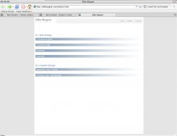
The White and blue isn't enough. Possible schemes, depending on your work & taste could be variants of red/yellow/black, grey/white, etcetera.

Post your site once everything's all done,

JM
 
bull

the last thing this site needs is color.
my recommendations...
adjust all to left (just a bit, to offset it; not to align it on the left side)
extrapolate or discard the numbering sequence
think about the layout of your information and whether it makes sense...
for example you have three links under 01. and they link to new pages, and then you've
got two links under the design section, and they pop up little windows- but all 5 are equal in
your hierarchy.
 
Register on MacRumors! This sidebar will go away, and you'll see fewer ads.