Become a MacRumors Supporter for $50/year with no ads, ability to filter front page stories, and private forums.

MacRumors

macrumors bot
Original poster
Apr 12, 2001
70,387
42,004


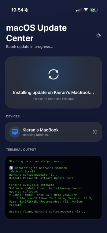
Apple today provided the first beta of an upcoming macOS Tahoe 26.3 update to developers for testing purposes, with the update coming three days after the launch of macOS Tahoe 26.2.
macOS-Tahoe-26-Thumb-2.jpg

Developers can download the macOS Tahoe 26.3 update by opening up the System Settings app, selecting the General category, and then choosing Software Update. Beta Updates will need to be enabled, and a free developer account is required.

There's no word yet on what's included in macOS Tahoe 26.3, but we'll update this article if new Mac features are found.

The beta is available to developers right now, but a public beta is expected later this week. We'll likely see Apple release macOS Tahoe 26.3 at the end of January given past launch timelines.

Article Link: First macOS Tahoe 26.3 Beta Now Available for Developers
 
  • Like
Reactions: Mike_Trivisonno
My dock on my MBA is now translucent, with a soft focus on my desktop behind it. I kinda like it.

I can't even remember if the Dock looked different before. 🙈 Also I changed my Wallpaper very often in the last days. Wasn't it visible through the Dock before?

How's the performance so far?

Nothing noticeably worse or better so far. But on an M4 Pro mini with 64GB I might not really feel it. Seems Finder isn't using 100% CPU for opening a window anymore. Still waiting for some processes to go crazy again and ramping the CPU temperatures and fan up but this only happened randomly in 26.2 (RC).
 
And yet, Liquid Glass still does this in the Settings app, placing scrolled text under and obscuring the search field, even when Reduced Transparency and Increase Contrast are turned on:
Liquid Glass issue in Settings app in Tahoe.png


But maybe this is fine, since using the search field in the Settings app still fails to find many things that are actually in the Settings app. It's gotten better at that, but it still needs work.
 
I just upgraded to macOS 26 and I swear it's messing with my eyeballs. Am I crazy or do the buttons on toolbars have these subtle blurred drop shadows. I catch the effect while scanning across the displays and it is making my eyes do a double take. It's very annoying.

Is there any way to just get a crisp, clean, grayscale interface like the old NeXT machines.

Also, the corners should be 90° to better fit the 90° corners on my monitors. I got the little curly triangles all over the place.

And...well let's just leave it there.
 
Register on MacRumors! This sidebar will go away, and you'll see fewer ads.