The fitness app for runners with Apple Watch has definitely improved, now showing more details than before. But there is one area it really still needs improvement.
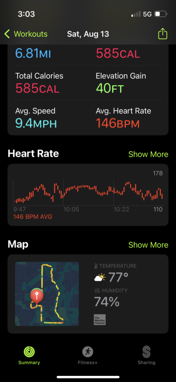
All the images and graphs are static and not interactive. For years and decades now, other programs and apps have had the ability where you can put your finger (or cursor) on a spot on the run or on a graph and drag it left or right, which would simultaneously bring up on the other graphs and maps a dot to show you the corresponding spot. This makes looking at how you run in certain areas of the run very useful.
I think I’ll post this as a feedback for Apple, but it’s crazy that we’re deep into the development of the Fitness app but this very basic ability is missing.
[Edited for typos/clarity]
Last edited: