Become a MacRumors Supporter for $50/year with no ads, ability to filter front page stories, and private forums.

qwerty994

macrumors member
Original poster
Jun 11, 2012
92
1
California
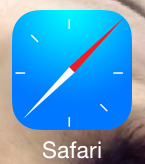
Hi there! Like many of you I'm a little disappointed in the new icons that came default in iOS 7, especially Safari. A little while ago I came up with this fix - a new icon!

Here is what the icon will look like:
33xh2xl.jpg


To get this, just add this page to your home screen:
http://bwg.ianthedeveloper.com/safari/

And now shove the default ugly one into a folder. I hope you guys like this. If you do, spread the word so everybody can get it. If not, then have a nice day.
 
Hi there! Like many of you I'm a little disappointed in the new icons that came default in iOS 7, especially Safari. A little while ago I came up with this fix - a new icon!

Here is what the icon will look like:
Image

To get this, just add this page to your home screen:
http://bwg.ianthedeveloper.com/safari/

And now shove the default ugly one into a folder. I hope you guys like this. If you do, spread the word so everybody can get it. If not, then have a nice day.
Looks like the icon of a flash game in 1998.
 
Hi there! Like many of you I'm a little disappointed in the new icons that came default in iOS 7, especially Safari. A little while ago I came up with this fix - a new icon!

Here is what the icon will look like:
Image

To get this, just add this page to your home screen:
http://bwg.ianthedeveloper.com/safari/

And now shove the default ugly one into a folder. I hope you guys like this. If you do, spread the word so everybody can get it. If not, then have a nice day.

I like it. Neat idea. I'd like it more with a google redirect personally, but it's an interesting thought. Much better that Apple's.
 
Hi there! Like many of you I'm a little disappointed in the new icons that came default in iOS 7, especially Safari. A little while ago I came up with this fix - a new icon!

Here is what the icon will look like:
Image

To get this, just add this page to your home screen:
http://bwg.ianthedeveloper.com/safari/

And now shove the default ugly one into a folder. I hope you guys like this. If you do, spread the word so everybody can get it. If not, then have a nice day.

...why? All this because you were not happy with the very first glimpse of the icons in the very first beta?
 
Thanks for the thought, but, no thanks. I'll wait and see what the following beta's offer me.

Regarding the design, check Apples icons for spatial placement. Yours is too large on the background. Otherwise, it's not a bad first attempt.
 
If you want to make it look less like a clock, maybe add the continent background in there, or just the N S E W compass markings.
 
Register on MacRumors! This sidebar will go away, and you'll see fewer ads.