Got a tip for us?
Let us know
Become a MacRumors Supporter for $50/year with no ads, ability to filter front page stories, and private forums.
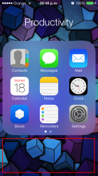
Folders. Wasted Space
- Thread starter Enmanuel
- Start date
- Sort by reaction score
You are using an out of date browser. It may not display this or other websites correctly.
You should upgrade or use an alternative browser.
You should upgrade or use an alternative browser.
You know what's even dumber? On the IPAD, it's the exact same thing. a 3x3 box of 9 apps. With SO much space everywhere else they could have fit more apps. Come on.
Though I like the way the Folders looks now compared to ios5/6 I do think they'll could've made it 4x4 layout and shrink them a little to fit inside ios7 design without making the inside any bigger and take up more unnecessary space.
I couldn't agree more. 12 icons per screen is obvious.
Obviously cluttered and chaotic. I like 3x3 much better.
1 extra row would make it cluttered and chaotic? Seriously? It was really cluttered and chaotic before iOS 7 somehow?Obviously cluttered and chaotic. I like 3x3 much better.
----------
If it's like that on iPads as well, that's just plain silly.You know what's even dumber? On the IPAD, it's the exact same thing. a 3x3 box of 9 apps. With SO much space everywhere else they could have fit more apps. Come on.
Zoomable GUI people. A 4x4 grid would make the icon in its zoomed out state impossible to glean any useful information from.
Folders. Wasted Space
This is exactly what I was thinking while reading the thread. While I can see how it might be useful to have more applications visible when you first open the folder, I completely understand why Apple chose to limit it to nine per page.
Zoomable GUI people. A 4x4 grid would make the icon in its zoomed out state impossible to glean any useful information from.
This is exactly what I was thinking while reading the thread. While I can see how it might be useful to have more applications visible when you first open the folder, I completely understand why Apple chose to limit it to nine per page.
Even for iPad?This is exactly what I was thinking while reading the thread. While I can see how it might be useful to have more applications visible when you first open the folder, I completely understand why Apple chose to limit it to nine per page.
Folders. Wasted Space
Yes, the zoomable GUI argument for why Apple chose to only display nine applications per page still holds for the iPad. That being said, I can also see how only displaying nine icons per page on the iPad results in a lot of wasted space.
Even for iPad?
Yes, the zoomable GUI argument for why Apple chose to only display nine applications per page still holds for the iPad. That being said, I can also see how only displaying nine icons per page on the iPad results in a lot of wasted space.
1 extra row would make it cluttered and chaotic? Seriously? It was really cluttered and chaotic before iOS 7 somehow?
Yep. It seriously was!
")
That's why they changed it. Along with many other aspects of iOS 6 and prior. The old design theory was a "more is more" theory, kind of like clothes and hairstyles in the 80s. Some people like that, which is ok. Everyone is entitled to their preferences. For me, it was cluttered and chaotic, and the new "less is more" cleanness and minimalism is well appreciated.
Oh, definitely everyone has their preferences. It just doesn't actually make something really cluttered or chaotic though simply because one might like something slightly more or less than something else. But, yeah, to each their own.Yep. It seriously was!
That's why they changed it. Along with many other aspects of iOS 6 and prior. The old design theory was a "more is more" theory, kind of like clothes and hairstyles in the 80s. Some people like that, which is ok. Everyone is entitled to their preferences. For me, it was cluttered and chaotic, and the new "less is more" cleanness and minimalism is well appreciated.
4x4 would have been fine and still could have maintsined the same zoom effect.
I would have sugested an option.. But apple does not like options.. As they tend to confuse people.
Im sure this will be one of the first ios7 jailbreak tweaks..
Oh there are already JB tweaks for that, they probably just have to be updated for iOS 7.
While I too think that there should be more than 9 apps shown, also don't forget about closing the folder. You can use the home button to close a folder, but you can also tap outside of the folder to close it and so this provides more space to do it. My guess though is that, as others have said, they did it so that the zoom animation looks better.
Right...but unfortunately that's more of form over function type of thing as is a little too common in iOS 7.While I too think that there should be more than 9 apps shown, also don't forget about closing the folder. You can use the home button to close a folder, but you can also tap outside of the folder to close it and so this provides more space to do it. My guess though is that, as others have said, they did it so that the zoom animation looks better.
but this square/squircle is the same proportions as the icons...a rectangular folder wouldn't fit their grid.
Yes, that's a very good point. When you zoom into a folder, its shape doesn't change, only its size.
Personally, I don't mind the 3x3 layout on the iPhone at all.
But as for the iPad, well that's quite a different matter.
They are zooming in and out on planes so you know where you are physically in the interface at all time, whether or not you agree with this you can't argue that this isn't form AND function.
Register on MacRumors! This sidebar will go away, and you'll see fewer ads.