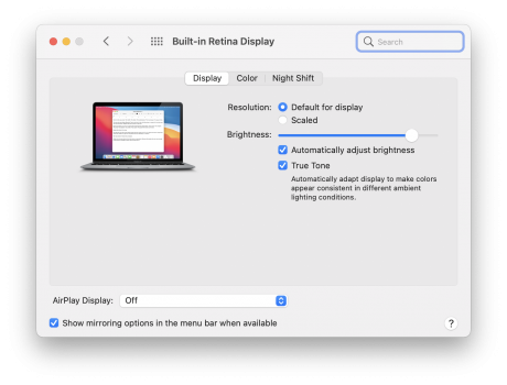
Could be several things: 1) White text on black background has repeatedly and over many years been shown to be harder to read, and especially if you have an astigmatism, so it could simply be that you are looking at an especially poorly designed site. So make sure that things actually look bad to you everywhere. 2) A badly calibrated monitor. I'm looking at a 2560x1440 (so non-high-dpi) monitor right now and it looks great, but I had to do a proper monitor calibration to make it so. The default calibration that MacOS chose for the monitor was not good enough; way too much contrast and this caused a lot of aliasing along the edges of text. To access the advanced options you have to hold down the 'option' key when selecting the Calibrate function. 3) Poor quality monitor. There are certainly some monitors than never do a great job with text, period, no matter how hard you try. We use a fair number of these cheapies in the education environment. 4) Apple totally disabled sub-pixel rendering when they went to retina displays across the line. The downside is that if you have a non-high-dpi monitor (like mine) this makes it harder to get things looking good. I prefer Microsoft's solution of giving the end-user the option to turn it on and off as they desire. But you know, this is Apple, and trust me, someone (probably everyone) working at Apple firmly believes they know better than you do how you should be using your computer, even though they've never met you or seen how you use your computer. That doesn't matter, it's Apple's way of f*ck off! Need something better for you? Too bad, what you get is whatever Apple wants. Microsoft is moving more in this direction too, so I guess eventually everyone who actually wants full control of their computers will be stuck with Linux or nothing at all. Anyway, I digress. You can attempt to re-enable sub-pixel smoothing and see if that helps, or even still works,
https://forums.macrumors.com/threads/the-subpixel-aa-debacle-and-font-rendering.2184484/ 5) MacOS and Windows font rendering has always been different and it's always been a bit jarring moving between the two. You may just need time to adjust. But don't be surprised if it's always a bit of a transition when you move back and forth a lot like I do. 6) Improperly adjusted monitor. It's often tempting to keep the contrast set way up to make colors 'pop' nice and vibrant, but this can really mess up the edges of text. Make sure you don't have your basic monitor adjustments set improperly. It's an easy mistake to make, and your settings that worked on your Windows box may not work well at all when that same monitor is connected to your Mac, so be prepared to play both with the software calibration and the hardware settings.
7) Should have put this first, but thought of it last: Your Mac may be detecting your monitor incorrectly and using the wrong color mode. It's been an annoying but not terribly common issue for some time now. I've been hearing more about it on the newer M1 systems:
https://spin.atomicobject.com/2018/08/24/macbook-pro-external-monitor-display-problem/ Good luck fixing this if it turns out the be the case, as it's a real PITA if it can be fixed at all.
You should certainly be able to get it to work properly in the end as what you are seeing is not normal. For reference here are pics of my mid-range ACER screen taken with my iPhone on this page in normal and dark modes, and they certainly look just fine. Nothing like what you are seeing:
View attachment 1760539View attachment 1760540
![]()


