S
syd430
Guest
Original poster
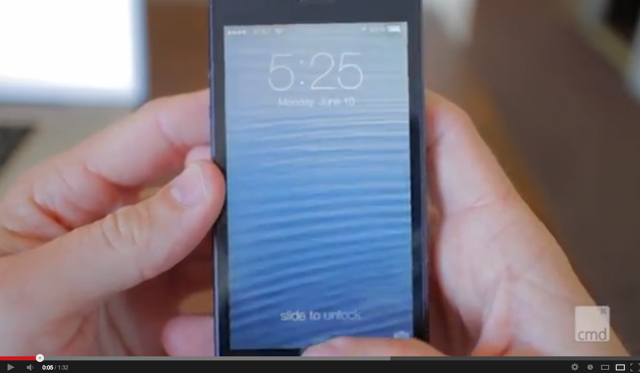
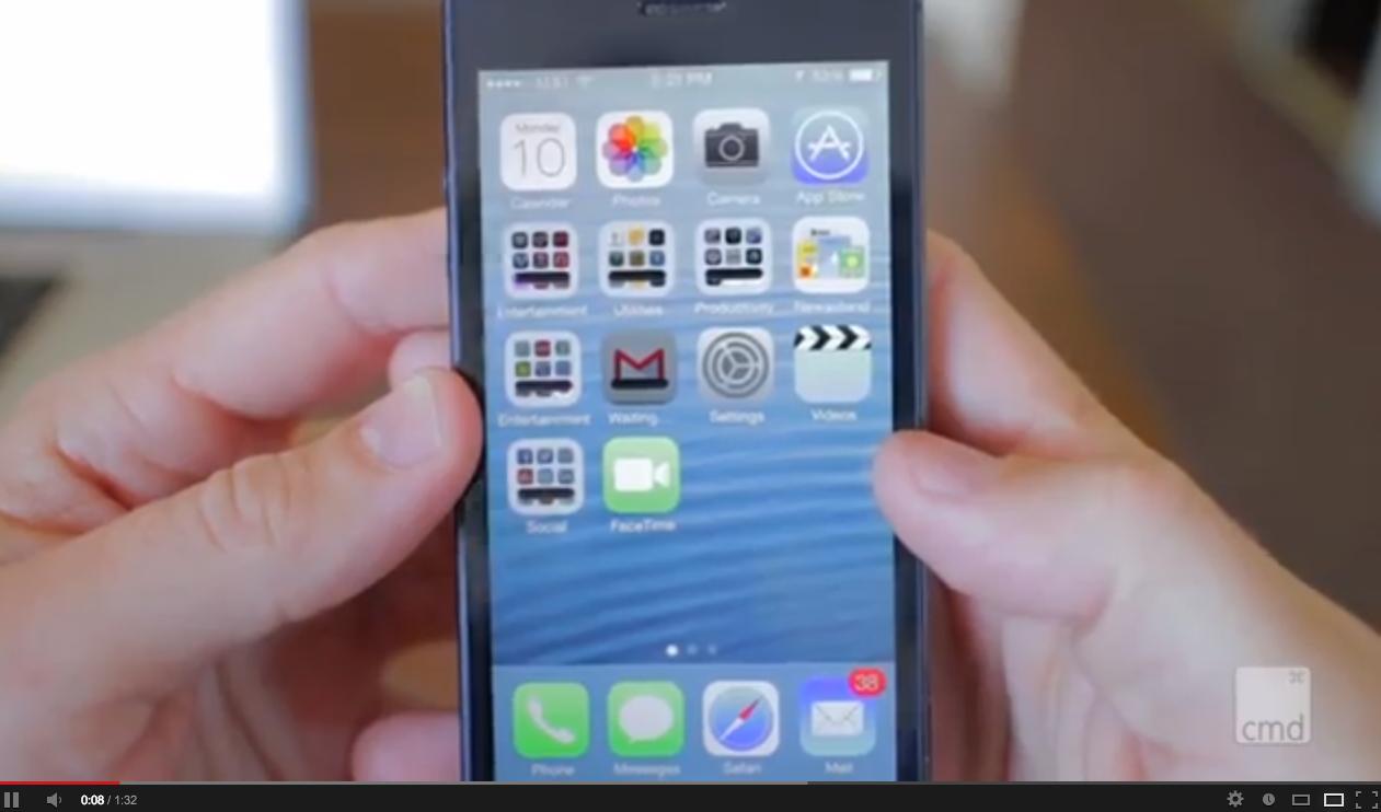
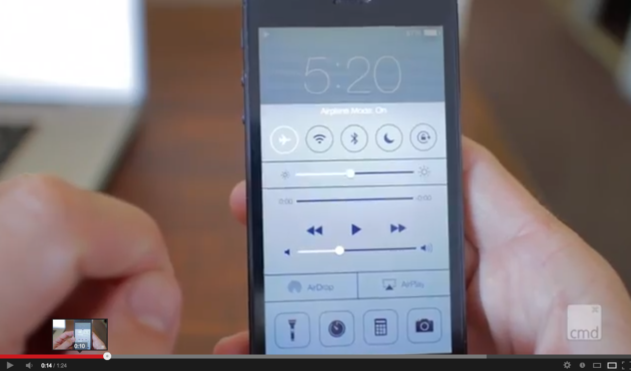
Just came across this video that uses the standard wave wallpaper from iOS 6:
http://www.youtube.com/watch?v=iM1M68HQQjQ
It really gives you a clearer point of reference for comparison when it's set against a familiar wallpaper. The only icon that's looks out of place here is the Photos app imo.
Now... if only they would get rid of the hideous and pointless coverflow tab switcher is Safari and it's really won me over (yes I know that they probably did this to differentiate from the main app switcher appearance but there has to be a better way).
I also sincerely hope you can disable the parallax effect on the homescreen, as I suspect that it could have a real impact on battery and performance with only superficial gains.
Edit: Screen grabs for the lazy
Last edited by a moderator: