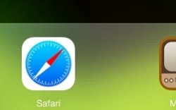
I don’t know about anyone else, but that garbled ‘moire’ graphic distortion that is visible on all of iOS 7’s transparent overlays is distracting. Especially when you type in your password, pull the Notification sheet down and in Reminders.
It’s everywhere there is a transparent overlay, but it’s more noticeable when darker wallpapers are applied. Is this a bug? A graphics limitation? Is this supposed to be better than the linen? It looks incredibly ugly and broken.
I can’t be the only one that notices this and is bothered by it. What are the chances of Apple addressing this in an upcoming release? It's most obvious on iPads.


