Become a MacRumors Supporter for $50/year with no ads, ability to filter front page stories, and private forums.

mmphosis

macrumors regular
Original poster
Jan 3, 2017
220
298
Every now and then I still take out some of my vintage PowerPC machines, and I realise that most of what hampers their usage today is due to CPU and GPU power, CPU architecture (no longer developed), and upgraded Web security protocols. But when it comes to their operating system — Mac OS X Panther, Tiger, Leopard, for the most part — I don’t feel I’m using an obsolete tool. I can do pretty much the same things I’m doing on more recent Macs running Mac OS 10.13 High Sierra, 10.14 Mojave, or Big Sur. Some workflows even feel more efficient.
 
I agree in some parts. But there are some simple improvements that I appreciate a lot on recents MacOSes that I miss on older ones too. Like "make a folder from selected items" for example, is genius, wonder why nobody thought of that before.
 
I agree in some parts. But there are some simple improvements that I appreciate a lot on recents MacOSes that I miss on older ones too. Like "make a folder from selected items" for example, is genius, wonder why nobody thought of that before.
I agree with that as well. The biggest additions which I use daily all came with Snow Leopard. Minimising in the app’s icon on the dock is a huge one. And the stacks being much much better (being able to scroll, go into subfolders etc)
Yes I can do most stuff just fine in older Mac OS versions, especially when keeping in mind the limitations of the day. I shouldn’t expect my Powermac G4 to do modern tasks, but I can expect it to work well with era appropriate software.
 
  • Like
Reactions: galgot
Hmm, when I think about it, Leopard is mostly as useful to me as El Cap or Hisi in regards to functionality. Aside from things like Dropbox not working on my powerpc Leopard boxes, I can't think of any other glaring differences in my use and workflow between the two. Trim support maybe? At some point Inet browsing will become a point of differentiation but even that is still functioning fine at this point.
 
  • Like
Reactions: galgot
El Capitan have serious flaws in the UI. Biggest for me being the "hidden" side windows scroll buttons in the finder. Or maybe i missed how to use it :)
But still, quite a stable release...
I skipped Sierra and HiSierra altogether.
I like Catalina.
 
The computer industry owes their worth to the web becoming more bloated and bloated by the day. Notes isn’t making old computers obsolete. It’s the web.

It does seem odd when you load an old OS and and notice how smooth it runs. It’s not quite clear to me why modern systems have to use so many resources to do much of the same things. All the background processes keep using more memory over the years.
 
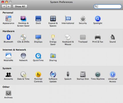
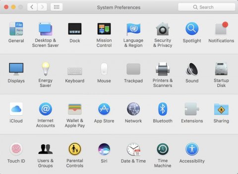
This is probably rather small for most people but one of the biggest things I absolutely hate about new versions of macOS is system preferences lack of categories. I don't remember which version changed this, but every time I use a PPC or early Intel Mac I'm reminded of how much easier it was to find what I want in system prefs. On my Mac Pro (Mojave) I am always using the search function to find the most basic things.
System preferences from Leopard:
Leopard System Preffs.jpg

System preferences from a newer version: (I got this from google, I was too lazy to boot up Mojave and take my own screenshot)
Modern system preffs.jpg

The titled categories just look so much cleaner. Without them I feel like I'm looking at a jumbled group of icons and it takes me over twice as long to find what I opened the prefs' for.
 
This is probably rather small for most people but one of the biggest things I absolutely hate about new versions of macOS is system preferences lack of categories. I don't remember which version changed this, but every time I use a PPC or early Intel Mac I'm reminded of how much easier it was to find what I want in system prefs. On my Mac Pro (Mojave) I am always using the search function to find the most basic things.
System preferences from Leopard:
View attachment 1809702

System preferences from a newer version: (I got this from google, I was too lazy to boot up Mojave and take my own screenshot)
View attachment 1809703

The titled categories just look so much cleaner. Without them I feel like I'm looking at a jumbled group of icons and it takes me over twice as long to find what I opened the prefs' for.
Indeed !
Plus the fact that on the older one, the categories icons sometime doesn't fill a complete line,
so it makes like the effect of paragraph in a text.
While with the new one , you face a "block of icons" like when you face a difficult to read block of text without paragraph.
Not a well thought UI...
 
  • Like
Reactions: Project Alice
Agreed. The categories are actually still there though. They've "just" been deprived of their titles.
Yeah, this is why I don't personally mind so much. And I can tell that they were grouped thoughtfully, even if I don't know precisely what it is they were grouped around.
 
I'm going to quote myself from Hacker News, where this was also posted:

---

"Is this really bad UI, or is it just you who are averse to change?"
It doesn't matter!

The funny thing about human-computer interfaces is that they are used by humans. Humans are adverse to change; ergo, a constantly-changing interface is also a bad interface.

When you change something—be it a GUI or an API—you need to take into account not just whether the change is better, but also whether it's worth the very high inherent cost of change. I don't think the modern tech industry does this anywhere near enough.
 
  • Like
Reactions: Amethyst1
In the example above, maybe the design process was :
We added more Pref Panels over the time (Notifications, Extensions, etc...),
We need to simplify the thing a bit...
Let's remove a line .
But it ended up giving the opposite feeling. Plus they moved some prefs around (like Bluetooth went from Hardware line to the third unamed line which is suppose to be Network...).

Remind me the Os9 control strip. Which was a good UI idea. But only if you didn't had too much strip controls , otherwise you ended up scrolling at the strip ends to find the one you was looking for.

Difficult to find the right solution to keep the thing simple when stuff keeps adding in the system...
 
Last edited:
  • Like
Reactions: Amethyst1
When discussing concepts of GUI/OS innovation, I am constantly reminded of the saying "solving a problem creates a new/bigger one". Perfect example of this in my life are web based apps file managers. I find them clunky and unintuitive (Outlook365 is a great example here). When you're getting 50+ emails a day, replies to email, forwards etc. how the app works, organizes and features this information is mazelike and convoluted, creating a whole new issue of finding the data you're looking for. The best way I can describe this is word barf because that's what it is. Outlook as a standalone app was and is much more usable and feature rich in ways that made sense to me; Web based outlook 365 word barf edition, not so much.

Anyhow, Project Alice brings up another interesting branch of this idea - in Apples rush to push a visual icon forward appearance, they removed categories which diminished context and allowed Apple to reposition/rename/remove many of the sys pref functions.

As a macos/x user, I value consistency in operation, location and function. It doesn't help me (or IMO anyone) that sys pref is still there when categories are removed, names and services changed and functionality moved around within the window or removed altogether. That is completely unnecessary IME and does nothing but diminish my daily user experience. This is not innovation and it seems to me that it is often passed off as such.
 
  • Like
Reactions: Project Alice
I had (what I think of as fun) a fun thought - an app that strips all the icons out of OSX. Just the words.

Because words are important.
I do agree words are important.

i tried display only text instead of icons in certains browsers ( Firefox in Linux ? Can't remember exactly), it's not very user friendly though.

Seems icons with labels are the most effective way. The icon makes an graphic "meaning shortcut" in our brain, then the label is there to confirm the function if needed.

But it would a fun experiment.
 
Last edited:
  • Like
Reactions: Amethyst1
I had (what I think of as fun) a fun thought - an app that strips all the icons out of OSX. Just the words.

Because words are important.

I do agree words are important.

i tried display only text instead of icons in certains browsers ( Firefox in Linux ? Can't remember exactly), it's not very user friendly though.

Seems icons with labels are the most effective way. The icon makes an graphic "meaning shortcut" in our brain, then the label is there to confirm the function if needed.

But it would a fun experiment.


Yeah something like that and does the same through the whole OS. That would be pretty cool imo.
I think this totally depends on how your brain is wired… I would definitely not like only text, I think both (icons and text) is perfect; but I think if I had to pick between one or the other I’d pick icons.
Texts is great for menus and such, but I do find myself still “visually” looking at text. Where it is on the screen, how long the text is in relation to where it is if that makes sense. I end up using a computer like muscle memory.
 
@Project Alice You've probably hit the nail on the head with that one; it can vary between individuals. When given the choice, I've always opted for buttons, menus, and alerts to be text-only. Personally, I think that looks cleaner and more professional than when icons are littered everywhere alongside text.

Perhaps it has to do with one's personality and whether they are predominantly right-brained or left-brained?
 
Last edited:
Perhaps it has to do with one's personality and whether they are predominantly right-brained or left-brained?

I think it's more complex than that, because there's also 'neuro-typical' and 'neuro-atypical'.

For example, I'm on the spectrum, so I find that over time, UIs have become increasingly complex and 'busy'. The result is that even when actually well organized, they don't seem or feel anything other than badly disorganized, which in turn makes them harder and harder to navigate.

The removal of skeuomorphism and the rendering of the UI into a flat and (comparatively, to me) featureless space, made working in MacOS much harder. Skeuomorphism had given depth so that objects stood out, and also gave them identity so they were easy to find and comprehend. When that was all removed, it meant I have ever since had to constantly look around the interface to try and recognize the components I want to use.

Adding highly active 'informational' content too, such as notifications, which can be frequent and disruptive, can end up almost overwhelming.

Apple don't design for people on the autism spectrum - they simply don't seem to give the needs of autistic people any consideration at all. Each iteration of redesign gets harder to work with.

Which is why my favorite system in the office to use for daily stuff is a G4 mini running MacOS9. It took a bit more getting used to, but once I got used to it, it didn't change - unlike more current systems, which update and change all the time, usually unexpectedly.

It's also why at home I regularly use a G4 iMac running Tiger - it's just more friendly.
 
@za9ra22 I've been conducting field research for a while now; what would you do to "un-busy" modern UIs? Is there any modern UI in circulation that meets this definition closest?

What about OS 9 and Tiger do you specifically like that give them the qualities of being inherently friendlier? If you could, which elements would you transplant into new versions of macOS?

Thank you ...
 
  • Like
Reactions: Project Alice
@za9ra22 I've been conducting field research for a while now; what would you do to "un-busy" modern UIs? Is there any modern UI in circulation that meets this definition closest?

What about OS 9 and Tiger do you specifically like that give them the qualities of being inherently friendlier? If you could, which elements would you transplant into new versions of macOS?

Thank you ...

One thing that I would like Apple to implement is a 'quiet' mode. Much like dark mode, but that stops all notifications by default, prevents the system from auto-updating itself or apps, stops the multitude of little red warning icons that something needs to be attended to, and generally leaves the user alone to work the system, not have the system keep pushing the user. I would include options for the user to 'opt in' to things they want, not have to opt out of things they don't - which in some circumstances isn't possible anyway.

In essence, while providing all the features and versatility of a modern OS, it would wait for the user to choose to manually check or undertake an activity in almost every sense. I rather think that users aren't so stupid and dense that they need to have their hands held when using a computer - and that however wise Apple may be (which is open to question), users are at least in some cases quite capable of operating their computers without constant nagging about what to do.

The reason is that all these system based activities which happen all the time in the background, end up interfering with my ability to focus on my work, because they are distractions. And while some distractions aren't entirely a bad thing, they are reaching the point that as a user, I am now working for the system, not the system working for me.

I would also like to see an option to return some 'dimensionality'. Not exactly skeuomorphism, but something that gives me a sense of where things are, and preferably elements that tell me what they are too. I don't need a note app that looks like a notebook, but I do need a workspace that is designed to work the way I work in the real world. Absent that, and what I see on my screen is a lot of flat, lifeless, unhelpful lumps of things that have indiscernible functions and often rather meaningless toolbars.

There hasn't been a modern OS that gives me what I want for a few years now, though I recently bought a Raspberry Pi, and the default UI on that isn't quite as bad.

To me, MacOS 9 had the best balance between functionality and purpose, mostly because once you got the system set up, it left you to get on with what you were using it for. It had a UI with some stylization, textures that made it easy to navigate around without having to think twice (or three or four or five times) about what buttons did what and what icons meant, because back then, they were familiar, and didn't change. The UI was fairly clean, but not sanitized within an inch of its life as it is now.

I compromised on Tiger on the G4 iMac mostly because that's what it came with when I bought it, and because I wanted to be able to run a couple of classic apps. But Tiger has a rather pleasing look and feel with textures and elements which are outstanding for easy navigation.

I would use the word 'friendly' to describe MacOS 9 and the early OS X variants because they were pleasant to work in, and had rather inviting interfaces that helped get things done. There was more sense of life and purpose about them, and were much more intuitive. They seem very cooperative and well thought out. Modern UIs are not friendly. They are dry, flat, and uninviting. There's no rationality or consistency in the placement of tools on toolbars, they leave me feeling very stupid for not being able to find things I want, and where I have to constantly try and readjust to changes I didn't ask for or want.

I can't speak for any others on the spectrum because we're all different, but unexpected or uninvited activity or changes are things many of us don't cope with particularly well, and in my case, a computer that often seems to demand as much of my time and attention feeding its needs rather than mine - when it wants rather than I do, is really not a useful or productive tool.

Hence while I have a 24-inch M1 iMac (for example) for modern stuff like web access and research, my main, productive, working systems are somewhat more vintage!
 
Last edited:
El Capitan have serious flaws in the UI. Biggest for me being the "hidden" side windows scroll buttons in the finder. Or maybe i missed how to use it :)
But still, quite a stable release...
I skipped Sierra and HiSierra altogether.
I like Catalina.
El Capitain was garbage, Lion was garbage, anything really after Snow Leopard was garbage. Now, we have Mac OS XI and it feels ok, but not like a real Mac OS X version.
 
Register on MacRumors! This sidebar will go away, and you'll see fewer ads.