Become a MacRumors Supporter for $50/year with no ads, ability to filter front page stories, and private forums.

thadoggfather

macrumors P6
Original poster
Oct 1, 2007
16,341
17,457
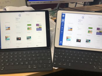
Seems like in TV app/Trailers app, my 9.7" pro has slightly more color pop than 10.5"

colors just more saturated.

Blacks were pretty bad on my first 256 unit, black levels on my 64 are pretty good and I think better than 9.7" even at max brightness maybe. even my first 256 had pretty horrible off axis tint and brightness dimming, the 64 not as much but still I can't help but feel like off axis my 9.7" pro might still be better (I can see pink tint off axis on both units, maybe its just a compromise as part of the screen tech to get ProMotion, I dunno)

I like the 120hz ProMotion, but I feel like that aside, the panel itself isn't that much better (or even necessarily better at all) than my 9.7" iPad Pro

thoughts?
 
Last edited:
  • Like
Reactions: parajba
I felt the same way comparing the new 12.9 to my old 9.7 pro. The color and white point are a bit better on the 9.7 and side by side the 12.9 seems greenish.
 
Are ya gonna swap it / return it?

I am planning on heading to the Apple store today and looking at the demo iPads there.

It seems to me that the 9.7 pro that I have here has better contrast and off axis viewing. It's enough of a difference for me to be concerned about it. I took a side by side picture to illustrate the issue, but it looks better in the picture than in reality.

97vs129.jpg
 
I am planning on heading to the Apple store today and looking at the demo iPads there.

It seems to me that the 9.7 pro that I have here has better contrast and off axis viewing. It's enough of a difference for me to be concerned about it. I took a side by side picture to illustrate the issue, but it looks better in the picture than in reality.

View attachment 704045

If you don't have a yellow edge maybe try another and keep the better of 2?

I'm staying with my 9.7 for a few reasons but yellow edge on 2 devices solidified it for me.

Wasn't thrilled with off axis blatant pink though on both 10.5 units, first one way more so. I recall seeing iPads from previous generations like this, and not being thrilled

Not worth giving apple more money for now
 
The bezel color makes a big difference IMO. The black bezel makes the screen pop and helps to hide any discoloration in the screen. The white bezel is going to bring out any yellow screen discoloration.
 
The bezel color makes a big difference IMO. The black bezel makes the screen pop and helps to hide any discoloration in the screen. The white bezel is going to bring out any yellow screen discoloration.


All iPads ive used have been black

It's panel variation or spec variation between gens, or both

Ive seen a few ugly 9.7 pros too
 
The bezel color makes a big difference IMO. The black bezel makes the screen pop and helps to hide any discoloration in the screen. The white bezel is going to bring out any yellow screen discoloration.

This. One of the reasons I’m not the biggest fan of the beautiful-looking, white bezel. Color distortion is real.

Edit:

TDF, this may be a silly question but are you using true tone on any of your devices?
 
This. One of the reasons I’m not the biggest fan of the beautiful-looking, white bezel. Color distortion is real.

Edit:

TDF, this may be a silly question but are you using true tone on any of your devices?

Of course not haha

Come on I'm a screen vet

--

Outside of preferring a jailbroken iPad it's a good thing I don't sell off old iPads before getting fully situated with the new .. for circumstances like this

If I didn't direclty compare the screen is quite nice on 10.5" barring the hideous yellow bottom edge in portrait/right side landscape
 
Curious what you mean by that? True-tone no good?

No I love truetone selectively and in right uses it's a nifty feature

I just mean I don't have true tone on either device when looking at the screen for uniformity, tint, etc
 
More yellow and dingy than my 9.7 ipp, so kinda meh for text, but I must say color saturation in pictures is better.
 

Attachments

  • ipads.jpg
    ipads.jpg
    1.7 MB · Views: 311
I have a feeling the bottom portrait/right landscape edge being yellow is fairly common

I had two decent tint units, with that going on

I'd hope it will correct itself, but i doubt that
 
At the Apple store I ended up picking up another 12.9 that is considerably better than the first. It's more neutral and less green with better contrast.

The 10.5's that I saw on display were all pretty good and in general it seems that the 10.5 display is better than the 12.9.

All of the displays this time on the new iPads seem to have a bit of a green/yellow hue, whereas with the 9.7 pro it is more pink.
 
Last edited:
  • Like
Reactions: thadoggfather
At the Apple store I ended up picking up another 12.9 that is considerably better than the first. It's more neutral and less green with better contrast.

The 10.5's that I saw on display where all pretty good and in general it seems that the 10.5 display is better than the 12.9.

All of the displays this time seem on the new iPads seem to have a bit of a green/yellow hue, whereas with the 9.7 pro it is more pink.

Awesome glad your new one is better :)

Did they put up any fuss when you explained your reason for exchanging? Just curious

Also mind taking another comparison photo of the replacement?
 
Awesome glad your new one is better :)

Did they put up any fuss when you explained your reason for exchanging? Just curious

Also mind taking another comparison photo of the replacement?


I didn't say anything about it when I was there. I will just send the first one back as it was a pre-order.

The pictures don't show the difference as dramatically as you can see it in person, but you can still plainly see it. The display on my first 12.9 has a different blueish green hued white point and much less contrast. In person it looks quite diffuse and irridescent.

The newer one has a much better display that has a white point closer to my 9.7 pro and much better color contrast.

Bezels...Yeah they are different but that doesn't account for the display differences. Last night we examined them in a completely darkened room so that you couldn't see the bezels and the difference in the display was very apparent.

When I was at the Apple store I thought I could see some variation in the 12.9 demos. There seems to be two kinds of displays, the better ones and then some displays that are green and less contrasty and more iridescent/mother of pearl looking.

True tone on:
truetoneon.jpg


True tone off:

truetoneoff.jpg


Anyways I am happy with the one I have now and the iPad hunt is over for this year.
 
  • Like
Reactions: thadoggfather
I didn't say anything about it when I was there. I will just send the first one back as it was a pre-order.

The pictures don't show the difference as dramatically as you can see it in person, but you can still plainly see it. The display on my first 12.9 has a different blueish green hued white point and much less contrast. In person it looks quite diffuse and irridescent.

The newer one has a much better display that has a white point closer to my 9.7 pro and much better color contrast.

Bezels...Yeah they are different but that doesn't account for the display differences. Last night we examined them in a completely darkened room so that you couldn't see the bezels and the difference in the display was very apparent.

When I was at the Apple store I thought I could see some variation in the 12.9 demos. There seems to be two kinds of displays, the better ones and then some displays that are green and less contrasty and more iridescent/mother of pearl looking.

True tone on:
View attachment 704216


True tone off:

View attachment 704217


Anyways I am happy with the one I have now and the iPad hunt is over for this year.

So I'm looking at a white iPad Pro 12.9 gen 2 and a black iPad Pro 12.9 gen 2?

The black one is night and day better, it looks more immediately on the screen as opposed to kinda spaced out and unfocused,

The text on the white one is also crunchier

And i dont like the tone as much

NAILED IT (from the pics)!

Your keeper looks a lot like characteristics of my 9.7, and the left looks a lot like 10.5's i had.

one swap isn't bad at all and now you know, you got a keeper by comparison :D

My luck was not so good this go round with 10.5
 
My iPad 10.5 display looks fine to me. I've never had a Apple product with display problems, like yellow band
at the bottom etc. Not saying it's not there, but my eyes do not perceive it. I'm glad about this because I could
not keep going to Apple Store for replacements.
 
  • Like
Reactions: HiItsMe
My iPad 10.5 display looks fine to me. I've never had a Apple product with display problems, like yellow band
at the bottom etc. Not saying it's not there, but my eyes do not perceive it. I'm glad about this because I could
not keep going to Apple Store for replacements.

Yea, I am in the same boat here. I understand some people can pick out any perceived flaw, but I just don't see it. Or maybe my brain just doesn't try to look for it. I have been happy with all my Apple screens and the 10.5 is no different. Absolutely the best that I have seen.
 
  • Like
Reactions: HiItsMe
The bezel color makes a big difference IMO. The black bezel makes the screen pop and helps to hide any discoloration in the screen. The white bezel is going to bring out any yellow screen discoloration.

Interesting point. But it makes sense based on what the eye see's with a contrasting bezel color with a black display.
 
Last edited:
I cant help wonder if some of you are members of the US Senate Intelligence Commitee because just like them, I wonder why you don't have more important things to spend you time on.
 
  • Like
Reactions: HiItsMe
I cant help wonder if some of you are members of the US Senate Intelligence Commitee because just like them, I wonder why you don't have more important things to spend you time on.

I don't think it's unreasonable or overly time consuming to put it side by side against an existing unit you still got for a few minutes looking for improvements and seeing the opposite with ease
 
Last edited:
These threads are useless unless you have a color calibration tool or calibrated display to reference. More yellow or blue than your old iPad is not a valid reference point.
 
These threads are useless unless you have a color calibration tool or calibrated display to reference. More yellow or blue than your old iPad is not a valid reference point.

But what about real content like video too ? And looking at contrast/blacks/etc side by side?

Not just white screen comparisons..
 
These threads are useless unless you have a color calibration tool or calibrated display to reference. More yellow or blue than your old iPad is not a valid reference point.

I opened it up last Tuesday and it was immediately certain that it was inferior to my 1st gen 12.9 display. My heart sank as I was so hyped up about having a new 12.9 with P3 color and low reflectivity, and I expected the improvement to be visible. It wasn't really necessary to measure the color, as it was plainly not good enough for what I would use it for.

You have to remember that outside of the USA these things are silly expensive. $1,321.60 here in Canada, so there is an expectation that the quality will match the expense.

In any event I am happy with the one I have now. The display on it is better than most of the iPads I saw in the local Apple stores.
 
Last edited:
Register on MacRumors! This sidebar will go away, and you'll see fewer ads.