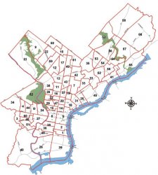
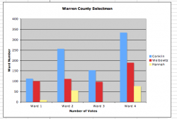
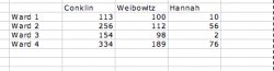
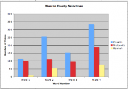
I have an excel spread sheet of number of votes a candidate received broken down by ward. Then I have the ward map. I am trying to compare the number of votes one candidate got to another, but trying to show it graphically based on the ward map. Here are attached ward map. data I will have to email to you can you PM me.
How, graphically, do you plan to illustrate this?
Putting a tiny bar chart on top of each ward would work, but only if the map were printed out the size of a wall.
The classic way to do it is to have a fill colour for each ward, and vary the colour based on the % vote split -- usable only for 2 party sytems, generally. And a real problem for colour-blind readers.
To get this done automatically I'm guessing would require specialist data-mapping software like ArcInfo (is that still available?) or a graphics program that can have parameters data-driven (CAD program or, there was one Mac illustration program long ago that could do this, ICR the name...) and drive the fill colour from the data. Of course, this means redrawing the map in the specific file format, or at least creating an overlay shape for each ward.
You could use Excel to caculate an RGB value for each ward, based on the % vote difference between party 1 and party 2
-100% would be pure red 255,00,00 an even split would be 127,00,127 and 100% would be 00,00,255 pure blue for example - (you would want to use % difference, not the absolute numbers of course).
") The help I need shouldn't be very difficult as I know excel well, but it is this type of chart that I am somewhat unsure of so I could really use a bit of assistance ASAP.
The help I need shouldn't be very difficult as I know excel well, but it is this type of chart that I am somewhat unsure of so I could really use a bit of assistance ASAP.