Excel's trendline options are rather pathetic.
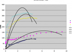
I do not know why, but in the trendline options excel has the logarithmic curves option greyed out. However, these data are clearly suited for a logarithmic curve. why is excel giving me a hard time? these curves are not polynominals!
I do not know why, but in the trendline options excel has the logarithmic curves option greyed out. However, these data are clearly suited for a logarithmic curve. why is excel giving me a hard time? these curves are not polynominals!