Become a MacRumors Supporter for $50/year with no ads, ability to filter front page stories, and private forums.

gyang333

macrumors member
Original poster
May 22, 2011
79
40
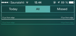
Apologies if this has been discussed here, I'm not sure what to search for as I'm not sure exactly what it's called... Anyway, if you look at the picture, the little dots aren't centered, is there a reason why? or is it like the notification center's Today | All | Missed bar not being centered either?

iIklznz.jpg
 
It should be part of the Parallax 3d effect which generates an offset for a. the wallpaper, b. the icons, c. the badges and d. page indicators all based on the angle of your phone. ;)
 
But I have parallax turned off.

and how does one explain this, where the spacing is off on the sides?

8qjDa8i.jpg
 
I went to the park today and a good long stroll. The fresh air did me a lot of good.... It was an awesome day and I realized I need to get out more frequently....
 
But I have parallax turned off.

and how does one explain this, where the spacing is off on the sides?

Image

How is the spacing off on the sides? Its perfectly symmetrical.

Yes the little dots are off by a hair, but its so little that I can't even tell unless I really look for it and I have an eye for detail. The slightest things that are not symmetrical bug me (OCD) but the dots are no big deal. And again, I see nothing wrong with notification center. I even took a ruler.
 
Oh I totally agree with you... however that does not change the fact that there are issues with the design. It's obviously an easy fix, but I doubt anyone would be happy if the home button was off center...
 
How is the spacing off on the sides? Its perfectly symmetrical.

Yes the little dots are off by a hair, but its so little that I can't even tell unless I really look for it and I have an eye for detail. The slightest things that are not symmetrical bug me (OCD) but the dots are no big deal. And again, I see nothing wrong with notification center. I even took a ruler.

rH0g3Vh.jpg
 
Aligning things perfectly is not how you balance them in design - if one were to do that with the notification center it would look off because the battery symbol is not aligned either - its all balanced not centered.

okay, thanks that makes sense.
 
If you look closely, it is actually centered. It does look off because the border of the "Today" tab is invisible because activated. If you imagine a border around "Today", you'll see that the difference is way minor.
 
No, it's not centred. Here is a picture with the All tab active, so both of the edge buttons have normal borders. I added pixel dimensions for convenience.

The status bar is 1 px too far to the left. The battery "nipple" (whatever it is called) has been excluded from the measures, because it should not be taken into account when positioning the elements. Status bar distance from the edges is indicated in white text and lines.

The segmented button is 2 px too far to the left. Shouldn't require additional explanations... Distance from edges is indicated in turqoise.
 

Attachments

  • NCC.png
    NCC.png
    24.5 KB · Views: 129
No, it's not centred. Here is a picture with the All tab active, so both of the edge buttons have normal borders. I added pixel dimensions for convenience.

The status bar is 1 px too far to the left. The battery "nipple" (whatever it is called) has been excluded from the measures, because it should not be taken into account when positioning the elements. Status bar distance from the edges is indicated in white text and lines.

The segmented button is 2 px too far to the left. Shouldn't require additional explanations... Distance from edges is indicated in turqoise.

This is how it looked in the beta:
IOS-7-Notification-Center-Today-Mode.jpg


Looks much better to me.
 
Register on MacRumors! This sidebar will go away, and you'll see fewer ads.