Re: A Tip...
Originally posted by Balin64
MacAztec...
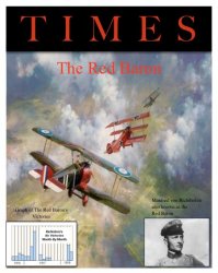
I strongly suggest you turn your project into a litho-type looking image. Be authentic! Also, try to find the very "teutonic" font that was used in Germany from the time of Bismark until WWII. Use it for the masthead: and definitely stay away from color.
Yiu have some good tools, and a good assignment: try to make it as authentic-looking for WWI era Germany. That will be the real challenge.
Good Luck and Have Fun being a teenager. Eres Chingon o No?
Just because it doesn't have to look like the magazine was printed in 1915 doesn't mean it wouldn't be cooler if it did.
For the masthead, use a darker or faded red to look more like it would have in 1915. Good cinematographers use faded, somber (dark), and earth tones for movies set in the past because it makes it look more authentic, even if we all realize that blues and reds and greens were as bright and vivid then as they are now.
But the Teutonic font is a good idea for the title of the feature story about the red baron, which would also be on the cover.
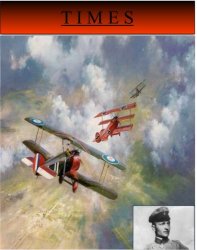
And since the painting is, well, a painting, I would keep the color. It looks more arresting. It's not like they had no color printing back then. At least, I think they had color magazine covers. It might have been expensive or rare, though.
Instead of that solid background for the masthead (which Time doesn't use), put the "Time" on a transparent layer over the picture. That would look a lot more accurate. Also, Time magazine has a red border around the cover, if I recall correctly.
And raise the picture of the the baron so it's more front and center. Where you have it, it looks like it's a teaser about an article on another subject (although you could do that, too--put in a teaser picture about another WWI figure--the Mata Hari would be fun).
And "Time" should be red and much larger--from one side of the magazine to the other.