Become a MacRumors Supporter for $50/year with no ads, ability to filter front page stories, and private forums.

blackxacto

macrumors 65816
Original poster
Jun 15, 2009
1,324
167
Middle TN
24” M4 iMac 10 core 16gbRAM macOS Tahoe 26.2:

I dislike grabbing the top of a finder window and dragging it to see it cover the screen. Anyway to turn this off? How do I drag a Finder window without it filling my screen?
 
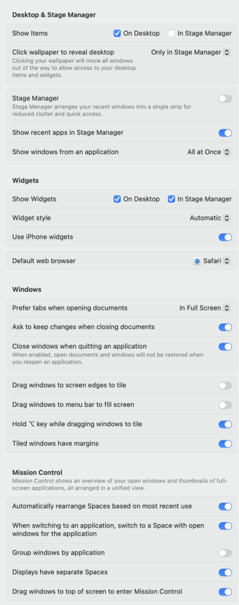
Did you turn off "Drag windows to screen edges to tile" as well? I didn't have to on my machine, but it's worth a shot.

Some of my settings:
Screenshot 2025-12-26 at 12.46.43 pm.png
 
  • Like
Reactions: goldmac2006
I shut off drag windows to menu bar and left right. I think that took care of this annoying behavior. Thanks everyone.
 

Attachments

  • Screen Shot 2025-12-25 at 6.22.54 PM.jpg
    Screen Shot 2025-12-25 at 6.22.54 PM.jpg
    122 KB · Views: 10
  • Like
Reactions: gymrat2k
I hate all this window maximising stuff. It totally slows down any productivity. We never had any of it until all the windows peeps started moving to Mac and moaned that it wasn't a thing. The maximise button used to resize the window to the maximum logical size and didn't waste screen space by filling the entire screen. What's the point in going full screen if a webpage for example is only 1080px wide or everything in a Finder window is encompassed in a 1240x760 window. It's all just wasted space and everything gets hidden behind it, just look at the OPs video and all the wasted space.

It's annoying now when moving windows around how it wants to automatically resize to fill the screen or half of it instead of just move where YOU want to put it. It should be off by default not on.

Ok... Post Xmas rant over. Probably booze withdrawal! I just miss when Apple made sense.
 
tumble wrote:
"I hate all this window maximising stuff..."

So do I.
So I turn it ALL off -- trying to "push the finder back" to the way it was years ago.
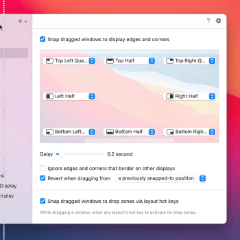
My settings:
desktop.jpg

That's all I'll ever need... :cool:
 
tumble wrote:
"I hate all this window maximising stuff..."

So do I.
So I turn it ALL off -- trying to "push the finder back" to the way it was years ago.
My settings:
View attachment 2591186
That's all I'll ever need... :cool:
Stagemanager is a complete mess. I looked at it once, wondered what the hell was going on then turned it off. Spaces in Leopard was perfect. One Mouse click, all the screens you want, pick one, done. Now there's stuff all over the screen, moving all over the place. Even the sidebar thing takes up space on your desktop which I find completely idiotic because stage manager is meant to help clear and manage your desktop. Why is the sidebar thing even required when the dock does the exact same thing?

All the elegant simple solutions that made MacOS what it was (a joy to use) are now all gone and you have to juggle with hundreds of settings in an attempt to turn it all off.
 
Last edited:
Stagemanager is a complete mess. I looked at it once, wondered what the hell was going on then turned it off. Spaces in Leopard was perfect. One Mouse click, all the screens you want, pick one, done.
Spaces is still there, and it works largely the way it always has. It's called "Mission Control" now.

IMO Stage Manager does provide some useful window management if you spend a bit of time using it, but it's still buggy and missing some key features (there's no way to open a new application and have it automatically added to the group of windows you're currently viewing, for instance).

I used to be an avid user of Spaces but that too can entail lots of manually dragging things over to the desktop space you want.

Even the sidebar thing takes up space on your desktop which I find completely idiotic because stage manager is meant to help clear and manage your desktop. Why is the sidebar thing even required when the dock does the exact same thing?
Because it does a different thing than the Dock. It parks groups of windows. But again, if you don't like Stage Manager, it's easy to shut it off, and you can even turn it off and on from the Control Center.

All the elegant simple solutions that made MacOS what it was (a joy to use) are now all gone and you have to juggle with hundreds of settings in an attempt to turn it all off.
Totally agree overall, though. There's just no super clean way to organize windows.

Lately I've fallen back on just opening apps and using ⌘-⌥-H to hide all the others behind it. Feels primitive but also "just works". ¯\_(ツ)_/¯
 
Wanted to drop a thank you. This has been annoying me recently. You made my day.

I have friends/coworkers who use tiling and I can't stand it. I have too many apps opened for that to work, lol.

Thank you.
 
Spaces is still there, and it works largely the way it always has. It's called "Mission Control" now.

IMO Stage Manager does provide some useful window management if you spend a bit of time using it, but it's still buggy and missing some key features (there's no way to open a new application and have it automatically added to the group of windows you're currently viewing, for instance).

I used to be an avid user of Spaces but that too can entail lots of manually dragging things over to the desktop space you want.


Because it does a different thing than the Dock. It parks groups of windows. But again, if you don't like Stage Manager, it's easy to shut it off, and you can even turn it off and on from the Control Center.


Totally agree overall, though. There's just no super clean way to organize windows.

Lately I've fallen back on just opening apps and using ⌘-⌥-H to hide all the others behind it. Feels primitive but also "just works". ¯\_(ツ)_/¯
The thing is with Mission Control everything takes about 5 seconds to get to the space you want. You activate Mission Control via keyboard or gesture, 1 sec animation to get to the UI, then you have to move the pointer to the top of the screen, then another 1 second animation for the spaces to appear, choose a space, then another 1 second animation to bring it to the front. If you're using multiple spaces throughout the day that's minutes wasted just waiting for the UI and its pointless animations.

Spaces in Leopard was click your mouse, all your spaces appeared, click one and youre ready to go. The animations were quicker, less of them and the whole UX was efficient and refined.

Regarding Stage Manager I personally don't see the point in it. What's so different to just minimising windows to the dock like usual compared to doing the same on the left of the screen where it takes up more space?

There are so many regressions and pointless bloat in MacOS. I discovered the 'Apps app' the other and sat there for ages trying to see what it was I was missing? It really is just an App in the apps folder to help you find apps in the apps folder! What the hell is that about?! Crazy.

Anyway glad the OP solved their issue.
 
The thing is with Mission Control everything takes about 5 seconds to get to the space you want. You activate Mission Control via keyboard or gesture, 1 sec animation to get to the UI, then you have to move the pointer to the top of the screen, then another 1 second animation for the spaces to appear, choose a space, then another 1 second animation to bring it to the front. If you're using multiple spaces throughout the day that's minutes wasted just waiting for the UI and its pointless animations.
Hmm. Not sure I follow. I just swipe left/right on a trackpad (or use the two buttons I have set up on my mouse) and move fluidly from space to space. A hot corner or a three-finger swipe up gives you an overview of all spaces. I'm not seeing anywhere near a full second for these animations, myself. They're very fluid.
 
Really wish the busybodies at Apple would stop with the endless multi-swipe-6-finger-touch-drag-nonsense. Many of these GUI changes just impede daily tasks when they are inadvertently turned on. If they want to make interface changes, make them available but not enabled, and allow people who want them, turn them on, even make the settings sync to iCloud so whatever machine you login to has the desired settings. And if you need to be supported via a remote session, those animated window shade desktop nonsense just makes the session longer and more tedious for the support rep. We get really esoteric gesture swipe tinker-bell GUI controls, but cannot set the phone camera to always shoot in RAW.... Really Apple, give users control please.
 
Register on MacRumors! This sidebar will go away, and you'll see fewer ads.