Got a tip for us?
Let us know
Become a MacRumors Supporter for $50/year with no ads, ability to filter front page stories, and private forums.
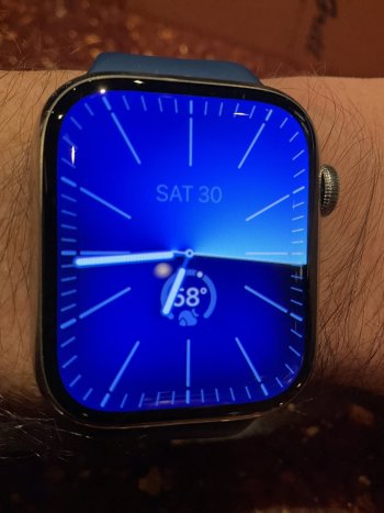
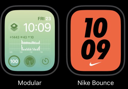
How has WatchOS 10 changed your watch face?
- Thread starter Mercenary
- Start date
- Sort by reaction score
You are using an out of date browser. It may not display this or other websites correctly.
You should upgrade or use an alternative browser.
You should upgrade or use an alternative browser.
Deleting the swipe, Apple forced me to return to the overcrowded Infograph, where I´ve put all complications of the three faces I could EASYILY SWIPE through earlier.
Smart stack has replaced the former dock with 6! Apps, but only with the three buttons.
Watch OS10 for me has only negative consequences:
-the things mentioned above
-the destroyed weather app
-the arrival time on another screen
-the horrible new activity app.
Never ever I had so bad experience with an update.
In reference to those who miss the quickness in accessing apps: I sorted my Apps with the most important used ones placed at the top of the Grid View.
If I now need quick access to an App it is one press of the Digital Crown and one tap on the App… the exact amount of presses when under AW9 it was a press on the Side Button and a tap on the screen for the App.
If I now need quick access to an App it is one press of the Digital Crown and one tap on the App… the exact amount of presses when under AW9 it was a press on the Side Button and a tap on the screen for the App.
I don't mind the Smart Stack but I wish they allowed more than just the three circular shortcuts. I'd remove all the complications off the watch face and just have five or six of them instead. Not a fan of the rectangular widgets because I have trouble reading the small text
This is what I’ve done and why I don’t see the point of the 3 app launcher on the Smart Stack. Far too many ways to launch apps. I think they should have left the app shortcuts on the app page.In reference to those who miss the quickness in accessing apps: I sorted my Apps with the most important used ones placed at the top of the Grid View.
If I now need quick access to an App it is one press of the Digital Crown and one tap on the App… the exact amount of presses when under AW9 it was a press on the Side Button and a tap on the screen for the App.
I use mine to replace some of the complications I used to have on the face (Timer, my health shortcut) rather than having a separate widget for each.This is what I’ve done and why I don’t see the point of the 3 app launcher on the Smart Stack. Far too many ways to launch apps. I think they should have left the app shortcuts on the app page.
For me, WatchOS 10 has ruined the Apple Watch experience. The activity app is clunky, the weather app is convoluted, and the timer app is a mess.
I used to easily "swipe" through the half-dozen faces that were my favorites. Now, I just stick with one, and I won't bother adding any others.
I used to easily "swipe" through the half-dozen faces that were my favorites. Now, I just stick with one, and I won't bother adding any others.
i dont know why they included another clock face at the top of the smart stack.
including the date might be useful for some people, but why double-up on the time?
including the date might be useful for some people, but why double-up on the time?
To a degree I agree with your sentiment; why take away a function that does not impact on a future OS release?I used to easily "swipe" through the half-dozen faces that were my favorites. Now, I just stick with one, and I won't bother adding any others.
Swiping is so much easier that having to tap & hold then swipe, then tap again….. it’s non-productive.
However, I think you are having a ‘cut of your nose to spite your face’ moment in not using other watch faces. They are still there and available… only with more effort that’s all.
I myself am not happy but at the same time “does it affect me”? Answer… No. It only affects me if I chose to not accept a change. 🙂
Register on MacRumors! This sidebar will go away, and you'll see fewer ads.


