Become a MacRumors Supporter for $50/year with no ads, ability to filter front page stories, and private forums.

acearchie

macrumors 68040
Original poster
Jan 15, 2006
3,264
104
I was wondering if I could get some help and tips on how to sort of colour grade my latest shoot.

It was my first outing with a borrowed 5dii and I am keen to get the colours looking a bit better (I know a subjective word!)

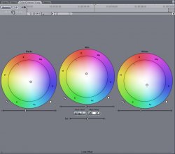
Here is a screen grab of what the image looks like straight out of the camera

screenshot20110415at233.png


Using the filters within FCP what would you suggest to make the image less yellow and more aesthetically pleasing? I realise that I have access to Color but I literally haven't touched it and don't have the time to complete this project and learn new software at the same time!

Thanks for any suggestions you may have!
 
if you want to color grade you need some minimum knowledge of color theory. there are a ton of resources available via google.

aesthetically pleasing
doesn't mean anything, but that's why you need basic edjumucation on color.

Just dicking around with the color plugins fcp provides should provide your answer though. throw up a 3-way correction and play around. it's very wysiwyg.
 
if you want to color grade you need some minimum knowledge of color theory. there are a ton of resources available via google.

doesn't mean anything, but that's why you need basic edjumucation on color.

Just dicking around with the color plugins fcp provides should provide your answer though. throw up a 3-way correction and play around. it's very wysiwyg.

Thanks for the info. What I'm looking for is for people that know their stuff to perhaps share what they would do to the image.

I realise that it is very yellow but this is how the natural light was. The light I was using was very cool so I put it at quite a distance so there wasn't a huge difference between the yellow background and blue foreground.
 
I personally like the look you have but then I dont know what your target is.
it has that reality look used in many tv shows.
Now if your trying to get it to more vibrant, I suggest taking it the still into Photoshop and trying the Curve tool.
Then record your base look and bring back to FCP and try color.
Most of the tools are somewhat the same from Photoshop to FC Color option.
"Most" ;)
 
i don't do grading... but that screen grab the image quality looks fantastic! (Esp. the eyes) What lens did you use?
 
Trial CC

Using FCP 3 way CC
 

Attachments

  • Primary CC on whole image.jpg
    Primary CC on whole image.jpg
    119.4 KB · Views: 91
  • Secondary CC on face only with matte.jpg
    Secondary CC on face only with matte.jpg
    151.7 KB · Views: 79
  • Matte on face.jpg
    Matte on face.jpg
    148.3 KB · Views: 75
  • Final result.jpg
    Final result.jpg
    126.8 KB · Views: 92
I personally like the look you have but then I dont know what your target is.
it has that reality look used in many tv shows.
Now if your trying to get it to more vibrant, I suggest taking it the still into Photoshop and trying the Curve tool.
Then record your base look and bring back to FCP and try color.
Most of the tools are somewhat the same from Photoshop to FC Color option.
"Most" ;)

I might be daring and try but first I will probably have a good fiddle with the three way CC. Thanks for the tip though.

i don't do grading... but that screen grab the image quality looks fantastic! (Esp. the eyes) What lens did you use?

It's a sigma 50mm f2.8 Macro @ 2.8 which was enough to get enough depth of field around the face. I was probably about a metre and a bit away from the guy.

Using FCP 3 way CC

Thanks for all the screengrabs! Very helpful!
 
See I can go either way with the looks uploaded here.
I like the yellow cause it makes me feel like Im actually there.
The updated one are safe colors but now it feels less dramatic IMHO.
I watched a few demo jockeys (Resolve, Flame, Smoke and DS) at NAB and what they perceive is good might not work for everyone.
 
It's obvious to the viewer that the light level in the room would be low, with a yellow/warm colour cast, so I wouldn't try to make it look like bright daylight.

Instead I'd push that yellow/green tint towards magenta, brighten the mids, and concentrate on keeping his face looking natural.

If you want to stylise it, a gentle glow and vignette would be the obvious candidates.
 

Attachments

  • screenshot20110415at233_2.jpg
    screenshot20110415at233_2.jpg
    87.2 KB · Views: 70
It's obvious to the viewer that the light level in the room would be low, with a yellow/warm colour cast, so I wouldn't try to make it look like bright daylight.

Instead I'd push that yellow/green tint towards magenta, brighten the mids, and concentrate on keeping his face looking natural.

If you want to stylise it, a gentle glow and vignette would be the obvious candidates.

Thanks for your input, I think I mighty go with these tips as I agree with you to keeping some realism but also removing a bit of the yellowness!

Thanks for all the help guys!
 
Register on MacRumors! This sidebar will go away, and you'll see fewer ads.